d3js (javascript)
skywater-pdk.readthedocs.io
(2023-08-19)
towardsdatascience.com
(2022-10-21)
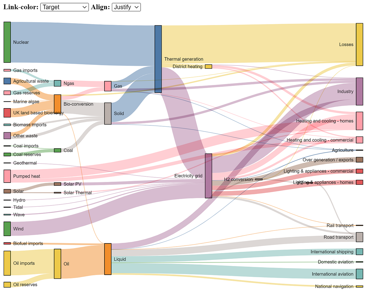
The Sankey chart is a great way to discover the most prominent contributions just by looking at how individual items flow across states.
towardsdatascience.com
(2022-10-14)
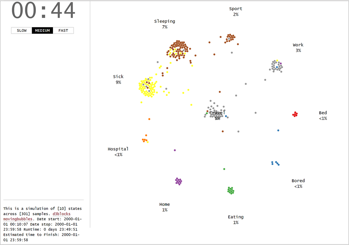
The MovingBubble chart is one of those mind-blowing charts to look at. Learn how to create them using your own data set and Python!
hackernoon.com
(2022-07-19)
blog.keen.io
(2022-07-18)
medium.com
(2022-01-12)

The landscape for learning d3 is rich, vast and sometimes perilous. You may be intimidated by the long list of functions in d3’s API…
datawanderings.com
(2021-12-16)
github.com
(2021-12-11)
A list of D3 libraries, plugins and utilities.
github.com
(2021-07-13)
Visualize flow between nodes in a directed acyclic network. - d3/d3-sankey
github.com
(2021-04-18)
A D3 project showing a barchart that allows user interactions
discotask.com
(2020-02-19)