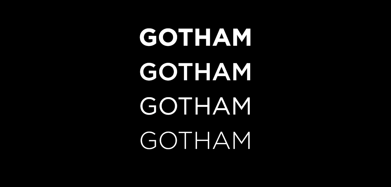
A story of a 150-year-old font you have never heard of – and one you probably saw earlier today.
A story of a 150-year-old font you have never heard of – and one you probably saw earlier today.
letterheady –adjective 1. overcome by a strong emotion due to a letterhead design. Edited by me,...

Learn how to use the art of web typography to enhance website readability and your brand identity.

Typography is an essential component of web design. It’s also affordable, with free commercial fonts, tools, and educational materials.

Todd Klein's online book exploring little-known aspects of comics: lettering, letterers, logo design and more.

The Museo Bodoniano in Parma, Italy, is a mecca for one of the world’s most enduring, and ubiquitous, typefaces. Meet Giambattista Bodoni, the “prince of typography.”
This is a story of my journey learning to build generative ML models from scratch and teaching a computer to create fonts in the process.
Putting a name to the typeface that defined the visual identity of the science fiction series and its author, Frank Herbert
The unedited, writerly feel of monospaced fonts meets the readability and legibility of proportional ones.
Noupe passionately delivers stylish and dynamic news for designers and Web developers across the globe on all subjects of design; ranging from CSS, Photography, JavaScript, Web design, Graphics, Typography and much more.

In today’s tech-savvy world, being a great designer is not all about being a whiz at tools such as Adobe Photoshop and Adobe Illustrator. The job is

Learn the fundamentals of typography through this gamified walkthrough with real-time feedback and logic-based principles.

What is hierarchy in typography, and how does it work? In this article, we'll explain type hierarchy and look at some examples of how it works.

In this article, we talk about the definition of kerning and its importance in design. Learn more about kerning here, and start kerning like a pro!
Creating exceptional content.
My grandmother approves of Atkinson Hyperlegible free font for her phone book printout

Knockout text is a technique where words are clipped out of an element and reveal the background. In other words, you only see the background because the
Now that you have worked through our articles on text styling fundamentals, it's time to test your comprehension with our assessment for the module: Typesetting a community school homepage.
A showcase of the best typefaces from the Google web fonts directory.
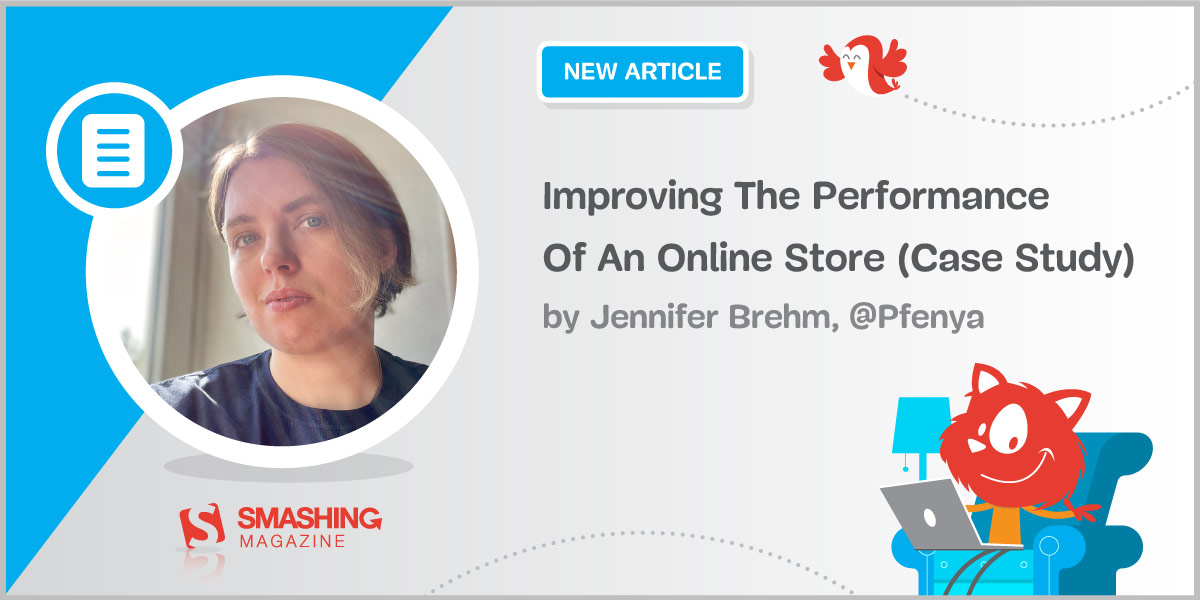
Getting a good performance score from Google is hard for any website — but doing so for an online store is even harder. We achieved green scores — even several for mobile. Here is how we did it.
What happens when you set fontSize: 32 in your favorite editor
An encyclopedic site about typefaces and type design, managed by Luc Devroye
It’s the font we deserve, but is it the one we need right now?
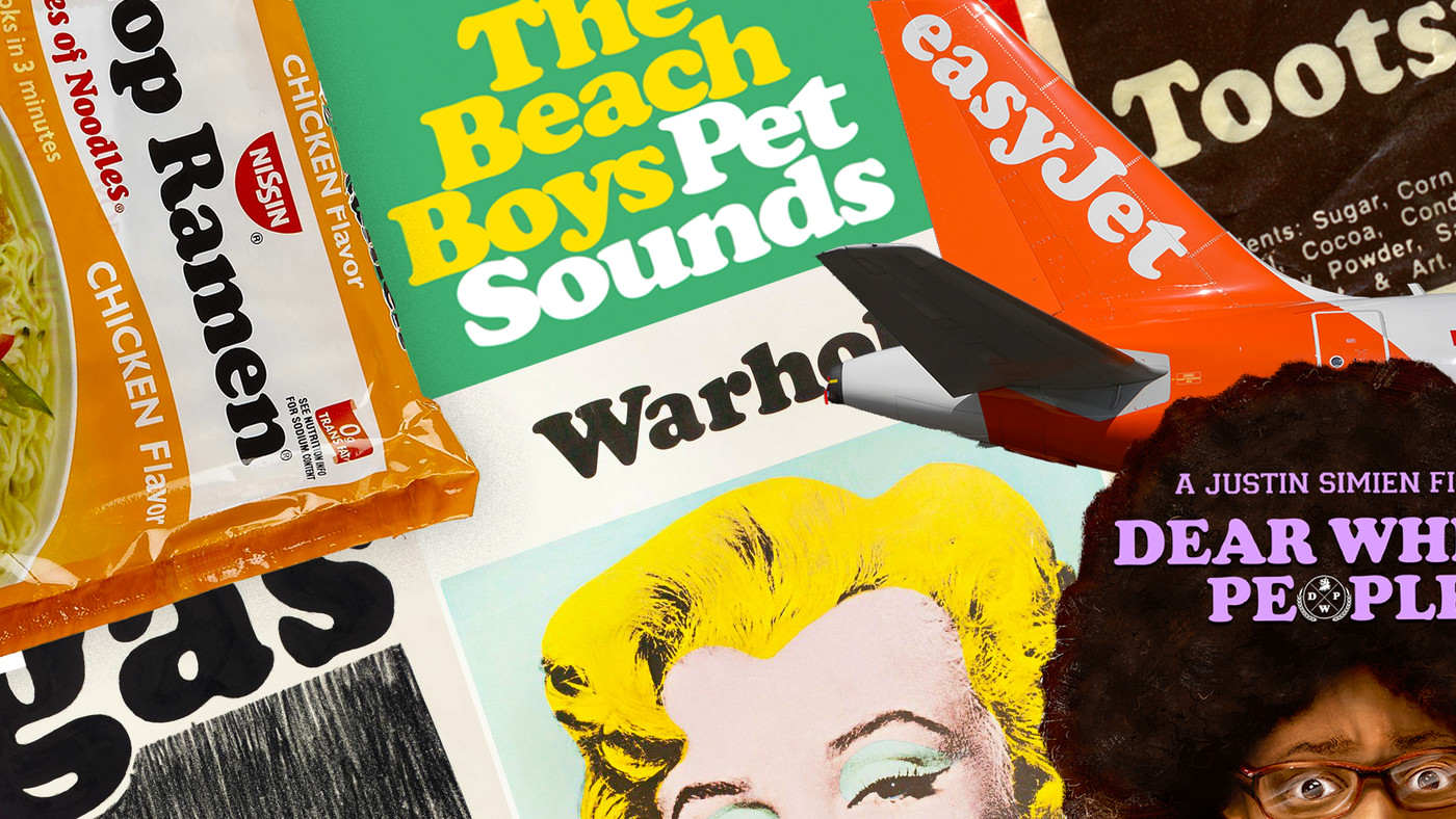
You know Times New Roman, you know Helvetica, you know Comic Sans — and though you may not realize it, you know Cooper Black as well. Just think of the 'VOTE FOR PEDRO' shirt worn in Napoleon Dynamite (and in real life for years thereafter), or a few decades earlier, the cover of Pet Sounds.

Did you know TNW’s Couch Conference has a track fully dedicated to exploring new design trends this year? Check out the full ‘Sprint’ program here. It’s easy to take books and other printed material for granted. However, before the inventio
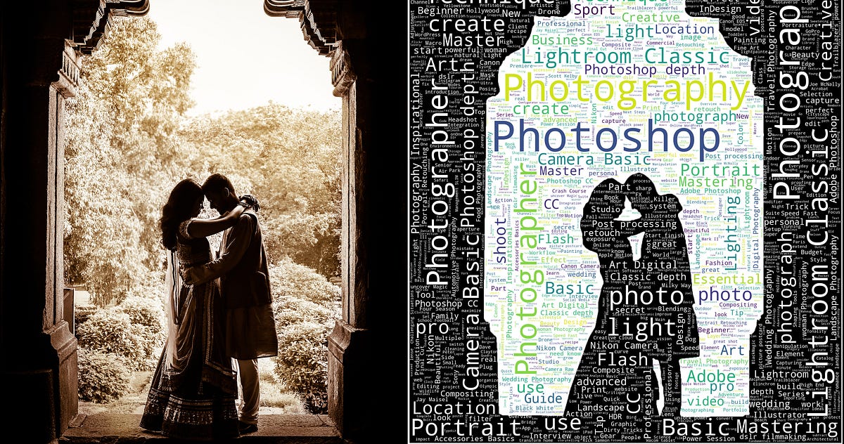
A Picture is worth a thousand words. Literally! there are 2200+ words in this picture. 😱

Effective font combinations are a hallmark of good design. Designers who master this aspect of typography can make the most basic designs more effective.