This article aims to explain the main data structures in R and how to use them.
This article aims to explain the main data structures in R and how to use them.
In February, one hundred fifty-nine new packages made it to CRAN. Here are my Top 40 picks in fifteen categories: Artificial Intelligence, Computational Methods, Ecology, Genomics, Health Sciences, Mathematics, Machine Learning, Medicine, Music,...

The ellmer package for using LLMs with R is a game changer for scientists Why is ellmer a game changer for scientists? In this tutorial we’ll look at how we can access LLM agents through API calls. We’ll use this skill for created structued data fro...

I’m very happy to introduce 7 additions to the Big Book of R collection which now stands at almost 450 free, open-source R programming books. A special thanks to Gary and Lucca Scrucca for their submissions. In case you missed it, the Big Book of R bot is live on … The post 7 New Books added to Big Book of R [7/12/2024] appeared first on Oscar Baruffa.

A couple of days ago, in our lab session, we discussed random forrests, and, since it was based on the example in ISLR, we had a quick discussion about the random choice of features, and the “” rule Interestingly, on that one, we can play a bit, and try all choices, and do it again, on a different train/test split, library(randomForest) library(ISLR2) set.seed(123) sim = function(t){ train = sample(nrow(Boston), size = nrow(Boston)*.7) subsim = function(i){ rf.boston

Introduction R programming has become an essential tool in the world of data analysis, offering powerful capabilities for manipulating and analyzing complex datasets. One of the fundamental skills that beginner R programmers need to master is t...
Hey guys, welcome back to my R-tips newsletter. Supply chain management is essential in making sure that your company’s business runs smoothly. One of the key elements is managing inventory efficiently. Today, I’m going to show you how to estimate inve...
Pic by author - using DALL-E 3 When running experiments don’t forget to bring your survival kit I’ve already made the case in several blog posts (part 1, part 2, part 3) that using survival analysis can improve churn prediction. In this blog post I’ll ...

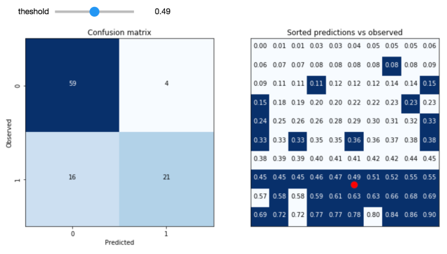
Which layout of an advertisement leads to more clicks? Would a different color or position of the purchase button lead to a higher conversion rate? Does a special offer really attract more customers – and which of two phrasings would be better? For a long time, people have trusted their gut feeling to answer these questions. Today all these questions could be answered by conducting an A/B test. For this purpose, visitors of a website are randomly assigned to one of two groups between which the target metric (i.e. click-through rate, conversion rate…) can then be compared. Due to this randomization, the groups do not systematically differ in all other relevant dimensions. This means: If your target metric takes a significantly higher value in one group, you can be quite sure that it is because of your treatment and not because of any other variable. In comparison to other methods, conducting an A/B test does not require extensive statistical knowledge. Nevertheless, some caveats have to be taken into account. When making a statistical decision, there are two possible errors (see also table 1): A Type I error means that we observe a significant result although there is no real difference between our groups. A Type II error means that we do not observe a significant result although there is in fact a difference. The Type I error can be controlled and set to a fixed number in advance, e.g., at 5%, often denoted as α or the significance level. The Type II error in contrast cannot be controlled directly. It decreases with the sample size and the magnitude of the actual effect. When, for example, one of the designs performs way better than the other one, it’s more likely that the difference is actually detected by the test in comparison to a situation where there is only a small difference with respect to the target metric. Therefore, the required sample size can be computed in advance, given α and the minimum effect size you want to be able to detect (statistical power analysis). Knowing the average traffic on the website you can get a rough idea of the time you have to wait for the test to complete. Setting the rule for the end of the test in advance is often called “fixed-horizon testing”. Table 1: Overview over possible errors and correct decisions in statistical tests Effect really exists No Yes Statistical test is significant No True negative Type II error (false negative) Yes Type I error (false positive) True positive Statistical tests generally provide the p-value which reflects the probability of obtaining the observed result (or an even more extreme one) just by chance, given that there is no effect. If the p-value is smaller than α, the result is denoted as “significant”. When running an A/B test you may not always want to wait until the end but take a look from time to time to see how the test performs. What if you suddenly observe that your p-value has already fallen below your significance level – doesn’t that mean that the winner has already been identified and you could stop the test? Although this conclusion is very appealing, it can also be very wrong. The p-value fluctuates strongly during the experiment and even if the p-value at the end of the fixed-horizon is substantially larger than α, it can go below α at some point during the experiment. This is the reason why looking at your p-value several times is a little bit like cheating, because it makes your actual probability of a Type I error substantially larger than the α you chose in advance. This is called “α inflation”. At best you only change the color or position of a button although it does not have any impact. At worst, your company provides a special offer which causes costs but actually no gain. The more often you check your p-value during the data collection, the more likely you are to draw wrong conclusions. In short: As attractive as it may seem, don’t stop your A/B test early just because you are observing a significant result. In fact you can prove that if you increase your time horizon to infinity, you are guaranteed to get a significant p-value at some point in time. The following code simulates some data and plots the course of the p-value during the test. (For the first samples which are still very small R returns a warning that the chi square approximation may be incorrect.) library(timeDate) library(ggplot2) # Choose parameters: pA

So, you’ve mastered the basics of ggplot2 animation and are now looking for a real-world challenge? You’re in the right place. After reading this one, you’ll know how to download and visualize stock data change through something known as race charts. You can think of race charts as dynamic visualizations (typically bar charts) that display […] The post appeared first on appsilon.com/blog/.

Something a llttle different: Hexbin maps by Jerry Tuttle I recently became acquainted with hexbin maps, so I thought I would experiment with one. In a hexbin map, each geographical region is represented by an equall...
Box plots are a very common tool in data visualization to show how your data is distributed. But they have a crucial flaw. Let’s find out what that flaw is. And if you’re interested in the video version of this blog post, you can find it here: ...
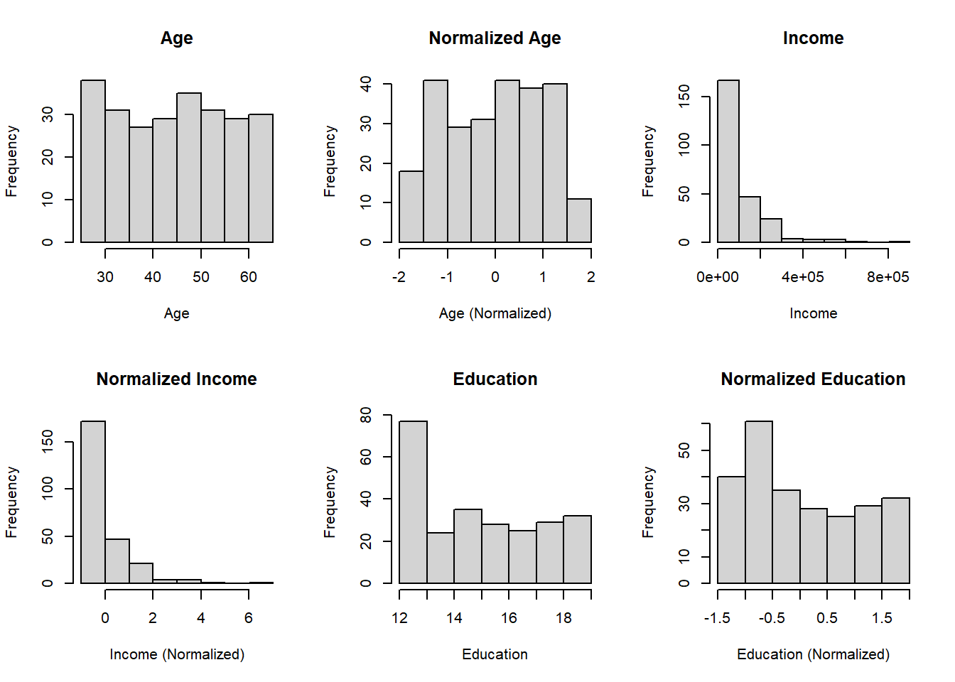
Introduction Data normalization is a crucial preprocessing step in data analysis and machine learning workflows. It helps in standardizing the scale of numeric features, ensuring fair treatment to all variables regardless of their magnitude. In ...
For me, mathematics cultivates a perpetual state of wonder about the nature of mind, the limits of thoughts, and our place in this vast cosmos (Clifford A. Pickover - The Math Book: From Pythagoras to the 57th Dimension, 250 Milestones in the History of Mathematics) I am a big fan of Clifford Pickover and I
Click here to get stared with machine learning in R using caret.
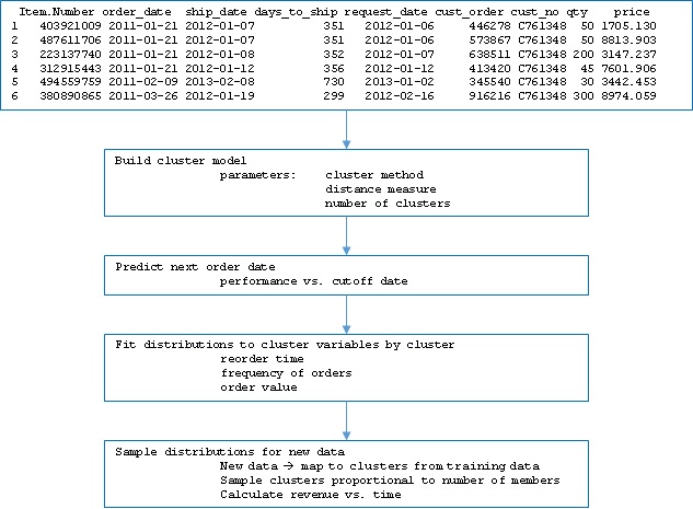
In this article we will review application of clustering to customer order data in three parts. First, we will define the approach to developing the cluster model including derived predictors and dummy variables; second we will extend beyond a typical “churn” model by using the model in a cumulative fashion to predict customer re-ordering in… Read More »Extending churn analysis to revenue forecasting using R

Machine learning is the study and application of algorithms that learn from and make predictions on data. From search results to self-driving cars, it has manifested itself in all areas of our lives and is one of the most exciting and fast-growing fields of research in the world of data science. The caret package, maintained by Max Kuhn, is the go-to package in the R community for predictive modeling and supervised learning. This widely used package provides a consistent interface to all of R's most powerful machine learning facilities. Need some more convincing? In this post, we explore 3 reasons why you should learn the caret package. Afterward, you can take DataCamp's Machine Learning Toolbox course taught by Zachary Deane-Mayer & Max Kuhn, co-authors of the caret package! 1. It can help you get a data science job Ever read through data science job postings and see words like "predictive modeling", "classification", "regression," or "machine learning"? Chances are if you are seeking a data science position, you will be expected to have experience and knowledge about all of these topics. Luckily, the caret package has you covered. The caret package is known as the "Swiss Army Knife" for machine learning with R; capable of performing many tasks with an intuitive, consistent format. Check out these recent data scientist job postings from Kaggle which are all seeking candidates with knowledge of R and machine learning: Data Scientist Analytics at Booking.com Data Scientist at Amazon.com Data Scientist at CVS Health 2. It's one of the most popular R packages The caret package receives over 38,000 direct downloads monthly making it one of the most popular packages in the R community. With that comes significant benefits including an abundant amount of documentation and helpful tutorials. You can install the Rdocumentation package to access helpful documentation and community examples directly in your R console. Simply copy and paste the following code: # Install and load RDocumentation for comprehensive help with R packages and functions install.packages("RDocumentation") library("RDocumentation") Of course, another benefit of learning a widely used package is that your colleagues are also likely using caret in their work - meaning you can collaborate on projects more easily. Additionally, caret is a dependent package for a large amount of additional machine learning and modeling packages as well. Understanding how caret works will make it easier and more fluid to learn even more helpful R packages. 3. It's easy to learn, but very powerful If you are a beginner R user, the caret package provides an easy interface for performing complex tasks. For example, you can train multiple different types of models with one easy, convenient format. You can also monitor various combinations of parameters and evaluate performance to understand their impact on the model you are trying to build. Additionally, the caret package helps you decide the most suitable model by comparing their accuracy and performance for a specific problem. Complete the code challenge below to see just how easy it is to to build models and predict values with caret. We've already gone ahead and split the mtcars dataset into a training set, train, and a test set,test. Both of these objects are available in the console. Your goal is to predict the miles per gallon of each car in the test dataset based on their weight. See for yourself how the caret package can handle this task with just two lines of code! eyJsYW5ndWFnZSI6InIiLCJwcmVfZXhlcmNpc2VfY29kZSI6IiAgICAgICAgIyBMb2FkIGNhcmV0IHBhY2thZ2VcbiAgICAgICAgICBsaWJyYXJ5KGNhcmV0KVxuICAgICAgICAjIHNldCBzZWVkIGZvciByZXByb2R1Y2libGUgcmVzdWx0c1xuICAgICAgICAgIHNldC5zZWVkKDExKVxuICAgICAgICAjIERldGVybWluZSByb3cgdG8gc3BsaXQgb246IHNwbGl0XG4gICAgICAgICAgc3BsaXQgPC0gcm91bmQobnJvdyhtdGNhcnMpICogLjgwKVxuXG4gICAgICAgICMgQ3JlYXRlIHRyYWluXG4gICAgICAgICAgdHJhaW4gPC0gbXRjYXJzWzE6c3BsaXQsIF1cblxuICAgICAgICAjIENyZWF0ZSB0ZXN0XG4gICAgICAgICAgdGVzdCA8LSBtdGNhcnNbKHNwbGl0ICsgMSk6bnJvdyhtdGNhcnMpLCBdIiwic2FtcGxlIjoiIyBGaW5pc2ggdGhlIG1vZGVsIGJ5IHJlcGxhY2luZyB0aGUgYmxhbmsgd2l0aCB0aGUgYHRyYWluYCBvYmplY3Rcbm10Y2Fyc19tb2RlbCA8LSB0cmFpbihtcGcgfiB3dCwgZGF0YSA9IF9fXywgbWV0aG9kID0gXCJsbVwiKVxuXG4jIFByZWRpY3QgdGhlIG1wZyBvZiBlYWNoIGNhciBieSByZXBsYWNpbmcgdGhlIGJsYW5rIHdpdGggdGhlIGB0ZXN0YCBvYmplY3RcbnJlc3VsdHMgPC0gcHJlZGljdChtdGNhcnNfbW9kZWwsIG5ld2RhdGEgPSBfX18pXG4gICAgICAgXG4jIFByaW50IHRoZSBgcmVzdWx0c2Agb2JqZWN0XG5yZXN1bHRzIiwic29sdXRpb24iOiIjIEZpbmlzaCB0aGUgbW9kZWwgYnkgcmVwbGFjaW5nIHRoZSBibGFuayB3aXRoIHRoZSBgdHJhaW5gIG9iamVjdFxubXRjYXJzX21vZGVsIDwtIHRyYWluKG1wZyB+IHd0LCBkYXRhID0gdHJhaW4sIG1ldGhvZCA9IFwibG1cIilcblxuIyBQcmVkaWN0IHRoZSBtcGcgb2YgZWFjaCBjYXIgYnkgcmVwbGFjaW5nIHRoZSBibGFuayB3aXRoIHRoZSBgdGVzdGAgb2JqZWN0XG5yZXN1bHRzIDwtIHByZWRpY3QobXRjYXJzX21vZGVsLCBuZXdkYXRhID0gdGVzdClcbiAgICAgICBcbiMgUHJpbnQgdGhlIGByZXN1bHRzYCBvYmplY3RcbnJlc3VsdHMiLCJzY3QiOiJ0ZXN0X2V4cHJlc3Npb25fb3V0cHV0KFwibXRjYXJzX21vZGVsXCIsIGluY29ycmVjdF9tc2cgPSBcIlRoZXJlJ3Mgc29tZXRoaW5nIHdyb25nIHdpdGggYG10Y2Fyc19tb2RlbGAuIEhhdmUgeW91IHNwZWNpZmllZCB0aGUgcmlnaHQgZm9ybXVsYSB1c2luZyB0aGUgYHRyYWluYCBkYXRhc2V0P1wiKVxuXG50ZXN0X2V4cHJlc3Npb25fb3V0cHV0KFwicmVzdWx0c1wiLCBpbmNvcnJlY3RfbXNnID0gXCJUaGVyZSdzIHNvbWV0aGluZyB3cm9uZyB3aXRoIGByZXN1bHRzYC4gSGF2ZSB5b3Ugc3BlY2lmaWVkIHRoZSByaWdodCBmb3JtdWxhIHVzaW5nIHRoZSBgcHJlZGljdCgpYCBmdW5jdGlvbiBhbmQgdGhlIGB0ZXN0YCBkYXRhc2V0P1wiKVxuXG5zdWNjZXNzX21zZyhcIkNvcnJlY3Q6IFNlZSBob3cgZWFzeSB0aGUgY2FyZXQgcGFja2FnZSBjYW4gYmU/XCIpIn0= Want to learn it for yourself? You're in luck! DataCamp just released a brand new Machine Learning Toolbox course. The course is taught by co-authors of the caret package, Max Kuhn and Zachary Deane-Mayer. You'll be learning directly from the people who wrote the package through 24 videos and 88 interactive exercises. The course also includes a customer churn case study that let's you put your caret skills to the test and gain practical machine learning experience. What are you waiting for? Take the course now!

Create Air Travel Route Maps that look like airline route maps you find in aeroplane magazines using ggplot. Spatially visualise your travel diary. Continue reading → The post Create Air Travel Route Maps in ggplot: A Visual Travel Diary appeared first on The Devil is in the Data.

On occasion of the 10,000th R package on CRAN, eoda operated an automated Twitter account which regularly posted the current number of packages available on CRAN until the 10,000-package milestone has been passed on January 28, 2017. #Rstatsgoes10k – Hello World, it’s 2017-01-28 01:59:03 and currently there are 10000 packages on CRAN. — eodacelebratesR (@Rstatsgoes10k) … „Tutorial: How to set up a Twitter bot using R“ weiterlesen
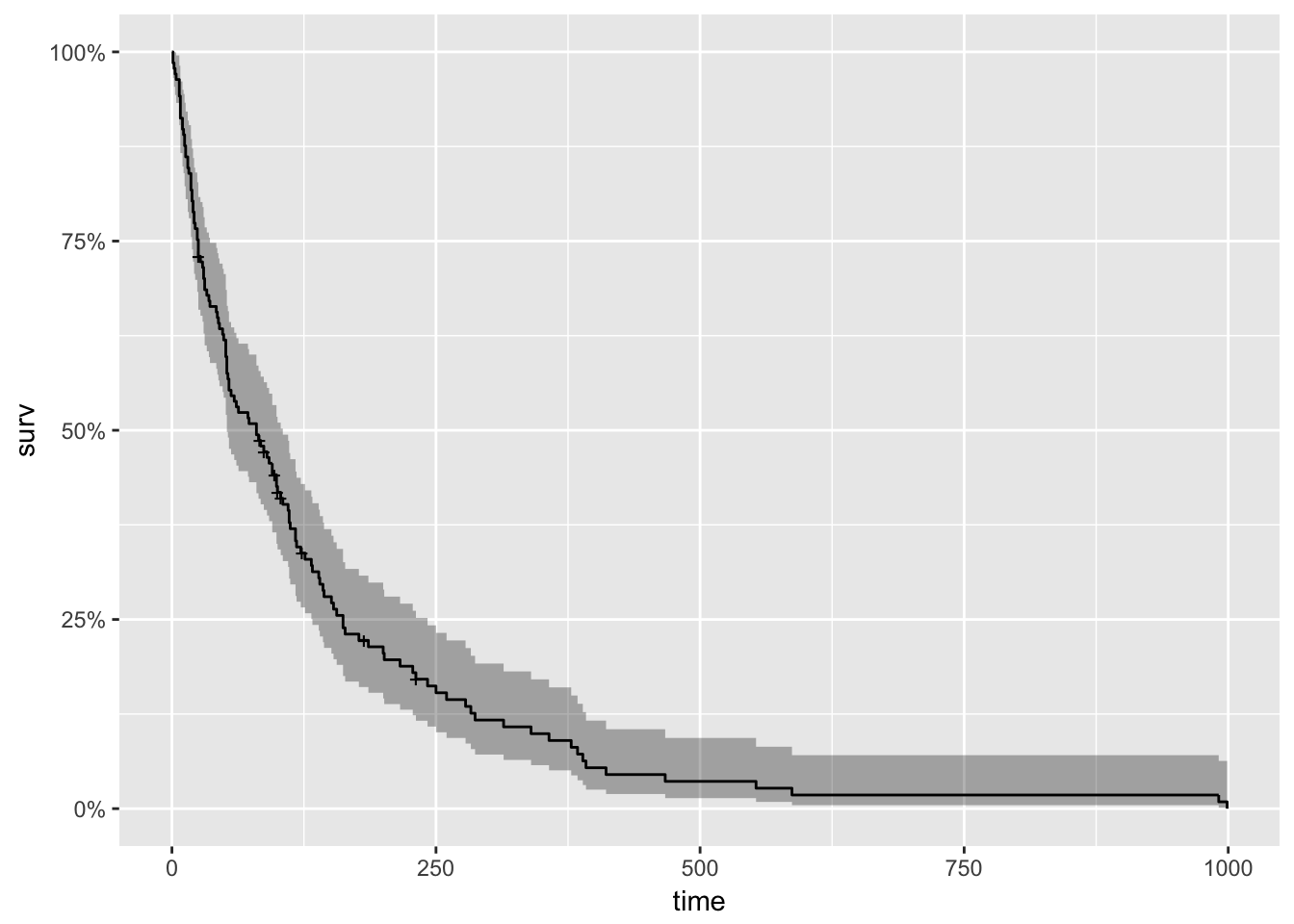
With roots dating back to at least 1662 when John Graunt, a London merchant, published an extensive set of inferences based on mortality records, survival analysis is one of the oldest subfields of Statistics [1]. Basic life-table methods, including techniques for dealing with censored data, were discovered before 1700 [2], and in the early eighteenth century, the old masters - de Moivre working on annuities, and Daniel Bernoulli studying competing risks for the analysis of smallpox inoculation - developed the modern foundations of the field [2]. Today, survival analysis models are important in Engineering, Insurance, Marketing, Medicine, and many more application areas. So, it is not surprising that R should be rich in survival analysis functions. CRAN’s Survival Analysis Task View, a curated list of the best relevant R survival analysis packages and functions, is indeed formidable. We all owe a great deal of gratitude to Arthur Allignol and Aurielien Latouche, the task view maintainers. Looking at the Task View on a small screen, however, is a bit like standing too close to a brick wall - left-right, up-down, bricks all around. It is a fantastic edifice that gives some idea of the significant contributions R developers have made both to the theory and practice of Survival Analysis. As well-organized as it is, however, I imagine that even survival analysis experts need some time to find their way around this task view. Newcomers - people either new to R or new to survival analysis or both - must find it overwhelming. So, it is with newcomers in mind that I offer the following narrow trajectory through the task view that relies on just a few packages: survival, ggplot2, ggfortify, and ranger The survival package is the cornerstone of the entire R survival analysis edifice. Not only is the package itself rich in features, but the object created by the Surv() function, which contains failure time and censoring information, is the basic survival analysis data structure in R. Dr. Terry Therneau, the package author, began working on the survival package in 1986. The first public release, in late 1989, used the Statlib service hosted by Carnegie Mellon University. Thereafter, the package was incorporated directly into Splus, and subsequently into R. ggfortify enables producing handsome, one-line survival plots with ggplot2::autoplot. ranger might be the surprise in my very short list of survival packages. The ranger() function is well-known for being a fast implementation of the Random Forests algorithm for building ensembles of classification and regression trees. But ranger() also works with survival data. Benchmarks indicate that ranger() is suitable for building time-to-event models with the large, high-dimensional data sets important to internet marketing applications. Since ranger() uses standard Surv() survival objects, it’s an ideal tool for getting acquainted with survival analysis in this machine-learning age. Load the data This first block of code loads the required packages, along with the veteran dataset from the survival package that contains data from a two-treatment, randomized trial for lung cancer. library(survival) library(ranger) library(ggplot2) library(dplyr) library(ggfortify) #------------ data(veteran) head(veteran) ## trt celltype time status karno diagtime age prior ## 1 1 squamous 72 1 60 7 69 0 ## 2 1 squamous 411 1 70 5 64 10 ## 3 1 squamous 228 1 60 3 38 0 ## 4 1 squamous 126 1 60 9 63 10 ## 5 1 squamous 118 1 70 11 65 10 ## 6 1 squamous 10 1 20 5 49 0 The variables in veteran are: * trt: 1=standard 2=test * celltype: 1=squamous, 2=small cell, 3=adeno, 4=large * time: survival time in days * status: censoring status * karno: Karnofsky performance score (100=good) * diagtime: months from diagnosis to randomization * age: in years * prior: prior therapy 0=no, 10=yes Kaplan Meier Analysis The first thing to do is to use Surv() to build the standard survival object. The variable time records survival time; status indicates whether the patient’s death was observed (status = 1) or that survival time was censored (status = 0). Note that a “+” after the time in the print out of km indicates censoring. # Kaplan Meier Survival Curve km
Are you interested in guest posting? Publish at DataScience+ via your editor (i.e., RStudio). Category Advanced Modeling Tags Data Visualisation GLMM Logistic Regression R Programming spatial model Many datasets these days are collected at different locations over space which may generate spatial dependence. Spatial dependence (observation close together are more correlated than those further apart) violate the assumption of independence of the residuals in regression models and require the use of a special class of models to draw the valid inference. The […]Related Post Find the best predictive model using R/caret package/modelgrid Variable Selection Methods: Lasso and Ridge Regression in Python Bootstrap with Monte Carlo Simulation in Python Monte Carlo Simulation and Statistical Probability Distributions in Python K-Nearest Neighbors (KNN) with Python
This is to continue on the topic of using the melt/cast functions in reshape to convert between long and wide format of data frame. Here is the example I found helpful in generating covariate table required for PEER (or Matrix_eQTL) analysis:Here ...

This tutorial was prepared for the Ninth Annual Midwest Graduate Student Summit on Applied Economics, Regional, and Urban Studies (AERUS) on April 23rd-24th, 2016 at the University of Illinois at Urbana Champaign.
This book is for anyone looking to do forensic science analysis in a data-driven and open way.
A complete guide to data exploration in R explains how to read data sets in R, explore data in R, impute missing values in your dataset, merge in R, etc
MongoDB is a NoSQL database program which uses JSON-like documents with schemas. It is free and open-source cross-platform database. MongoDB, top NoSQL database engine in use today, could be a good data storage alternative when analyzing large volume data. To use MongoDB with R, first, we have to download and install MongoDB Next, start MongoDB. […]Related PostFinding Optimal Number of ClustersAnalyzing the first Presidential DebateGoodReads: Machine Learning (Part 3)Machine Learning for Drug Adverse Event DiscoveryGoodReads: Exploratory data analysis and sentiment analysis (Part 2)

Stay up-to-date on the latest data science and AI news in the worlds of artificial intelligence, machine learning, deep learning, implementation, and more.
Stay up-to-date on the latest data science and AI news in the worlds of artificial intelligence, machine learning, deep learning, implementation, and more.

I had a feeling that R has developed as a language to such a degree that many of us are using it now in completely different ways. This means that there are likely to be numerous tricks, packages, functions, etc that each of us use, but that others are completely…

A book for Spatial Statistics for Data Science with R.
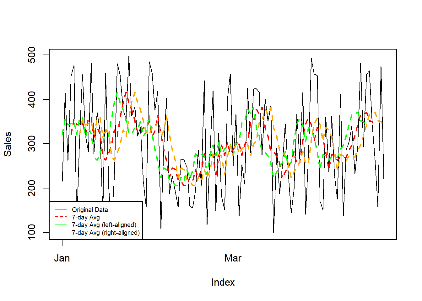
Introduction Ever felt those data points were a bit too jittery? Smoothing out trends and revealing underlying patterns is a breeze with rolling averages in R. Ready to roll? Let’s dive in! Rolling with the ‘zoo’ Meet the ‘zoo’ package, your t...
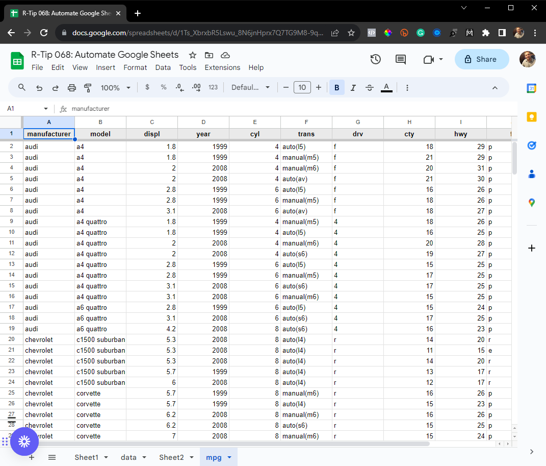
Hey guys, welcome back to my R-tips newsletter. In today’s R-tip, I’m sharing a super common data science task (one that saved me 20 hours per week)… You’re getting the cheat code to automating Google Sheets. Plus, I’m sharing exactly how I made this a...

Introduction As data scientists, being able to investigate and visualize the geographic...
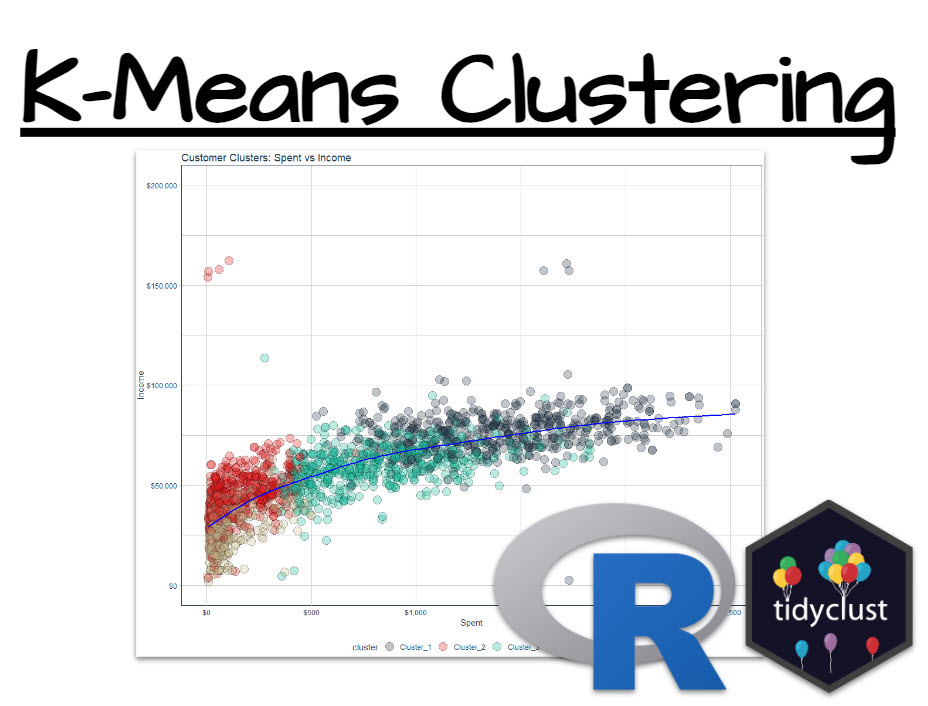
To be successful as a Data Scientist, you’re often put in positions where you need to find groups within your data. One key business use-case is finding clusters of customers that behave similarly. And that’s a powerful skill that I’m going to help you...

On the method’s advantages and disadvantages, demonstrated with the synthdid package in R
Introduction Shiny is an R package that allows you to build interactive web applications using R code. TidyDensity is an R package that provides a tidyverse-style interface for working with probability density functions. In this tutorial, we’ll ...

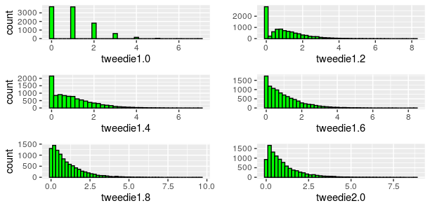
Just some simple codes to illustrate some points we will discuss this week, for the last course on GLMs, before the final exam. We have mentioned that the Gamma distribution belongs to the exponential, so we can run a regression, and compute the associated AIC, > set.seed(123) > test.data = rgamma(n=2000, scale=1, shape=1) > m1 = glm( test.data~1, family=Gamma(link=log)) > AIC(m1) [1] 3997.332 The Gamma distribution is also a special case of the Tweedie distribution, with power 2 > library(statmod) > library(tweedie) > m2 … Continue reading Model selection, AIC and Tweedie regression →

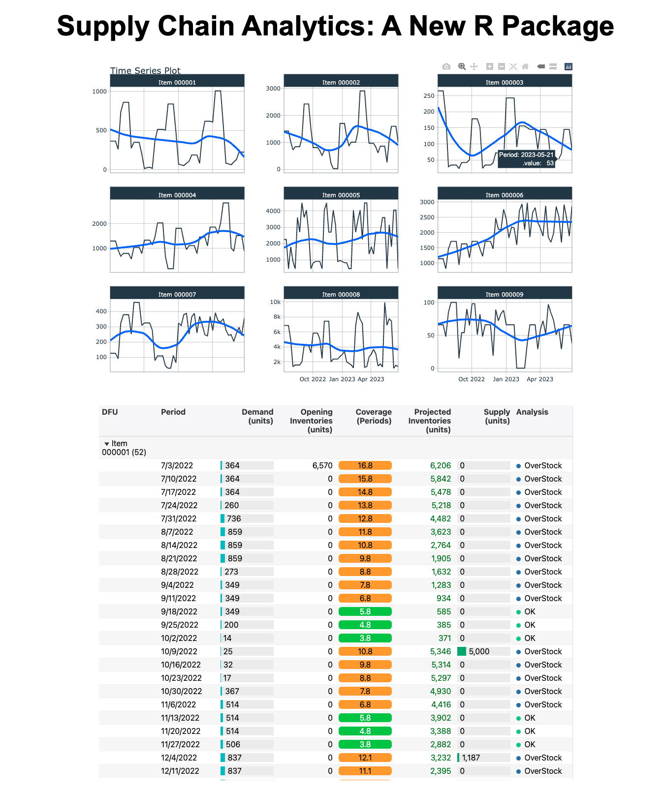
Nicolas Nguyen works in the Supply Chain industry, in the area of Demand and Supply Planning, S&OP and Analytics, where he enjoys developing solutions using R and Shiny. Outside his job, he teaches data visualization in R at the Engineering School EIGSI and Business School Excelia in the city of La Rochelle, France. Introduction Demand & Supply Planning requires forecasting techniques to determine the inventory needed to fulfill future orders. With R, we can build end-to-end supply chain monitoring processes to identify potential issues and run scenario testing. In a 3-part series, I will walk through a Demand & Supply Planning workflow: Using R in Inventory Management and Demand Forecasting: an introduction of projected inventory and coverage methodology (this post) Analyzing Projected Inventory Calculations Using R: an analysis of a demo dataset using the planr package Visualizing Projected Calculations with reactable and shiny: once the analysis is done, how would you present your results to your boss? By the end of the series, you will understand how and why to use R for Demand & Supply Planning calculations. Let’s begin! The “problem” we aim to solve When we work in Demand & Supply Planning, it’s pretty common that we need to calculate projected inventories (and related projected coverages). We often have three options to perform this calculation, using: an APS (Advanced Planning System) software an ERP, such as SAP or JDE and of course…Excel! All are fine and have different pros and cons. For example, we simply sometimes don’t have all the data in our ERP either APS, like when we work with third-party distributors or we want to model a supply chain network that relies on different systems with unconnected data. How about using R to perform these calculations? How simple and fast could they be? And, could we do more than just the calculations? For example, could we get an analysis of the projected situation of a portfolio (as an output of a function), so we don’t have to look at each product one by one and can instead: Easily get a summary view of the portfolio? Then zoom on the products with risks of shortages or overstocks? In a series of posts, I will demonstrate how R can help us in Demand & Supply planning. This first post introduces the proj_inv() and light_proj_inv() functions for projected inventory and coverage calculations. proj_inv(): to calculate projected inventories and coverages with some analysis features light_proj_inv(): to calculate projected inventories and coverages (only) Runs faster than the previous function (as it’s lighter and doesn’t provide any analysis features) With R, we have an efficient way to run end-to-end supply chain monitoring processes. Methodology How to calculate projected inventories First, let’s have a look at an example of how to calculate projected inventories. Consider that the field Demand = Sales Forecasts. We start with some Opening Inventory of 1000 units. During month M, we sell 100 units (the Demand). At the end of the 1st period (Month M), the inventory is 900 units. Then, there’s a demand of 800 units at the end of the following period (Month M+1). During the period (Month M+2), we get a Supply of 400 units, and sell 100: it is now 1100 units in stock. That’s all, this is how we calculate projected inventories ☺ Figure 1: Describes the mechanism of the calculation of projected inventories based on Opening Inventories, Demand and Supply How to calculate projected coverages Now, let’s have a look at how to calculate projected coverages. The idea: we look forward. We consider the projected inventories at the end of a period and evaluate the related coverage based on the Upcoming Demand. See the example below: Figure 2: Description of the calculation of projected coverages, considering the inventories at a point in time and the Upcoming Demand If we use Excel, we often see a “shortcut” to estimate the related coverages, like considering an average of the Demand over the next 3 or 6 months. This can lead to incorrect results if the Demand is not constant (if we have some seasonality or a strong trend, for example). However, these calculations become very easy through the proj_inv() and light_proj_inv() functions. Projected inventory calculations in R Now, let’s see how the above is done using two functions from the planr package. First, let’s create a tibble of data for the example shown above (we will cover Min.Stocks.Coverage and Max.Stocks.Coverage more thoroughly in another post): # Install the planr package # remotes::install_github("nguyennico/planr") library(planr) library(dplyr) Planr_Example % select(Projected.Inventories.Qty) ## # A tibble: 7 × 2 ## # Groups: DFU [1] ## DFU Projected.Inventories.Qty ## ## 1 Item0001 900 ## 2 Item0001 800 ## 3 Item0001 1100 ## 4 Item0001 300 ## 5 Item0001 200 ## 6 Item0001 -100 ## 7 Item0001 200 We can also take a look at projected coverage. It matches our example calculation in Figure 2: the opening coverage is 2.9 months. Calculated_Inv %>% select(Calculated.Coverage.in.Periods) ## # A tibble: 7 × 2 ## # Groups: DFU [1] ## DFU Calculated.Coverage.in.Periods ## ## 1 Item0001 2.9 ## 2 Item0001 1.9 ## 3 Item0001 2.7 ## 4 Item0001 1.7 ## 5 Item0001 0.7 ## 6 Item0001 0 ## 7 Item0001 99 Very easy to calculate! The proj_inv() and light_proj_inv() functions can also be used and combined to perform more complex tasks. I’ve described several use cases in the appendix. Moving forward, these functions form the basis for the classic DRP (Distribution Requirement Planning) calculation, where, based on some parameters (usually minimum and maximum levels of stock, a reorder quantity, and a frozen horizon), we calculate a Replenishment Plan. Conclusion Thank you for reading this introduction of projected inventories and coverages in Demand & Supply Planning! I hope that you enjoyed reading how this methodology translate into R. ASCM (formerly APICS) guidelines In the beginning of 2019, the Association for Supply Chain Management (ASCM) published an article about the usage of R (and Python) in Supply Chain Planning, and more precisely for the Sales & Operations Planning (S&OP) process, which is related to Demand and Supply Planning. Figure 3: An extract from the ASCM article regarding the S&OP and Digital Supply Chain. It shows how R and Python are becoming more and more used for demand & supply planning and are great tools to run a S&OP process. In the example above, we can see how R helps build the digital environment useful to run the S&OP process, which involves a lot of data processing. The planr package aims to support this process by providing functions that calculate projected inventories. Stay tuned for more on projected calculations using R Thank you for reading the introduction on how to use R for projected inventory calculations in Demand & Supply Planning! I hope you enjoyed this introduction to the planr package. My series of posts will continue with: Analyzing Projected Calculations Using R (using a demo dataset) Visualizing Projected Calculations with reactable and Shiny (or, what your boss wants to see) In the meantime, check out these useful links: planr package GitHub repository: https://github.com/nguyennico/planr URL for a Shiny app showing a demo of the proj_inv() and light_proj_inv() functions: Demo: app proj_inv() function (shinyapps.io) Appendix: Use cases and examples The proj_inv() and light_proj_inv() functions can easily be used and combined to perform more complex tasks, such as: Modeling of a Supply Chain Network Calculation of projected inventories from Raw Materials to Finished Goods A multi-echelon distribution network: from a National Distribution Center to Regional Wholesalers to Retailers Becoming a useful tool: To build an End-to-End Supply Chain monitoring process To support the S&OP (Sales and Operations Planning) process, allowing us to run some scenarios quickly: Change of Sales plan Change of Supply (Production) plan Change of stock level parameters Change of Transit Time Etc. Here are some detailed use cases for the functions. Third-party distributors We sometimes work with third-party distributors to distribute our products. A common question is: how much stock do our partners hold? If we have access to their opening inventories and Sales IN & OUT Forecasts, we can quickly calculate the projected inventories by applying the proj_inv() or light_proj_inv() functions. Then, we anticipate any risks of shortages or overstocks, and create a collaborative workflow. Figure 4: Illustration of a SiSo (Sales IN Sales OUT) situation. We have some stocks held at a storage location, for example, a third-party distributor, and know what will be sold out of this location (the sales out) and what will be replenished to it (the sales in), as well as the opening inventory. The aim is to calculate the projected inventories and coverages at this location. From raw materials to finished goods In the example below, we produce olive oil (but it could be shampoo, liquor, etc.). We start with a raw material, the olive oil, that we use to fill up different sizes of bottles (35cl, 50cl, etc…), on which we then apply (stick) a label (and back label). There are different labels, depending on the languages (markets where the products are sold). Once we have a labelled bottle, we put it inside an outer box, ready to be shipped and sold. There are different dimensions of outer boxes, where we can put, for examplem 4, 6 or 12 bottles. They are the Finished Goods. We have two groups of products here: Finished Goods Semi-Finished: at different steps, filled bottle (not yet labelled) or labelled bottle We might be interested in looking at the projected inventories at different levels / steps of the manufacturing process: Finished Goods Raw Materials: naked bottles, labels, or liquid (olive oil) Semi-Finished Products For this, we can apply the proj_inv() or light_proj_inv() functions on each level of analysis. Figure 5...
Learn how to design beautiful tables in R! Join our workshop on Designing Beautiful Tables in R which is a part of our workshops for Ukraine series. Here’s some more info: Title: Designing Beautiful Tables in R Date: Thursday, April 27th, 18:00 – 20:00 CEST (Rome, Berlin, Paris timezone) Speaker: Tanya Shapiro is a freelance … Continue reading Designing Beautiful Tables in RDesigning Beautiful Tables in R was first posted on March 25, 2023 at 3:28 pm.
This thesis consists of two main projects and a third project which is provided in the appendix. The contribution of the first project, is a tool set for parallel random number gen- eration on GPUs…

Nothing short of wacky usage of plot() function with xspline to interpolate the points, but still a “parameter” short of Bezier’s curve. 🙂 Given two random vectors, you can generate a plot that, xspline will smooth out the plot and…Read more ›
It’s March 2023 and right now ChatGPT, the amazing AI chatbot tool from OpenAI, is all the rage. But when OpenAI released their public web API for ChatGPT on the 1st of March you might have been a bit disappointed. If you’re an R user, that is. Because, when scrolling through the release announcement you find that there is a python package to use this new API, but no R package. I’m here to say: Don’t be disappointed! As long as there is a web API for a service then it’s going to be easy to use this service from R, no specialized package needed. So here’s an example of how to use the new (as of March 2023) ChatGPT API from R. But know that when the next AI API hotness comes out (likely April 2023, or so) then it’s going to be easy to interface with that from R, as well. Calling the ChatGPT web API from R To use the ChatGPT API in any way you first need to sign up and get an API key: The “password” you need to access the web API. It could look something like "sk-5xWWxmbnJvbWU4-M212Z2g5dzlu-MzhucmI5Yj-l4c2RkdmZ26". Of course, that’s not my real API key because that’s something you should keep secret! With an API key at hand you now look up the documentation and learn that this is how you would send a request to the API from the terminal: curl https://api.openai.com/v1/chat/completions \ -H "Authorization: Bearer $OPENAI_API_KEY" \ -H "Content-Type: application/json" \ -d '{ "model": "gpt-3.5-turbo", "messages": [{"role": "user", "content": "What is a banana?"}] }' But how do we send a request to the API using R? What we can do is to “replicate” this call using httr: a popular R package to send HTTP requests. Here’s how this request would be made using httr (with the curl lines as comments above the corresponding httr code) library(httr) api_key

The article talks about R packages with a range of functions, including data manipulation, data visualization, machine learning, etc.
A consistent, simple and easy to use set of wrappers around the fantastic 'stringi' package. All function and argument names (and positions) are consistent, all functions deal with "NA"'s and zero length vectors in the same way, and the output from one function is easy to feed into the input of another.
The goal of 'readr' is to provide a fast and friendly way to read rectangular data (like 'csv', 'tsv', and 'fwf'). It is designed to flexibly parse many types of data found in the wild, while still cleanly failing when data unexpectedly changes.
A system for 'declaratively' creating graphics, based on "The Grammar of Graphics". You provide the data, tell 'ggplot2' how to map variables to aesthetics, what graphical primitives to use, and it takes care of the details.

If there’s one type of data no company has a shortage of, it has to be time series data. Yet, many beginner and intermediate R developers struggle to grasp their heads around basic R time series concepts, such as manipulating datetime values, visualizing time data over time, and handling missing date values. Lucky for you, […] The post appeared first on appsilon.com/blog/.

Learn the basic steps to run a Multiple Correspondence Analysis in R

At the EEX, German baseload electricity futures for the year 2023 trade at a price of 950 Euro / MWh and peak load futures at 1275 Euro / MWh. Future prices for France are even higher. (Prices were looked up on 2022-08-28). In contrast, average German...

This article will dive into R's different uses and demonstrate what you can do with this programming language once you've learned it.
A technical manual of graphs, networks and their applications in the people and social sciences
Leverage the powerful data wrangling tools in R’s dplyr to clean and prepare your data.
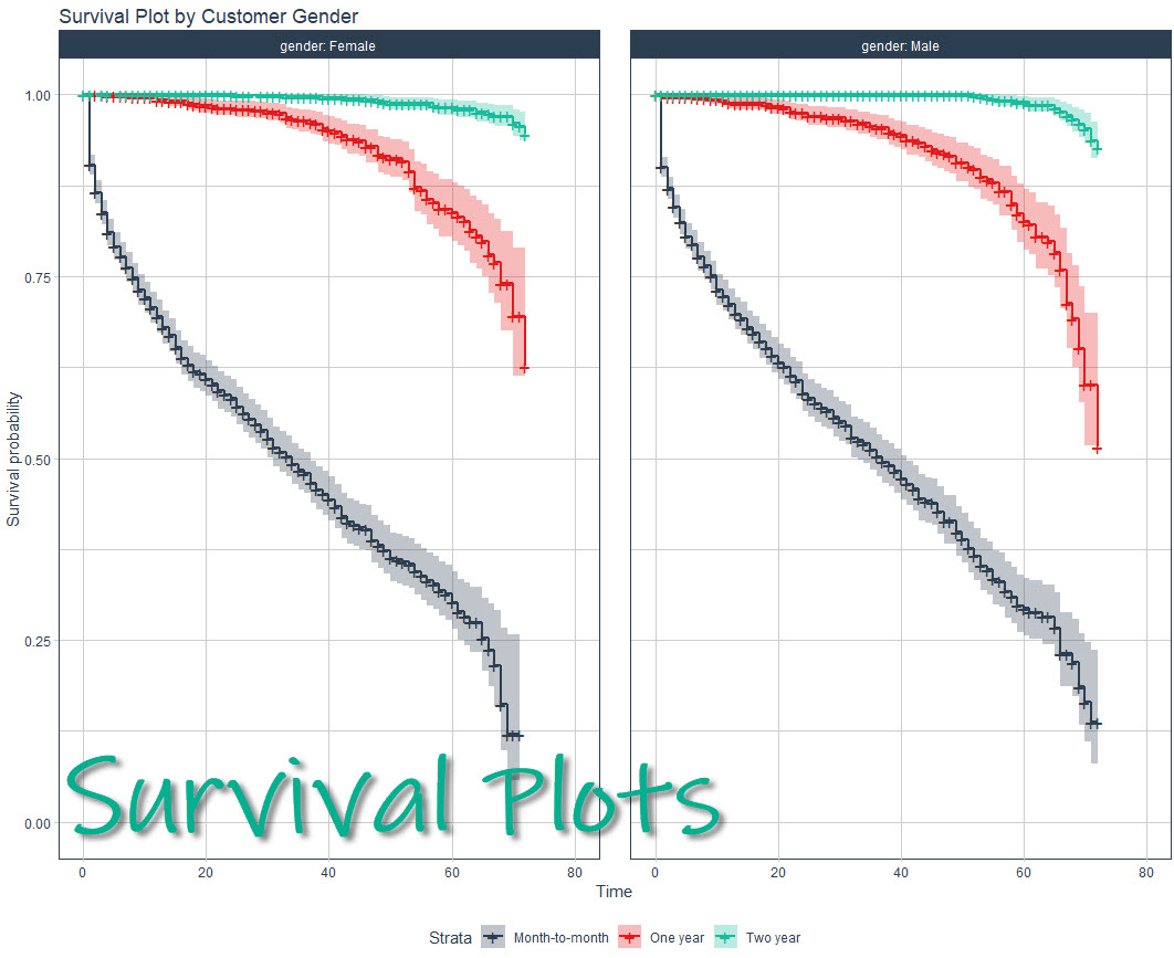
Making a survival analysis can be a challenge even for experienced R users, but the good news is I’ll help you make beautiful, publication-quality survival plots in under 10-minutes. Here’s what WE are going to do: Make your first survival model an...
An extremely long review of R.
This cookbook contains more than 150 recipes to help scientists, engineers, programmers, and data analysts generate high-quality graphs quickly—without having to comb through all the details of R’s graphing systems. Each recipe tackles a specific problem with a solution you can apply to your own project and includes a discussion of how and why the recipe works.
A guide to text analysis within the tidy data framework, using the tidytext package and other tidy tools
R graphics tutorial: scatterplots with anti-aliasing, using the Cairo library. Two lines of code to make much better visualizations in R.

In January 2016, I was honored to receive an “Honorable Mention” of the John Chambers Award 2016. This article was written for R-bloggers, whose builder, Tal Galili, kindly invited me to write an introduction to the rARPACK package. A Short Story of rARPACK Eigenvalue decomposition is a commonly used technique in numerous statistical problems. For example, principal component analysis (PCA) basically conducts eigenvalue decomposition on the sample covariance of a data matrix: the eigenvalues are the component variances, and eigenvectors are the variable loadings. In R, the standard way to compute eigenvalues is the eigen() function. However, when the matrix becomes large, eigen() can be very time-consuming: the complexity to calculate all eigenvalues of a $n times n$ matrix is $O(n^3)$. While in real applications, we usually only need to compute a few eigenvalues or eigenvectors, for example to visualize high dimensional data using PCA, we may only use the first two or three components to draw a scatterplot. Unfortunately in eigen(), there is no option to limit the number of eigenvalues to be computed. This means that we always need to do the full eigen decomposition, which can cause a huge waste in computation. And this is why the rARPACK package was developed. As the name indicates, rARPACK was originally an R wrapper of the ARPACK library, a FORTRAN package that is used to calculate a few eigenvalues of a square matrix. However ARPACK has stopped development for a long time, and it has some compatibility issues with the current version of LAPACK. Therefore to maintain rARPACK in a good state, I wrote a new backend for rARPACK, and that is the C++ library Spectra. The name of rARPACK was POORLY designed, I admit. Starting from version 0.8-0, rARPACK no longer relies on ARPACK, but due to CRAN polices and reverse dependence, I have to keep using the old name. Features and Usage The usage of rARPACK is simple. If you want to calculate some eigenvalues of a square matrix A, just call the function eigs() and tells it how many eigenvalues you want (argument k), and which eigenvalues to calculate (argument which). By default, which = "LM" means to pick the eigenvalues with the largest magnitude (modulus for complex numbers and absolute value for real numbers). If the matrix is known to be symmetric, calling eigs_sym() is preferred since it guarantees that the eigenvalues are real. library(rARPACK) set.seed(123) ## Some random data x = matrix(rnorm(1000 * 100), 1000) ## If retvec == FALSE, we don't calculate eigenvectors eigs_sym(cov(x), k = 5, which = "LM", opts = list(retvec = FALSE)) For really large data, the matrix is usually in sparse form. rARPACK supports several sparse matrix types defined in the Matrix package, and you can even pass an implicit matrix defined by a function to eigs(). See ?rARPACK::eigs for details. library(Matrix) spmat = as(cov(x), "dgCMatrix") eigs_sym(spmat, 2) ## Implicitly define the matrix by a function that calculates A %*% x ## Below represents a diagonal matrix diag(c(1:10)) fmat = function(x, args) { return(x * (1:10)) } eigs_sym(fmat, 3, n = 10, args = NULL) From Eigenvalue to SVD An extension to eigenvalue decomposition is the singular value decomposition (SVD), which works for general rectangular matrices. Still take PCA as an example. To calculate variable loadings, we can perform an SVD on the centered data matrix, and the loadings will be contained in the right singular vectors. This method avoids computing the covariance matrix, and is generally more stable and accurate than using cov() and eigen(). Similar to eigs(), rARPACK provides the function svds() to conduct partial SVD, meaning that only part of the singular pairs (values and vectors) are to be computed. Below shows an example that computes the first three PCs of a 2000x500 matrix, and I compare the timings of three different algorithms: library(microbenchmark) set.seed(123) ## Some random data x = matrix(rnorm(2000 * 500), 2000) pc = function(x, k) { ## First center data xc = scale(x, center = TRUE, scale = FALSE) ## Partial SVD decomp = svds(xc, k, nu = 0, nv = k) return(list(loadings = decomp$v, scores = xc %*% decomp$v)) } microbenchmark(princomp(x), prcomp(x), pc(x, 3), times = 5) The princomp() and prcomp() functions are the standard approaches in R to do PCA, which will call eigen() and svd() respectively. On my machine (Fedora Linux 23, R 3.2.3 with optimized single-threaded OpenBLAS), the timing results are as follows: Unit: milliseconds expr min lq mean median uq max neval princomp(x) 274.7621 276.1187 304.3067 288.7990 289.5324 392.3211 5 prcomp(x) 306.4675 391.9723 408.9141 396.8029 397.3183 552.0093 5 pc(x, 3) 162.2127 163.0465 188.3369 163.3839 186.1554 266.8859 5 Applications SVD has some interesting applications, and one of them is image compression. The basic idea is to perform a partial SVD on the image matrix, and then recover it using the calculated singular values and singular vectors. Below shows an image of size 622x1000: (Orignal image) If we use the first five singular pairs to recover the image, then we need to store 8115 elements, which is only 1.3% of the original data size. The recovered image will look like below: (5 singular pairs) Even if the recovered image is quite blurred, it already reveals the main structure of the original image. And if we increase the number of singular pairs to 50, then the difference is almost imperceptible, as is shown below. (50 singular pairs) There is also a nice Shiny App developed by Nan Xiao, Yihui Xie and Tong He that allows users to upload an image and visualize the effect of compression using this algorithm. The code is available on GitHub. Performance Finally, I would like to use some benchmark results to show the performance of rARPACK. As far as I know, there are very few packages available in R that can do the partial eigenvalue decomposition, so the results here are based on partial SVD. The first plot compares different SVD functions on a 1000x500 matrix, with dense format on the left panel, and sparse format on the right. The second plot shows the results on a 5000x2500 matrix. The functions used corresponding to the axis labels are as follows: svd: svd() from base R, which computes the full SVD irlba: irlba() from irlba package, partial SVD propack, trlan: propack.svd() and trlan.svd() from svd package, partial SVD svds: svds() from rARPACK The code for benchmark and the environment to run the code can be found here.

Powerful R libraries built by the World’s Biggest Tech Companies

Way back in August 2020, I launched Big Book of R, a collection of free (and some paid) R programming books organised by categories like Geospatial, Statistics, Packages and many more. What started off as a 100 book collection has now grown to over 200 :D! Anyway, I felt was … The post Big Book of R has over 200 books! appeared first on Oscar Baruffa.
This is a draft of a book for learning data analysis with the R language. This book emphasizes hands activities. Comments and suggestions are welcome.
Note. This is an update to article: Using R and H2O to identify product anomalies during the manufacturing process.It has some updates but also code optimization from Yana Kane-Esrig( https://www.linkedin.com/in/ykaneesrig/ ), as sh...
An illustrative guide to estimate the pure premium using Tweedie models in GLMs and Machine Learning

A kind reader recently shared the following comment on the Practical Data Science with R 2nd Edition live-site. Thanks for the chapter on data frames and data.tables. It has helped me overcome an o…
Isotonic regression is a method for obtaining a monotonic fit for 1-dimensional data. Let’s say we have data such that . (We assume no ties among the ‘s for simplicity.) Informally, isotonic regression looks for such that the ‘s approximate … Continue reading →

Case study of tweets from comments on Indonesia’s biggest media
Efficient R Programming is about increasing the amount of work you can do with R in a given amount of time. It’s about both computational and programmer efficiency.

Vector Indexing, Eigenvector Solvers, Singular Value Decomposition, & More

Practical Data Science with R, 2nd Edition author Dr. Nina Zumel, with a fresh author’s copy of her book!
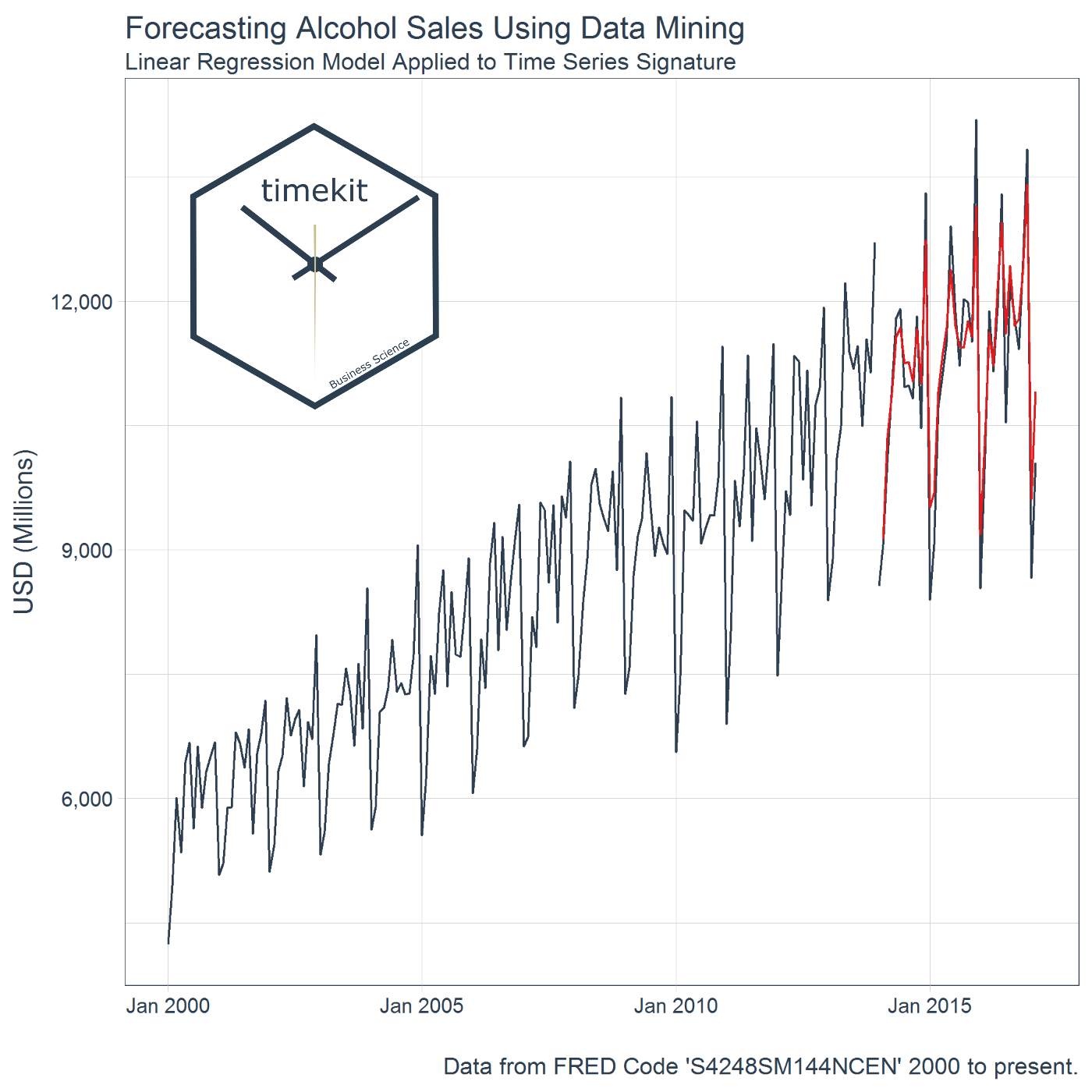
The timekit package contains a collection of tools for working with time series in R. There’s a number of benefits. One of the biggest is the ability to use a time series signature to predict future values (forecast) through data mining techniques. W...

Operations need to have demand forecasts in order to establish optimal resource allocation policies. But, when we make predictions the only thing that we assure is the occurrence of prediction errors. Fortunately, there is no need to be 100% accurate to succeed, we just need to perform better than our competitors. In this exercise we […] Related exercise sets:Forecasting: Exponential Smoothing Exercises (Part-3) Forecasting for small business Exercises (Part-3) Forecasting: Time Series Exploration Exercises (Part-1) Explore all our (>1000) R exercisesFind an R course using our R Course Finder directory

Building machine learning and statistical models often requires pre- and post-transformation of the input and/or response variables, prior to training (or fitting) the models. For example, a model may require training on the logarithm of the response and input variables. As a consequence, fitting and then generating predictions from these models requires repeated application of … Continue reading
Learn R through 1000+ free exercises on basic R concepts, data cleaning, modeling, machine learning, and visualization.
Stay up-to-date on the latest data science and AI news in the worlds of artificial intelligence, machine learning, deep learning, implementation, and more.

This article comes from Togaware. A Survival Guide to Data Science with R These draft chapters weave together a collection of tools for the data scientist—tools that are all part of the R Statistical Software Suite. Each chapter is a collection of one (or more) pages that cover particular aspects of the topic. The chapters can be… Read More »One-page R: a survival guide to data science with R
Last week, I had the opportunity to talk to a group of Master’s level Statistics and Business Analytics students at Cal State East Bay about R and Data Science. Many in my audience were adult students coming back to school with job experience writing code in Java, Python and SAS. It was a pretty sophisticated crowd, but not surprisingly, their R skills were stitched together in a way that left some big gaps.
Stefan Feuerriegel This blog entry concerns our course on “Operations Reserch with R” that we teach as part of our study program. We hope that the materials are of value to lectures and everyone else working in the field of numerical optimiatzion. Course outline The course starts with a review of numerical and linear algebra … Continue reading "Operations Research with R"
R Language Tutorials for Advanced Statistics
If you have tried to communicate research results and data visualizations using R, there is a good chance you will have come across one of its great limitations. R is painful when you need to...

We will review another fascinating approach that marries heuristic and probabilistic methods. We will link marketing channels with a probability of a customer passing through each step of a Sales Funnel

Release 1.4 of the magick package introduces a new feature called image convolution that was requested by Thomas L. Pedersen. In this post we explain what this is all about. Kernel Matrix The new image_convolve() function applies a kernel over the image. Kernel convolution means that each pixel value is recalculated using the weighted neighborhood sum defined in the kernel matrix. For example lets look at this simple kernel: library(magick) kern % image_negate() As with the blurring, the original image can be blended in with the transformed one, effectively sharpening the image along edges. img %>% image_convolve('DoG:0,0,2', scaling = '100, 100%') The ImageMagick documentation has more examples of convolve with various avaiable kernels.
Sentiment Analysis is one of the most obvious things Data Analysts with unlabelled Text data (with no score or no rating) end up doing in an attempt to extract some insights out of it and the same Sentiment analysis is also one of the potential research areas for any NLP (Natural Language Processing) enthusiasts. For […] Related Post Creating Reporting Template with Glue in R Predict Employee Turnover With Python Making a Shiny dashboard using ‘highcharter’ – Analyzing Inflation Rates Time Series Analysis in R Part 2: Time Series Transformations Time Series Analysis in R Part 1: The Time Series Object

‘ImageMagick’ is one of the famous open source libraries available for editing and manipulating Images of different types (Raster & Vector Images). magick is an R-package binding to ‘ImageMagick’ for Advanced Image-Processing in R, authored by Jeroen Ooms. magick supports many common image formats like png, jpeg, tiff and manipulations like rotate, scale, crop, trim, […] Related Post Analyzing the Bible and the Quran using Spark Predict Customer Churn – Logistic Regression, Decision Tree and Random Forest Find Your Best Customers with Customer Segmentation in Python Principal Component Analysis – Unsupervised Learning ARIMA models and Intervention Analysis
Lately I’ve been thinking a lot about the connection between prediction models and the decisions that they influence. There is a lot of theory around this, but communicating how the various pieces all fit together with the folks who will use and be impacted by these decisions can be challenging. One of the important conceptual pieces […]
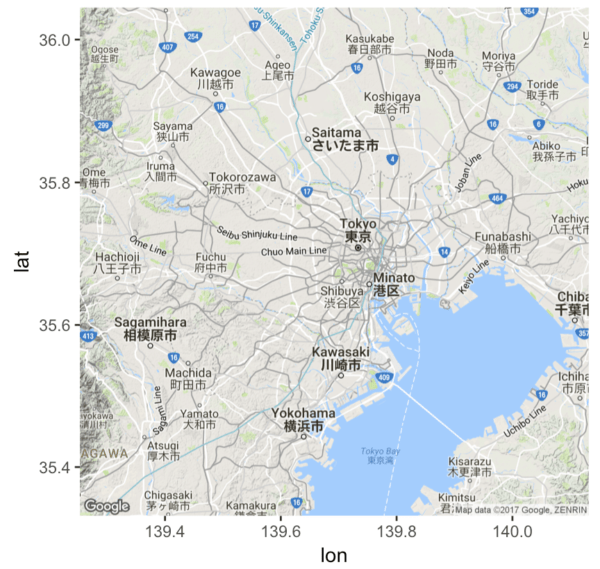
A tutorial for using ggmap to plot basic maps in R, by using images from Google Maps as a ggplot layer.

We have been writing a lot on higher-order data transforms lately: Coordinatized Data: A Fluid Data Specification Data Wrangling at Scale Fluid Data Big Data Transforms. What I want to do now is "write a bit more, so I finally feel I have been concise." The cdata R package supplies general data transform operators. The … Continue reading Arbitrary Data Transforms Using cdata

It can be found on the RStudio cheatsheet page. Suggestions and pull requests are always welcome.