ui-ux

Warm lights, tactile buttons, intuitive usage.
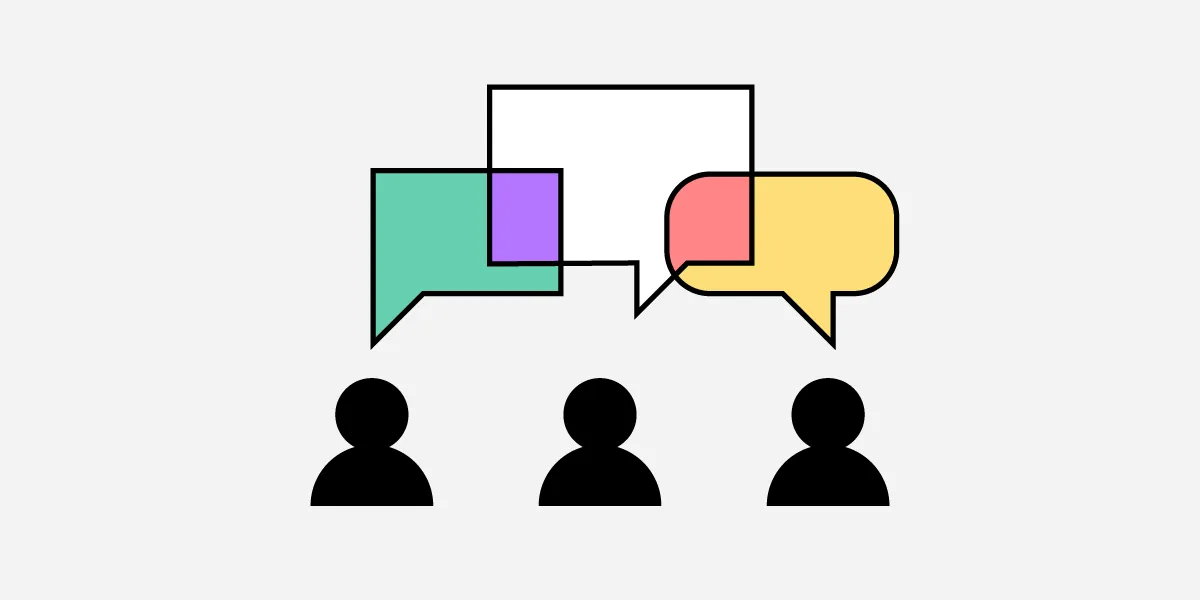
Dive into the customer's mind. Read guides. Watch cool videos. Pricing, sales, design, negotiation, and more.

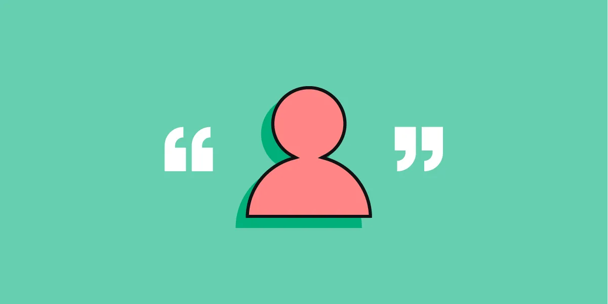
I recently met a woman named Dolores*, an older Hispanic woman, living in Queens, NY with her mother and teenage daughter. As the primary provider for her family, she had come to the organization…

A list of what tools and resources are most relevant for our designers right now.
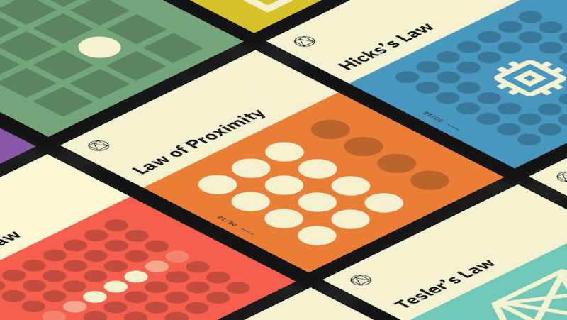
Design teams rely on a combination of principles, patterns, heuristics, and charters to create consistent and usable experiences in a collaborative way.

These 10 user-experience articles published in 2024 were those that our audience read the most.

OnlyFans leverages a meticulously crafted UX to create a powerful sense of intimacy and exclusivity, captivating users while sparking ethical debates about manipulation and exploitation.

A SWOT analysis helps teams understand how well a product, service, or organization is positioned in the market to serve its customers.

“I want to make it pop!”, but not at the expense of your customer experience. Here’s why.

Study guides and glossaries that were most popular in 2024

Use methods like 5-second testing, first-click testing, and preference testing to gain insights into how users perceive your visual design.

Great thought and effort go into creating restaurant menus – and there are some very powerful psychological tricks employed to make you choose.

Use this glossary to quickly clarify key terms and concepts related to product management and UX.
Table and Cards views with animated transitions on sorting, switching view, and browser resizing (no dependencies, just vanilla Javascript, CSS, and HTML). - evoluteur/isomorphic-table-cards

One of the main laws that applies to almost everything in our lives, including building digital products, is Murphy’s Law: “Anything that can go wrong will go wrong.” Our goal is to prevent things from going wrong and, if they do, mitigate the consequences. In this article, Victor Ponamarev explores different strategies for preventing users from making mistakes.


Use this curated set of free NN/g templates and guides for inspiration and to accelerate your product development activities and UX career.
A step-by-step process to creating an empathy map as a lean user persona with examples from leading design tool - UXPin.
"Screenshots won't get you in", but Chrome DevTools will.
,co_rgb:ffffff,c_fit,w_1000,h_300/fl_layer_apply,g_south_west,x_100,y_160/l_text:Inter-Regular.ttf_40:Adam%20Silver,co_rgb:eff6ff,c_fit,w_1400/fl_layer_apply,g_south_west,x_100,y_90/card5.png)

Labels in a card sorting study must be neutral to prevent keyword matching and encourage careful, conceptual groupings from users.
Decent Patterns is a collective effort to further the adoption of decentralized technologies by providing open tooling and resources for the community.

Can designers defend pursuing beauty when communicating science or innovation?
Decent Patterns is a collective effort to further the adoption of decentralized technologies by providing open tooling and resources for the community.

Crowded and hard-to-navigate designs are two of the biggest reasons users leave a website. When users quickly leave, engaging them and boosting

Should you hide or disable a feature? You’ve probably been there before. Here are some considerations for hiding versus disabling, along with possible alternatives to improve UX. An upcoming part of [Smart Interface Design Patterns](https://smart-interface-design-patterns.com).

Potential in place of purpose is what separates an iPad from an iPod, blockchains from databases, and generative AI from text editors. The more complex the product, the more potential it has to have potential. The more it can distract from it's own lack of usefulness.

A few relevant, high-quality visuals placed next to associated text can boost users’ comprehension of your content and its memorability.

For merchants, elevating a site's user experience means more conversions. Usability testing platforms can identify pain points, collect feedback, more.

Use affinity diagramming to cluster and organize research findings or to sort design ideas in ideation workshops.

Scrolling, scanning, skipping: How do users consume content online? Here’s what you need to know about reading behavior and design strategies to prevent harmful scanning patterns. An upcoming part of Smart Interface Design Patterns.

Most calculator and quiz tools provide at least one or more of the following services: converting inputs, predicting the future, or providing recommendations.
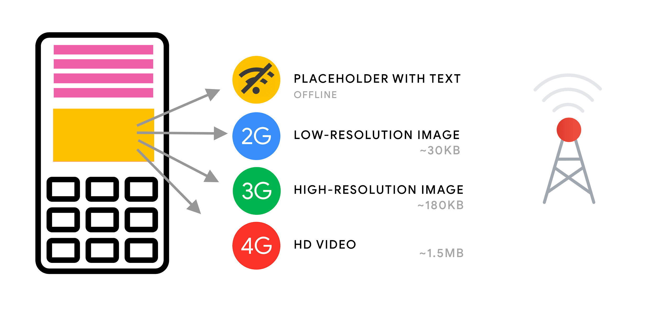
A practical guide to responsive image best practices. By a responsive designer with 20+ years web experience.
Let's go through 6 carefully-picked prototype examples and learn about the difference between low and high fidelity prototypes.

Elevate your website's user experience and engagement with 24 captivating HTML CSS chat box designs. From sleek and modern to fun and whimsical, there's a design to match every website's style and tone.

Tooltips are a very common pattern used in CSS for years. There are a lot of ways to approach tooltips in CSS, though some evoke headaches with all the magic numbers they require. In this article, Temani Afif presents modern techniques to create tooltips with the smallest amount of markup and the greatest amount of flexibility.

What users believe they know about a user interface impacts how they use it. Mismatched mental models are common, especially with designs that try something new.
Web magazine about user experience matters, providing insights and inspiration for the user experience community

Card sort studies help shape information architectures; tree-testing studies evaluate them.

In the first part of our series, we'll explore two Hotwire methods to make modals accessible in your Rails application.

In a card-sorting study, users organize topics into groups. Use this research method to create an information architecture that suits your users' expectations.
Web magazine about user experience matters, providing insights and inspiration for the user experience community
Learn how to design, prototype and collaborate with the official documentation for Sketch. Get started in UI/UX/app/web design here.
Read our guide on designing an app for streamlining complex approval processes. Discover UX rules, UI tips, and more.
Discover best App Landing Page Examples and find out what makes them work. The tips include UI, UX, and copy advise to steal.

Recalling items from scratch is harder than recognizing the correct option in a list of choices because the extra context helps users retrieve information from memory.

Unsure where to start? Use this collection of links to our articles and videos to learn about some principles of human psychology and how they relate to UX design.

A large database of 100% free UI components and design source files available in formats popular in the industry.

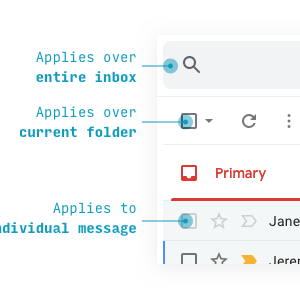
Adam Silver – interaction designer - London, UK
They made this digital faux-Montana delightful enough that I don’t want to leave. But hey, you can use these powers for good.Anyway, my point is that people want payoff for the effort they put into things, and that includes the websites they browse. But you can build emotional rewards into just…

Many journeys include touchpoints where users must wait in line, whether for a physical or online interaction. Well-designed virtual queues help manage the wait to free up users to do other things.

Use this glossary to quickly clarify key terms and concepts related to quantitative user studies.
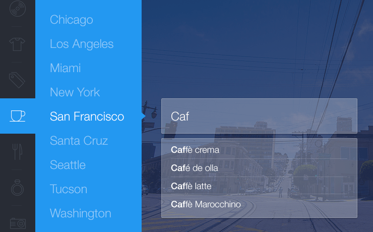
Learn about designing advanced search features. Explore key elements of search UI and build a user-friendly search input.
Discover what UI moodboards are and learn how they can help you perfect product aesthetics. Get our do's and dont's of UI mood board.
Why in 2023 is streaming TV such a terrible experience?

All the AI design hype got me twitching enough to write about the business risks of working so high-fidelity so fast.
Try those 9 techniques and improve discoverability in your product. Make your users happy and create a smooth ux for them.

Unsure of what a word means and how it applies to UX in-practice? Use this glossary to quickly clarify key terms and Agile concepts.

Even though customer experience (CX) leaders are becoming increasingly focused on optimizing their firms’ customer journeys, they face a clear challenge: Which touchpoints along the journey should they invest in? That is, which moments when the customer interacts with their brand are most impactful to the customer’s overall experience? One way to think of customer journeys is as continuous patterns of mental experiences traced over time. Thinking of customer journeys as patterns raises a new set of productive questions, such as: Which patterns are most successful? And what features of those patterns lead to success? Some have argued that the best patterns are smooth and frictionless, while others have made the case for patterns that fluctuate, given that they are likely to be more eventful and stimulating. This article covers research and data on which patterns are most effective, and where CX managers should be investing their limited resources for the best possible customer experience outcomes.
Learn about dark patterns and ways of spotting them, no matter the type of the pattern apply. We will shed the light for you.
Create realistic metallic effects with these CSS and JavaScript code snippets. Create metallic text, buttons, backgrounds, and more.


Inexperienced facilitation in affinity diagramming workshops can lead to groupings that do not serve the team goals or misrepresent underlying issues.
Creating a website is no small feat. It requires careful planning, strategic design, and thoughtful...
Web application providing an intuitive user experience to databases. - mathesar-foundation/mathesar
Task-oriented user stories mix up customer value with cost. But they are easy to turn into a tool for thinking bigger.
When is the right time to disclose information? How much of it should you disclose? Let's explore progressive disclosure, a UX technique.

Visually pleasing designs use consistent type styles and spacing, create a visual hierarchy, and utilize an underlying grid structure.
From UI basics to more advanced techniques, with the help of these tutorials, you'll be able to learn and master Figma in no time.
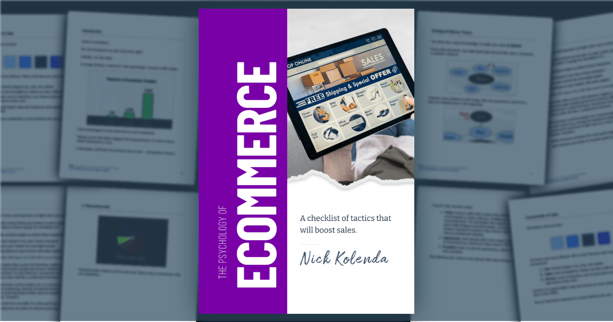
Repeat customers are the lifeblood of successful ecommerce stores. Here are helpful tips for encouraging buyers for the long term.
Learn about Storybook and how it streamlines product development. Check the most popular tutorials on Storybook.
Smashing Magazine — front-end, UX and design for front-end engineers and designers

Empathy maps are a powerful, flexible tool that can be used to plan for future research studies, capture insights during current user research, and communicate research insights from research that has already been conducted to others.

Welcome to our collection of CSS cards! In this comprehensive compilation, we have gathered a wide range of free HTML and CSS card code examples from various reputable sources, including CodePen, GitHub, and other valuable resources.

How AR and VR are reshaping apparel e-commerce.
Learn about design system components. Deepen your knowledge of atomic design and see how you can use it for product design. Enjoy!
Web magazine about user experience matters, providing insights and inspiration for the user experience community
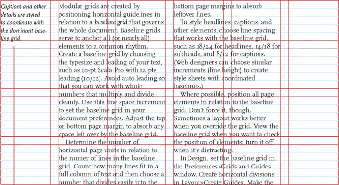
A grid is like invisible glue that holds a design together. Even when elements are physically separated from each other, something invisible connects them together. Grids help designers to build better products by tying different design elements together to achieve effective hierarchy, alignment and consistency, with little effort. If executed properly, your designs will appear thoughtful and organized. In this article Nick Babich aims to give you a good understanding of grid systems, what they are, and how they can be applied to your design process. Understanding how to use grids will come from practical experience.

Buttons. 7 Basic Rules for Button Design by @101babich Button Design Cheatsheet for...
Don’t underestimate ritual and tactility.

Ecommerce websites require great user experience (UX) to achieve the reason for which they’re...

Discover the 9 best ecommerce UX practices from the world's top B2B ecommerce sites that made the top of HackerNews as the best ecommerce site.
Check out the list of top UX design tools that will make you design a stellar user experience. Learn what you can expect from each tool.

Visual-design principles can be applied consistently throughout the process of creating a polished UX map. Start by choosing a tool, then create a visual system, establish the basic layout, and finally add content and make adjustments.
Plus! Market-Making; Poaching and Equity Currency; China's Covid Economy; The Cost of AI; Friendshoring; Diff Jobs
Disclaimer: There is a video version of this tutorial, watch it here Here are 5 card designs, with...

Well-designed questions related to age, gender, race, income and other demographic characteristics help UX researchers screen participants, recruit a diverse participant pool, and segment data. These questions are sensitive and should put research participants at ease.

Delight can be experienced at the visceral, behavioral, and reflective levels. A great design achieves all three of these levels and is best evaluated with specific research methods.
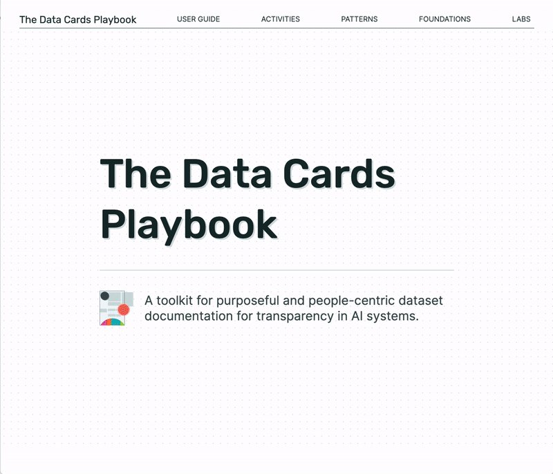
Posted by Mahima Pushkarna, Senior Interaction Designer, and Andrew Zaldivar, Senior Developer Relations Engineer, Google Research As machine learn...

A content strategy is a high-level plan that guides the intentional creation and maintenance of information in a digital product.
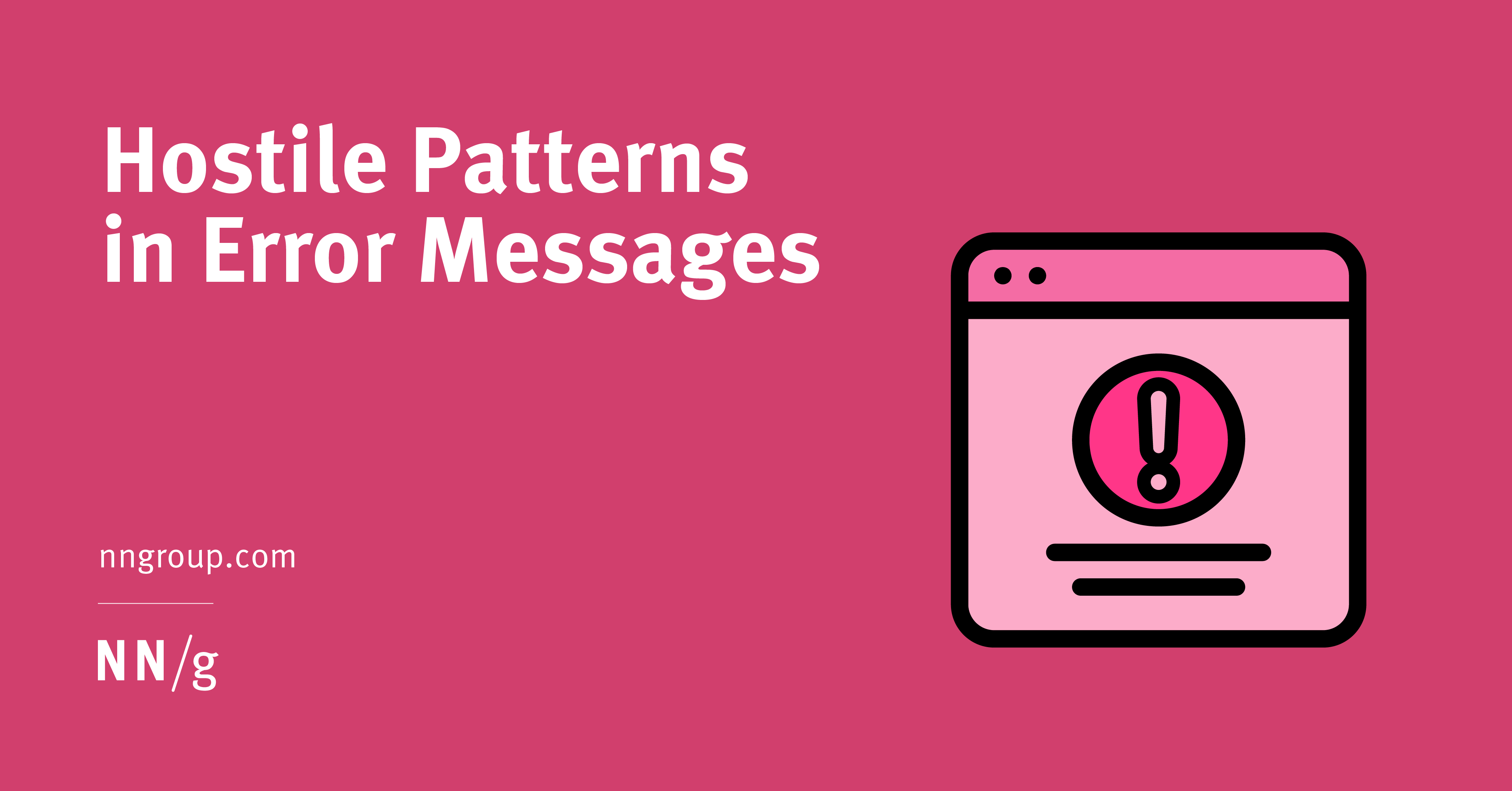
Premature error messages, aggressively styled fields, and unnecessarily disruptive system-status messages feel bad-mannered and increase cognitive load for users during otherwise simple tasks.
Web magazine about user experience matters, providing insights and inspiration for the user experience community
Learn the pros/cons and best practices for card design UI, a popular interface design elements. Plenty of examples included, so dive in!

Unsure where to start? Use this collection of links to our articles and videos to learn about personas and how to create and apply them.
Learn more about design tokens and find out more about using them in your product design process. See if you need them.

Interested in Figma alternatives? This article covers the best choices for professional UI & UX designers. Free and paid.
Learn 8 accessibility hacks that will make your website suitable for a variety of users, including those who have certain challenges.
What is pattern library, UI kit, and brand voice? Learn all the terms that you need to build and use a long-lasting design system.

Antipersonas help anticipate how products can be misused in ways that can harm users and the business.

In this article, Andrew Somers, a 35-year veteran of the Hollywood film and television industry, shares his experience about the hard-fought battles and lessons learned designing for illuminated presentations.
Web magazine about user experience matters, providing insights and inspiration for the user experience community
Discover BASIC UX, a top framework that UX designers use to shape their solution, and build the best product possible.
Web site created using create-react-app
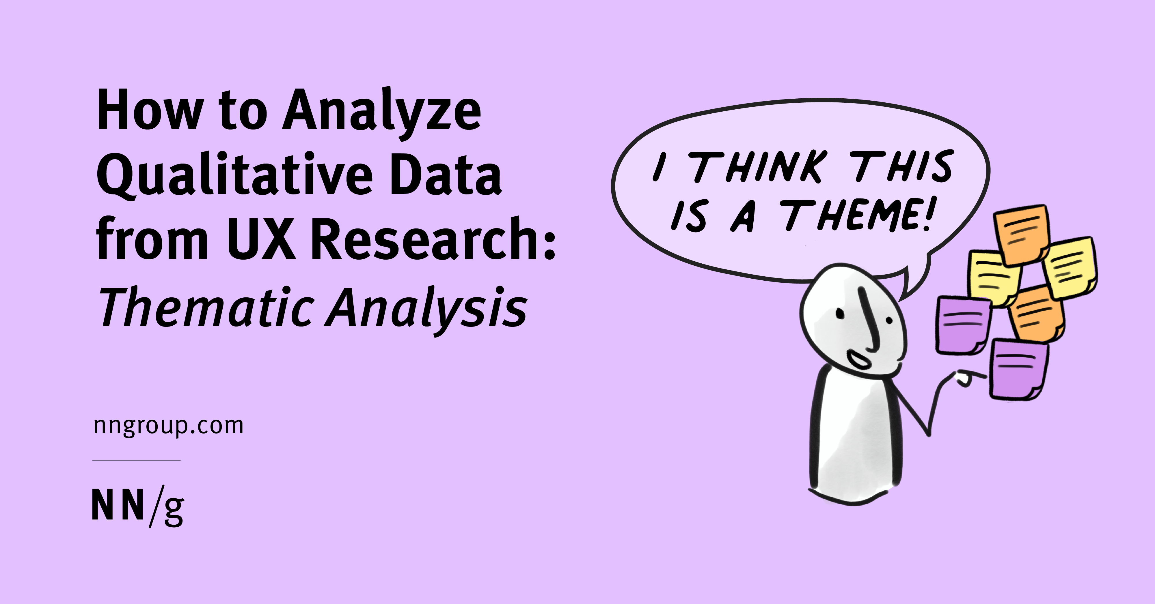
Identifying the main themes in data from user studies — such as: interviews, focus groups, diary studies, and field studies — is often done through thematic analysis.

The Japanese define quality in two ways — atarimae hinshitsu and miryokuteki hinshitsu. Understanding the difference between them is the key to building products that users love.

Microinteraction best practices that improve e-commerce UX.

Unsure where to start? Use this collection of links to our articles and videos to learn how to write and present information that aligns with users’ needs and online behaviors.
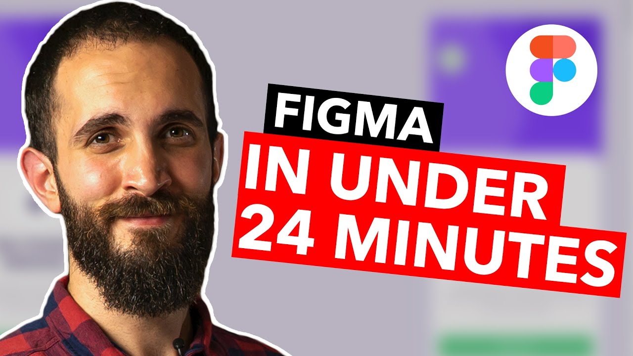
✅ Check out our FREE FACILITATION TRAINING and learn the 5 things you can do to become a top 1% facilitator and earn 6 figures while doing it! 👉https://go.ajsmart.com/start?utm_source=youtube&utm_medium=channel-video&utm_campaign=081220 ________ Do you want to learn Figma but don’t know where to start? Well, if you follow this step-by-step tutorial, it will only take you 24 minutes to learn all the basics you need to know to start designing apps and websites in Figma. In this Figma tutorial for beginners, UX designer Amr guides you through Figma’s interface and tools following a very valuable principle to start mastering this tool. “If you want to learn the basics, you should copy other designs”. Do you have more questions about Figma or the next steps you should take? Leave them in the comments below ⬇️ ✅ If you want to learn about facilitation and workshopping join our FREE FACILITATION COMMUNITY where hundreds of workshop facilitators gather to share their resources, insights and experiences 👉 https://www.skool.com/facilitatorclub Also if you haven't already, subscribe to our Youtube channel for weekly UX / UI / Career / and Design Sprint videos: ❤️ https://www.youtube.com/AJ&Smart?sub_confirmation=1 😉 🛠Free resources mentioned in this video: 1️⃣ Figma website - https://www.figma.com/ 2️⃣ Figma resources (Food delivery app UI template) - https://www.figma.com/community/file/852455074698003039 3️⃣ Free Figma icons - https://www.figma.com/resources/assets/evericons-for-figma/ 4️⃣ Unsplash (Free images) - https://unsplash.com/ ⏰ Video Timestamps 0:00 Intro 0:22 Advantages of using Figma 1:22 How to log in into figma.com 1:36 Why you should copy other designs Start of Tutorial 2:28 How to start a project from a TEMPLATE 5:10 Interface OVERVIEW 5:27 Create a FRAME 6:38 SHAPE and COLOR creation 8:28 CORNER RADIUS adjustment 10:12 Create a CIRCLE 12:25 How to use an ICON 14:28 How to paste IMAGES 15:32 How to use TEXT 18:39 BUTTON UI 21:39 Conclusion 22:32 Next steps Thanks for watching! ---- #Figma #FigmaTutorial #UXDesign 📣 FREE FACILITATION TRAINING! 👉 https://go.ajsmart.com/start We’ve JUST launched a new 1-hour facilitation training, where we’ll teach you: ✅How we landed facilitation gigs with the world’s best companies (Google, Twitter, LEGO & more!) ✅How to successfully build & facilitate ANY workshop, even when you’re not a subject-matter expert ✅How to become a high-paid facilitator in 90 days or less, using our special ‘5-1-6 method’. Interested? This training is available for a limited time only, so unlock it now and start watching! If you want to stay ahead of the UX game, level up your career, and be in the know on the nerdiest, ‘techiest’ things, sign up for our FREE newsletter here: 📩 👇 📝 https://aj-smart.ck.page/21100f1c73 👀 Want more? Join 200,000+ people subscribing to our AJ&Smart YouTube, LinkedIn and Instagram channels for free content to help you and your team do more valuable work. AJ&Smart is the #1 design sprint firm in the world, the official Design Sprint training partner with Jake Knapp inventor of the google design sprint and partner of choice for the world's most successful brands. Figma UI Design Tutorial: Get Started in Just 24 Minutes! (2021) https://youtu.be/FTFaQWZBqQ8

Signing up for a website is a big commitment to most people. Users who sign up for your site are giving you their personal information. If you misuse their personal information, you could abuse their trust. Most users today are more wary than ever about who handles their personal information. In a cyber world full of […]
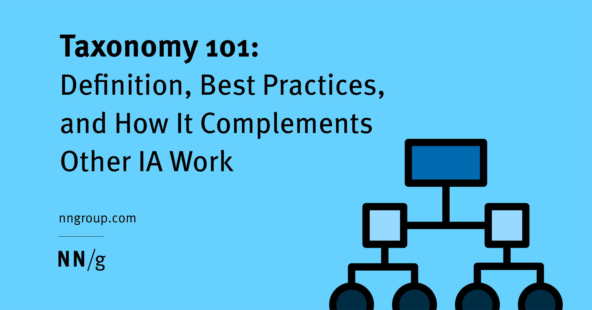
A taxonomy is a backstage structure that complements the visible navigation. Taxonomies support consistent information retrieval by creating formal metadata rules.
Your #1 resource for digital marketing tips, trends, and strategy to help you build a successful online business.

It's not always true that simplicity makes the best product. Sometimes making things less simple will get you the users you truly want.
Read this guide to learn how to Distinguish between User Experience and User Interface Design.
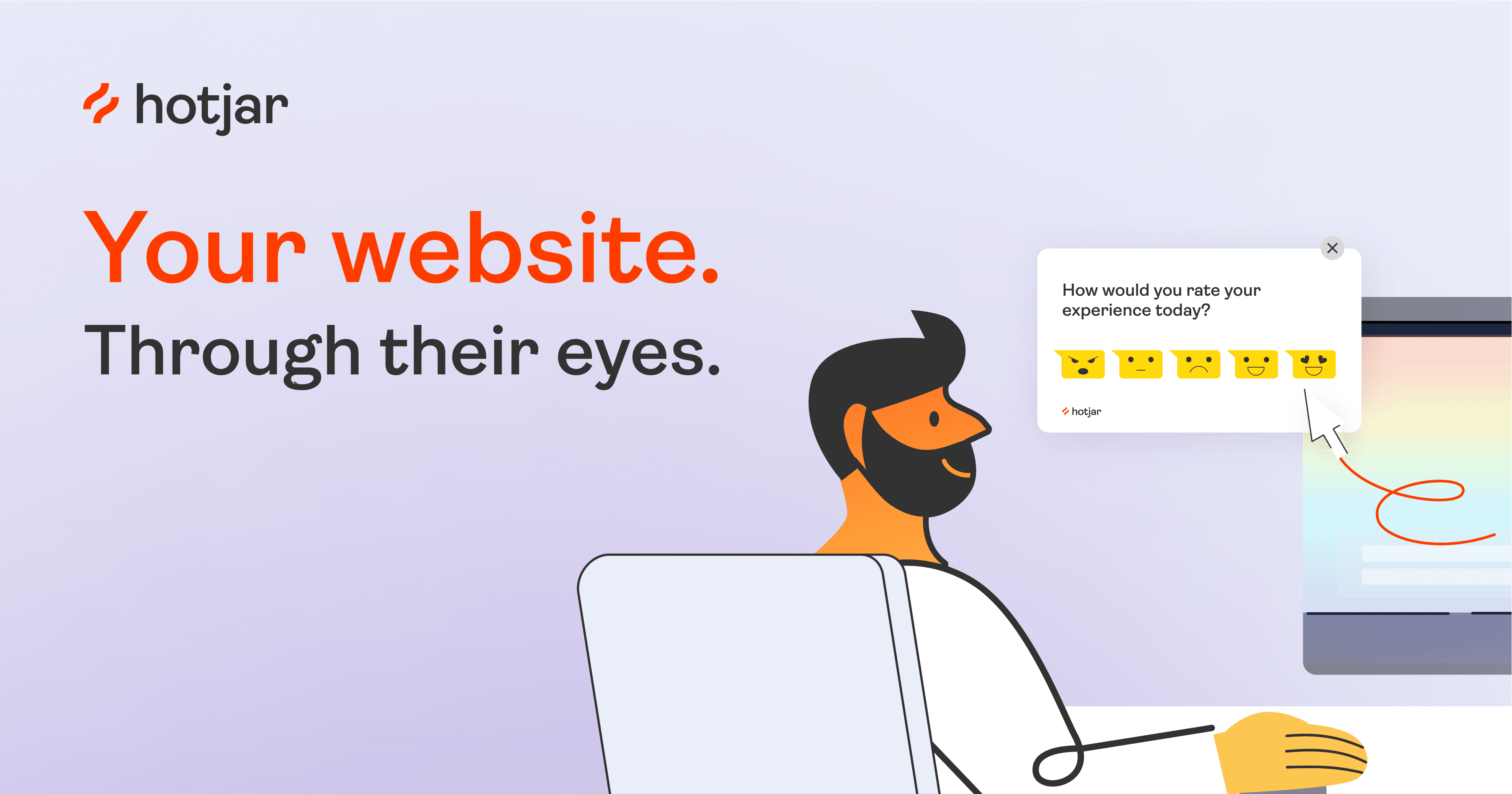
The next best thing to sitting beside someone browsing your site. See where they click, ask what they think, and learn why they drop off. Get started for free.

An introduction to Web Authentication (WebAuthn), the new API that can replace passwords with strong authentication.

The Art of Game Feel (a.k.a Juice) in Product Design

In today’s tech-savvy world, being a great designer is not all about being a whiz at tools such as Adobe Photoshop and Adobe Illustrator. The job is
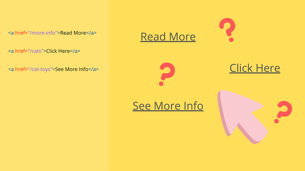
It’s probably not the first time you’ve heard that using links like “Read More” or “Click Here” is bad practice. This topic has been…

Gamification is becoming a hot commodity around the web, but what is it? Is it being used correctly? Let's have a look at various aspects of gamification and how they can be used and...

Use a flexible responsibility-assignment matrix to clarify UX roles and responsibilities, anticipate team collaboration points, and maintain productivity in product development.

A Style Tile is a design deliverable consisting of fonts, colors and interface elements that communicates the evolution of a visual brand for the web. Learn how to use them here.
Google's data viz team, formed just last year, has put out best practices for designing charts.
Learn how to run a competitive analysis for UX and check out our 6 research methods, so you know what to do what to look at.

Until recently, a lack of digital prioritization and desire to control access have led to sub-par luxury ecommerce experiences. Many luxury brands are struggling to improve.
🌟 Curated design resources from all over the world. - gztchan/awesome-design

Effective storytelling involves both engaging the audience and structuring stories in a concise, yet effective manner. You can improve your user stories by taking advantage of the concept of story triangle and of the story-mountain template.
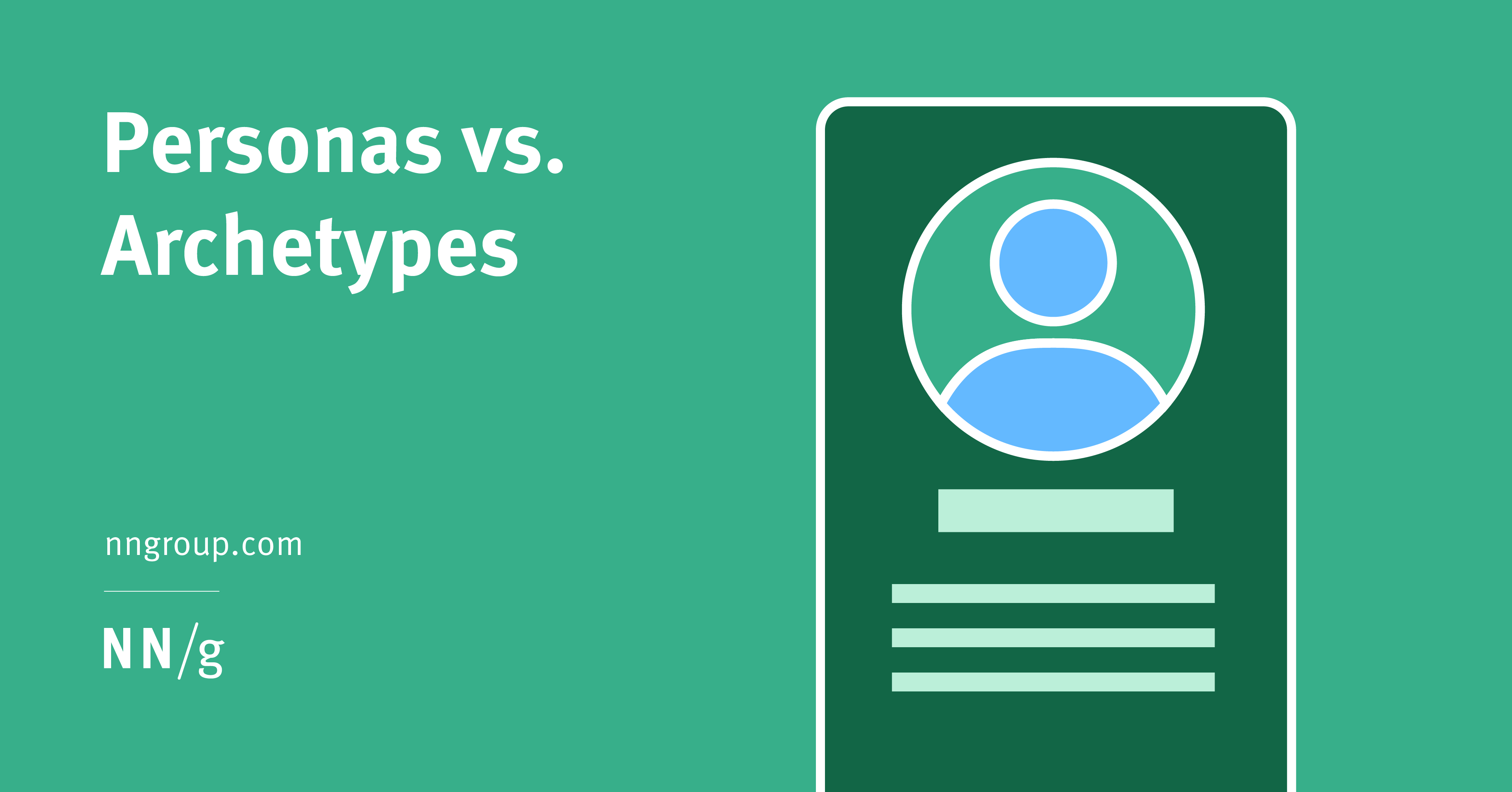
Archetypes and personas used for UX work contain similar insights, are based on similar kinds of data, and differ mainly in presentation. Personas are presented as a single human character, whereas archetypes are not tied to specific names or faces.
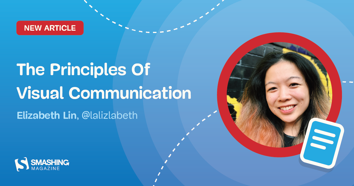
We’re taught to communicate with words. We write essays, prepare speeches, and take written notes. But words aren’t always the best option for conveying information and ideas. Sometimes the best way to tell stories is through thoughtfully crafted visuals, not long paragraphs of text. Visual storytelling is the process of conveying ideas using things you can see. In this article, Elizabeth Lin will explore visual principles, highlight why visual storytelling is a valuable skill for everyone to learn, and demonstrate how you can improve your visual storytelling through play.

A style guide, also referred to as a pattern library, is a living document that details the front-end code for all the elements and modules of a website or application. It also documents the site’s…
Start your next UX project with this checklist and don't forget about anything!


If you're looking for the best books on web design topics, you are in the right place. In this...
Familiarity has a major impact on our decision-making process. Understanding the psychology behind it will lead to better UX / design, copy and CTAs.

How do UI design, usability, and user experience combine to impact your success?
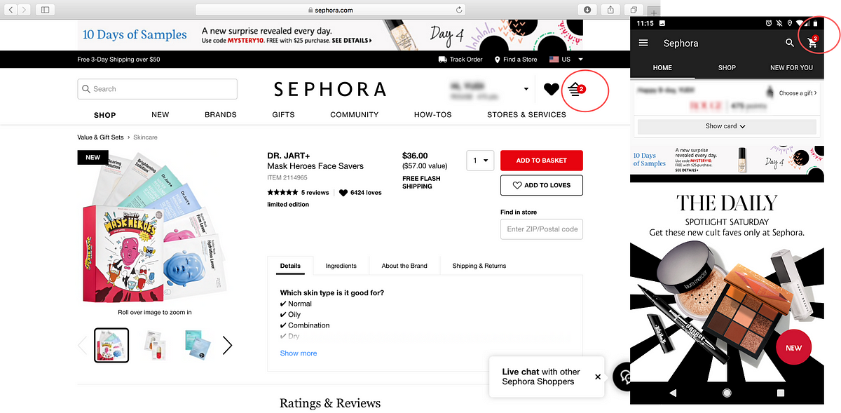
My girlfriends always complain to me that Sephora is like a black hole that sucks up all their money. Some of my girlfriends even have to…

The problem is we don’t know the initial state of the ham biscuit sign and who it is intended for.

The most important tool for any UX designer is a pen and a stack of paper. Why? Because before you even think about designing an interface you should be sitting down to sketch out your ideas. Find out why you should be ditching the computer and embracing pen and paper.

Flat design is a big trend right now when it comes to design projects â€" from logos to letterhead to website design. And if you don’t get familiar with it, you might get left behind.

Micro-interactions are usually overlooked by designers as a "nice-to-have" rather than a "must-have." Know why micro-interactions are important for your brand.

Storyboarding UX Part 1 An Introduction Welcome to the immersive world of UX design where every click, swipe, and scroll tells a story.

From bold transformations to simple highlights, we share some fantastic CSS & JavaScript card UI hover effect snippets.
Time to take a look and the user interface at UI and UX design trends and make them a source of inspiration. Learn about top 10 trends.
The catalog of design patterns grouped by intent, complexity, and popularity. The catalog contains all classic design patterns and several architectural patterns.
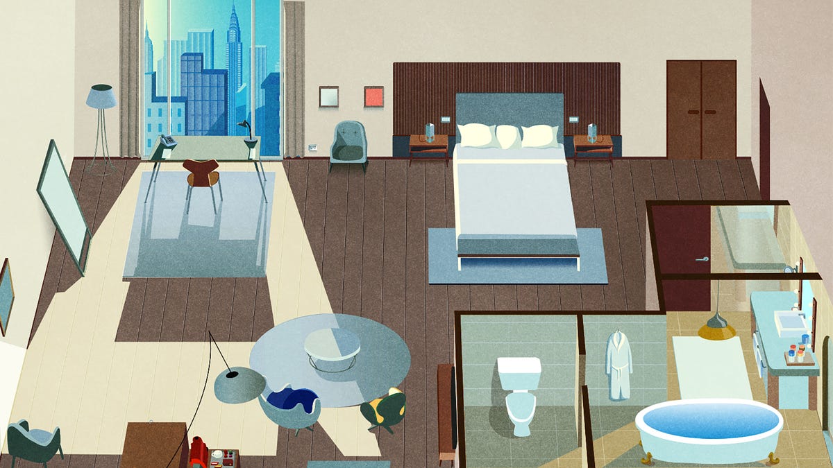
There’s more than meets the eye to room design


If you’re a creative entrepreneur who understands the power of branding in your packaging design, you’re already
In 2012 I tried out a brand new luxury vehicle at a automotive conference. It was a minimalist European model, and nothing seemed out of…

Door handles can be the first and only part of a building we touch, but their design is all too often an afterthought, writes Edwin Heathcote

I was a corporate restaurant consultant. Here’s how the sausage gets made.

Over the years, many have tried to bring us web annotations. On 23 February 2017, things took a giant leap forward when the W3C, the standards body for the web, standardized annotation. Yesterday, on February 23, things took a giant leap forward when the W3C, the standards body for the Web, standardized annotation. Twenty four years after Marc Andreessen first built collaborative annotation into Mosaic and tested it on a few “guinea pigs” before turning it off, annotations have finally become first-class citizens of the web.
the real reason zsh beats bash • how I got twice as fast in python • autocompleting all the things • maximizing user-interface bandwidth
Two years ago, I transitioned from design to product management (PM). After 10 years as a designer, from interning to managing a team, I…
From "sneaking" to "forced action", explore the various types of deceptive patterns used by companies to mislead and trick users, and gain insights on how to protect yourself.

LEGO interface panels are beautiful, iconic, and great for learning interface design basics. I bought 52 of them from BrickLink to explore the design, layout and organisation of complex interfaces.

Deep dives into powerful Figma features. Skip the basics and learn prototyping, auto-layout, systems, and illustration with your instructor, Pablo Stanley.
Today we have gathered together a small but interesting toolkit which is going to help you find and harness the inspiration you need on a daily basis. The creative process for web designers is unrelenting,...

Browse a curated design library of web app screens, UI components and User flows from top SaaS web apps, inspiring product teams from leading companies.

Scenario mapping is a really quick, easy and dare I say it even fun way to collaboratively create, discuss and communicate user scenarios. Find out how to go about creating scenario maps and why they’re so damn useful in the first place.
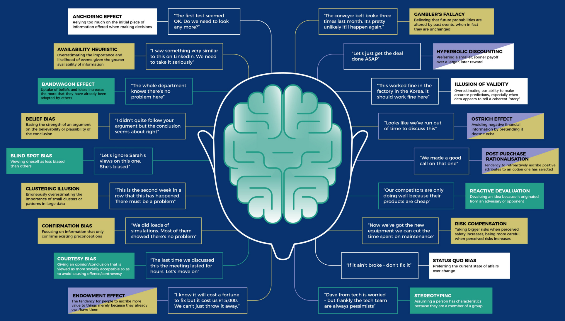
Here are 18 of the most common mental mistakes in business and investing. Make sure to learn from these cognitive bias examples to make better decisions.

We need to know what colors our merch is. But because downstream users include many different people and algorithms, we need to describe colors as a hierarch...
Some of the most popular apps today are highly personalized — everyone sees content tailored to them. This is typically powered with…
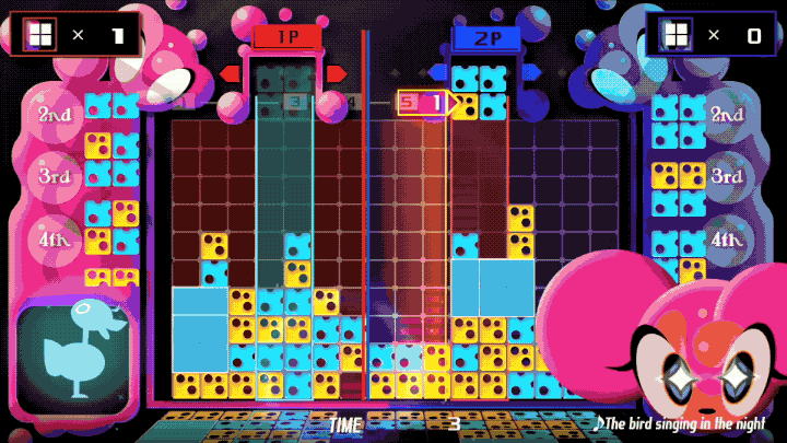
The famous rhythm game Lumines is back, and it's a reminder of where things went wrong.

Master the use of grids and do wonders with your designs.
They’re generally very helpful, clear-cut in their communication, and unobtrusive, so users can do what the tooltips suggest without running into any impediment.Looked at in this way, your average tooltip is easily a micro interaction, as it helps users achieve a single task or helps users…
Over 50 great free UX tools, including tools to help with prototyping, design, user research, user testing, surveys, card sorting, annotating, screen grabbing, sitemapping, analytics and accessibility.
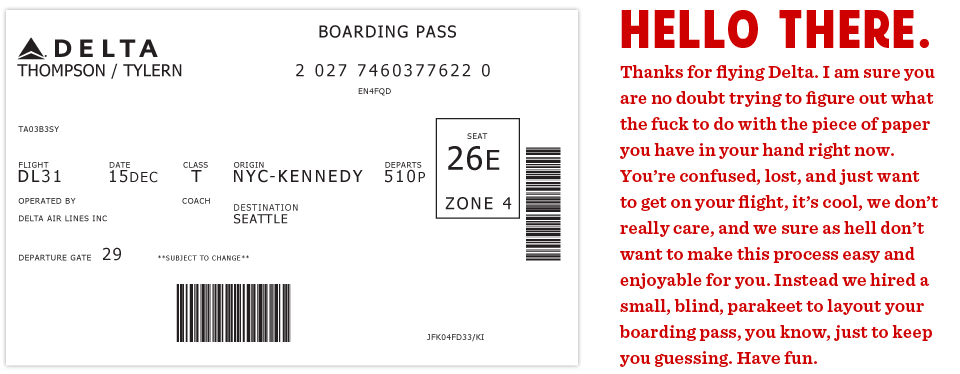
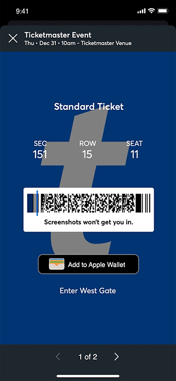
This is the actual boarding pass I got from Delta. It's a nightmare. Note all the random alignment...
User Interface Design Pattern Library. UI patterns for web designers. See screenshot examples and learn how to do great design like the pros.
We’ve put together a list of some of the best places to find UI design patterns on the web—so you don’t have to spend your whole life redesigning the wheel.

The year 2019 is promising a lot of new discoveries in UI/UX design. The trends created last year will unlock their real potential with technology behind design
Learn how to design awesome UIs by yourself using specific tactics explained from a developer's point-of-view.
Figma is the first interface design tool based in the browser, making it easier for teams to create software. Join us in https://t.me/figma_linux - Figma-Linux/figma-linux

The business world has accepted the idea that innovation can come from anywhere; it now needs to understand that user experience must come from everywhere.
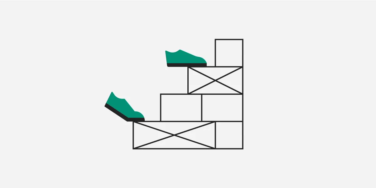
Where to put controls in your UI designs · Conceptual and physical areas of the interface · Styling controls that are distant from what they control
Questions that ensure you consider e̶v̶e̶r̶y̶t̶h̶i̶n̶g̶ a few things when designing a new feature.

So you like our media brand Growth Quarters? You should join our Growth Quarters event track at TNW2020, where you’ll hear how the most successful founders kickstarted and grew their companies. This article was originally published by Buil

A button is an interactive element that results in the action described on it. If it says “save” on a button, clicking it will most likely “save” something. It’s also one of the most important interactive elements of any digital product. It
Beautiful UI components and templates by the creators of Tailwind CSS.
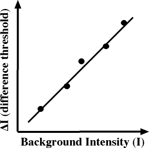
I confess I have never heard (or at least don't remember ever hearing) about Weber's Law (pronouned vayber) until reading about it with this news item. It is the Law of Just Noticeable Differences. It deals with the minimum difference in a stimulus necessary to notice. While clearly established, and there are many hypotheses to

Need to produce a UX document? Get inspired by these example UX documents and deliverables.
What makes UI engineering difficult?

Did you know TNW’s Couch Conference has a track fully dedicated to exploring new design trends this year? Check out the full ‘Sprint’ program here. Having started MING Labs in China in 2011, we have seen a big development from the old-inter
Empower your digital team with instant access to industry-specific UX insights. Improve ROI on your projects and increase confidence in decisions.
Every single one of the 18,000+ screenshots is annotated with highlights of UX “violations” and “adherences” (i.e. what the page design does well from a UX perspective, and what it does poorly).
Nowadays it’s hard to impress or even surprise with an interface animation. It shows interactions between screens, explains how to use the…
Short analysis on the current state of affairs and a few tips to keep in mind.
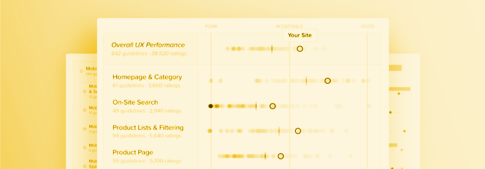
See the ranked UX performance of the 250 leading e-commerce sites in the US and Europe. The chart summarizes 50,000+ UX performance ratings.

The best user experiences are often found on the most boring interfaces. If you want your product to stand out above the rest, then be average.

In this article, we talk about the definition of kerning and its importance in design. Learn more about kerning here, and start kerning like a pro!
Learn Figma for UI/UX Design with the best Figma tutorials for beginners in 2024.

Chapter 1 - What is responsive images? In this guide, we will learn everything related to...
The best designers employ specific habits, learned practices, and observed principles when they work. Here are a few of them.

SAP’s acquisition of Qualtrics shows how the shift in technology has changed business; it is a perfect example of using the Internet to one’s advantage.
Read more about these top 10 open source and free SVG powered icon libraries that you can use for your next project
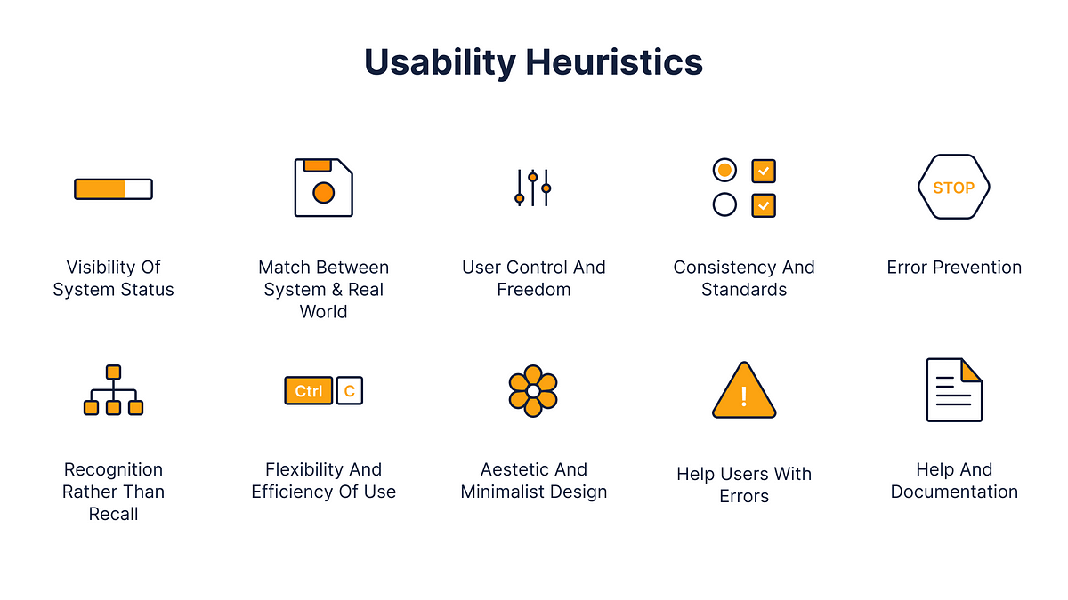
The advantages and disadvantages of heuristic evaluation plus step by step instructions for running a successful inspection of your design's usability.
My mission for 2014 was to get more people started in User Experience (UX) Design. In January, hundreds of thousands of people did the original UX Crash Course and it was translated into Spanish, Portuguese and Korean by amazing volunteers. In May we continued with a User Psychology lesson every day.

As a rule of thumb business owners should be primarily focused on delighting their customers in any way possible. Every subtle interaction should be closely optimized for customer enchantment, and a decision as simple as where to park your car can subconsciously attract or detract a customer.
The history of technology is one of subtracting humans and replacing them with machines. Do the unintended consequences include creating shoplifters?

Building a dream UI/UX design for your app is very much about communication with your design team. Here is a list of 57 essential terms.
It’s one thing to say “let’s have search” and draw a box with a magnifying glass on the right. It’s a whole other task to implement good search.
a awesome list about User Experience disciplines.

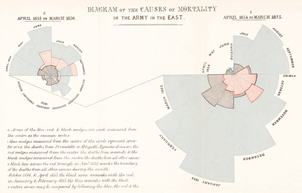
“Above all else show the data.” –Edward Tufte Survey responses. Product reviews. Keyword searches. Forums. As UX practitioners, we commonly scour troves of qualitative data for customer insight. But can we go faster than line-by-line analysis? Moreover, how can we provide semantic analysis to project stakeholders? Enter Wordle. If you haven’t played with it yet, Wordle is a free Java application that generates visual word clouds. It can provide a compelling snapshot of user feedback for analysis or presentation. Using

What if clearing trackers was as easy as cleaning your computer screen?

The golden rules of how to design a logo for successful branding, from the idea to implementation.
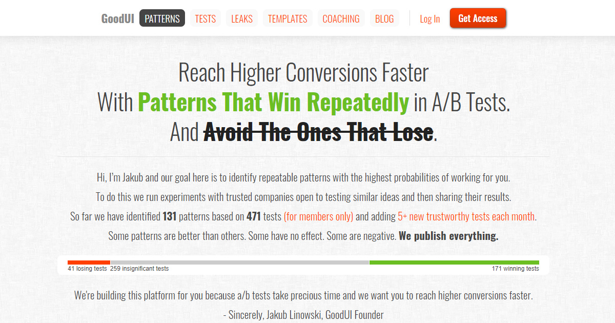
Reach higher conversions faster by repeating what worked for others and avoiding what failed.
Creating exceptional content.
✨ A curated list of awesome design principles.
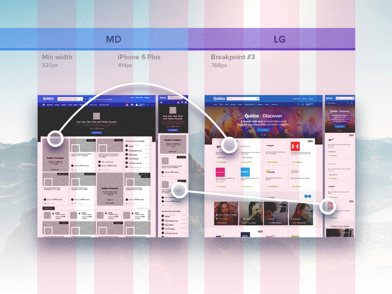
In 2011, Elaine McVicar wrote an article describing the process of designing one of the first complex responsive sites. Now that the concept is no longer in its infancy, we're taking another look at how to redesign a large scale responsive site.
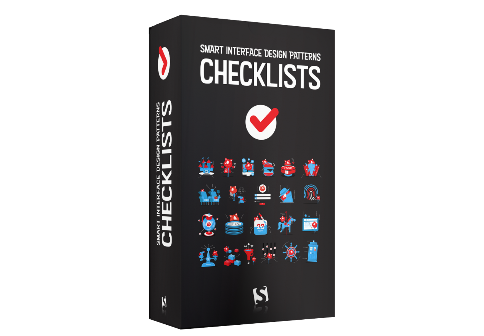
Meet our Smart Interface Design Patterns Checklist Cards, a deck of 100 cards with questions to ask when designing and building any interface component — carousel, hamburger, table, date picker, autocomplete, slider, onboarding, pricing plans, authentication, web forms and many others. Check the preview (PDF) and jump to description ↓
The most common tool, methods, processes, and deliverables that designers use throughout the digital product design process.
Seeing yourself as different · Knowing who the app is for · Understanding how people differ · Appreciating how people use the app

How do colors affect us when we buy things? The latest research reveals the science of colors in marketing and how to use it for your advantage:
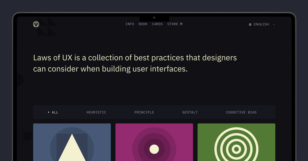
Laws of UX is a collection of best practices that designers can consider when building user interfaces.
My grandmother approves of Atkinson Hyperlegible free font for her phone book printout

Pauline Brown, former chairman of North America for the luxury goods company LVMH, argues that in additional to traditional and emotional intelligence, great leaders also need to develop what she calls aesthetic intelligence. This means knowing what good taste is and thinking about how your services and products stimulate all five senses to create delight. Brown argues that in today’s crowded marketplace, this kind of AI is what will set companies apart — and not just in the consumer products and luxury sectors. B2B or B2C, small or large, digital or bricks-and-mortar, all organizations need to hire and train people to think this way. Brown is the author of the book “Aesthetic Intelligence: How to Boost It and Use It in Business and Beyond.”
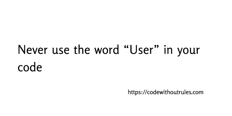
You’re six months into a project when you realize a tiny, simple assumption you made at the start was completely wrong. And now you need to fix the problem while keeping the existing system running—with far more effort than it would’ve taken if you’d just gotten it right in the first place. Today I’d like to tell you about one common mistake, a single word that will cause you endless trouble. I am speaking, of course, about “users”. There are two basic problems with this word: “User” is almost never a good description of your requirements. “User” encourages a fundamental security design flaw. The concept “user” is dangerously vague, and you will almost always be better off using more accurate terminology.

Emil Protalinski / VentureBeat: Google says Flutter, its open source UI framework, now has nearly 500,000 developers, up 10% month-over-month in March, as it outlines future changes
Design clear interactions instead clever ones, and users will follow
Obey the Law of Locality · ABD: Anything But Dropdowns · Pass the Squint Test · Teach by example
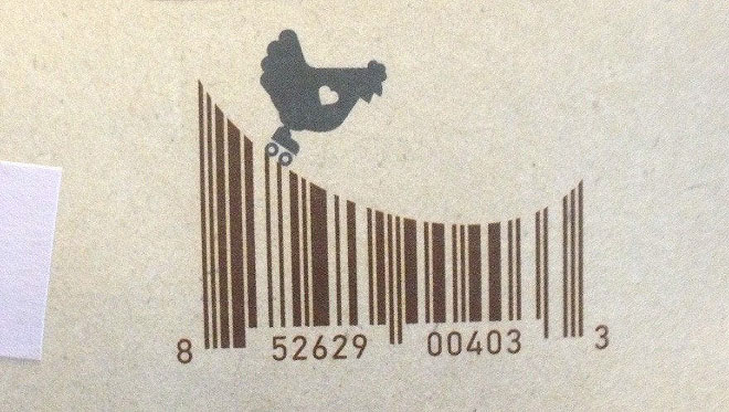
Barcodes are so common and frequent that we do not even notice them anymore. From now on, we’re going to be more attentive to them, because it turns out that sometimes they’re quite brilliant and very creative. h/t: sadnaduseless
The 8-point grid is a powerful system for creating consistent and visually appealing user interfaces (UIs). This post is about how to establish vertical rhythm and set typography in an 8pt grid...

Unlock the growth potential of your SaaS UX design. From reducing churn rates to boosting customer engagement, discover the benefits of great UX design for SaaS. Get inspired by real-life examples and learn best practices from experienced UX practitioners.
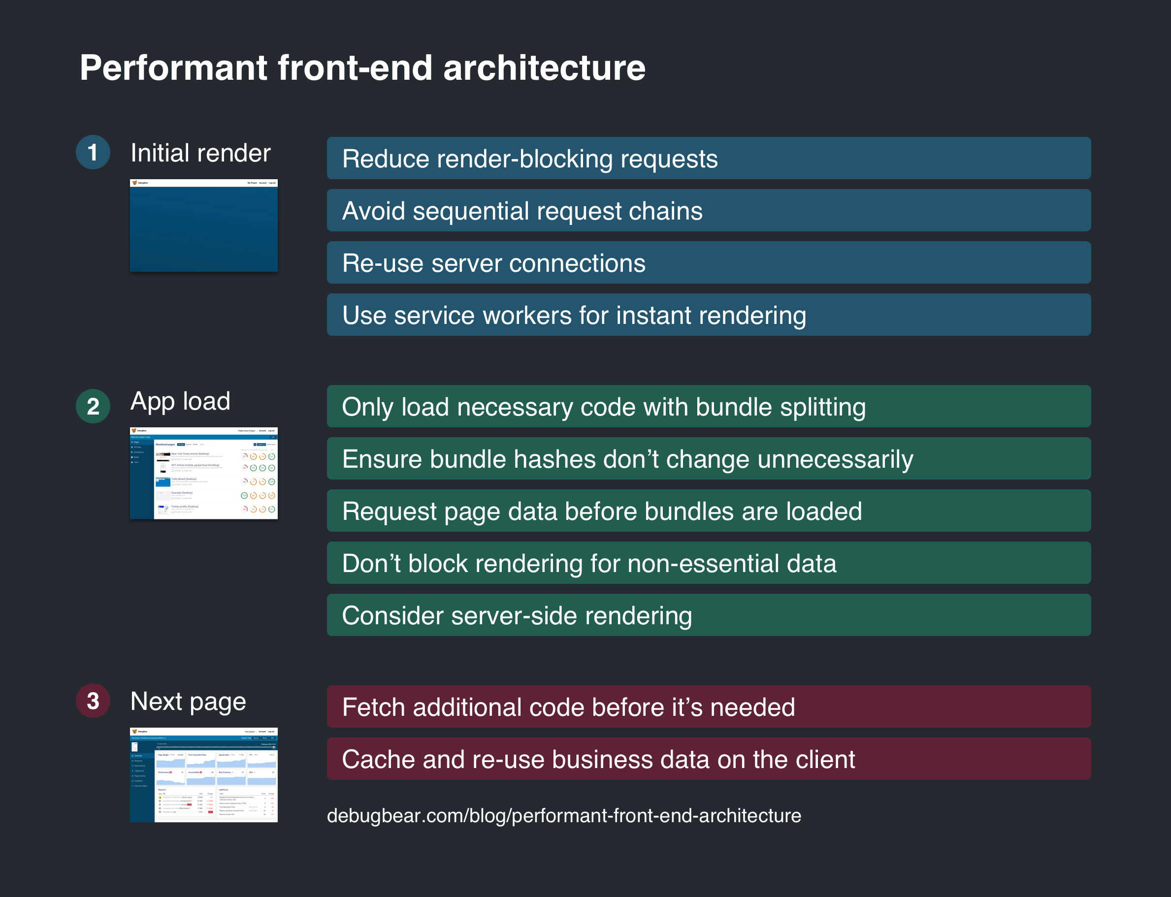
Make your client-side apps load fast and provide a good user experience.
The quantitative methods we used were all time and cost-efficient, demonstrating that user research doesn’t require thousands of dollars and endless time.
What's the best way to learn to create a user journey map? Seeing how experts do it. Get guidelines and examples for journey mapping.
Human brain processes information as well as how it forms certain patterns of behavior. Discover cognitive psychology tips for UX.
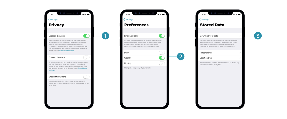
Many mobile applications require access to location, photos, and even the camera during installation, which isn’t something most customers would be happy to consent to. In this series of articles, Vitaly Friedman talks about privacy-related design patterns. You’ll be exploring some of the respectful ways to approach privacy and data collection, and how to deal with the notorious cookie consent prompts, intrusive push notifications, glorious permission requests, malicious third-party tracking and offboarding experience.
Web magazine about user experience matters, providing insights and inspiration for the user experience community

Clear signifiers and clear feedback at all stages of the interaction make drag–and–drop discoverable and easy to use.
Web magazine about user experience matters, providing insights and inspiration for the user experience community
Used correctly, it can capture audience attention, make your website more engaging, and even improve your chances of delivering conversions for your clients.Unfortunately, like many things in the web design world, it’s also easy to get too carried away with animation. As professional designers and…

Onboarding is the process of getting users familiar with a new interface. It can involve one or more of the following components: feature promotion, customization, and instructions.
Free Nielsen Norman Group report on UX professionals' career experience and what a career in UX looks like today.

Customers shopping online rely on product pages to decide what to buy. Help them by answering questions, enabling comparison, providing reviews, and facilitating the purchase process.
Web magazine about user experience matters, providing insights and inspiration for the user experience community
Let’s make 2021... fast! An annual front-end performance checklist, with everything you need to know to create fast experiences on the web today, from metrics to tooling and CSS/JavaScript techniques.
Web magazine about user experience matters, providing insights and inspiration for the user experience community
Web magazine about user experience matters, providing insights and inspiration for the user experience community

A split button is a dual-function menu button that offers a default action as well as the possibility of choosing a different action by selecting from a set of alternatives.
Web magazine about user experience matters, providing insights and inspiration for the user experience community
Today, people seek out information quickly, and cards serve it up well, regardless of device. Most of you probably have a better understanding why card-style design is so popular and will continue to increase in popularity. This trend won’t end anytime soon. Cards are here to stay and continue to be an essential part of app design. In this article, Nick Babich will explain what cards mean to UI designers, and he'll review three popular card-based services.

Parallax-scrolling effects add visual interest, but they make content slow to load or hard to read. Consider if the benefits are worth the cost.
yEd is a free desktop application to quickly create, import, edit, and automatically arrange diagrams. It runs on Windows, macOS, and Unix/Linux.
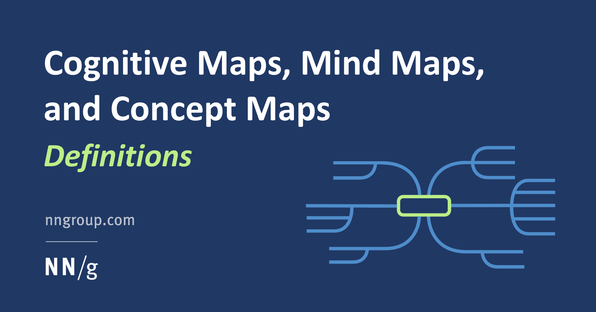
Cognitive maps, concept maps, and mind maps are diagramming techniques that can be utilized throughout the UX process to visualize knowledge and surface relationships among concepts.
Web magazine about user experience matters, providing insights and inspiration for the user experience community
Web magazine about user experience matters, providing insights and inspiration for the user experience community

Fact-finding tasks were less memorable, while complex research-based tasks required more effort from users. Top user expectations for each task type varied.

Coming out of a banner year, Marvin Ellison discusses how initiatives put in place years ago contributed to the retailer's success.

Design is an arrangement of both shapes and space. Learn to see the shapes that space forms and how space communicates. This is second part of a series on design principles for beginners. The first part covered an introduction to gestalt; today Steven Bradley will build on those gestalt principles and show you how many of the fundamental principles you work with as designers have their origin there. Make an effort to spend time observing how space is used in design!

The theory of visual hierarchy is different from its practical application. More advanced concepts of visual perception are worth exploring because their mastery is key for great visual design. #ui #ux #design

UX researchers use this popular observational methodology to uncover problems and opportunities in designs.

Exit intent popups can provide a good customer experience and offer benefits to users who are about to leave a website.
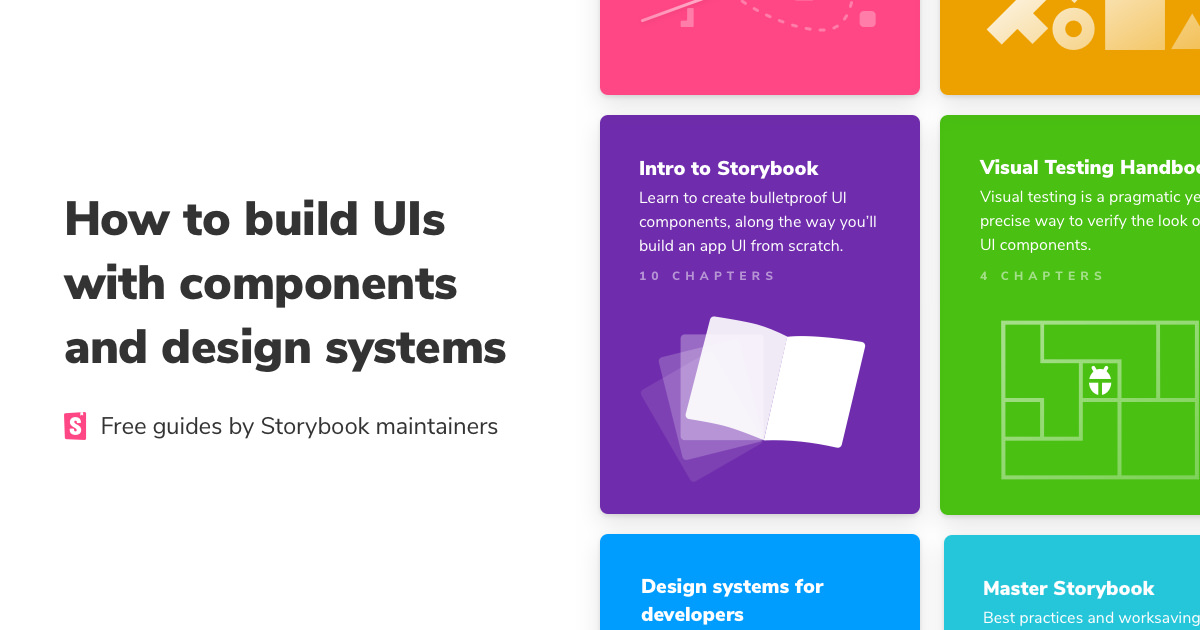
Learn how to develop UIs with components and design systems. Our in-depth frontend guides are created by Storybook maintainers and peer-reviewed by the open source community.

Public restrooms are plagued by unusable toilet-paper dispensers, difficult flushing controls, and poor stall-status visibility. Many of these issues can be addressed by following standard usability practices.

A perceived high-authority status of the person making a request can make people more compliant with that request. Applying this principle in UX can ease users' decision-making process.
With so many applications and services and people and machines and chatbots fighting for our attention, staying focused is a luxury that needs to be savored and protected, and so no wonder notifications don’t enjoy a decent reputation these days. More than that, often they feel off the point and manipulative, too. In this series of articles, Vitaly Friedman will talk about privacy-related design patterns. He’ll be exploring some of the respectful ways to approach privacy and data collection, and how to deal with those notorious cookie consent prompts, intrusive push notifications, glorious permission requests, malicious third-party tracking and offboarding experience.
I found a great domain name for sale on @undeveloped. Check it out!
As designers and developers, it’s beneficial to familiarize yourself with methods that allow you to create frictionless interactions.In this article, I’ll analyze steps in user flow that often cause friction and propose solutions on how to optimize them. In this product, interactions are intuitive,…

A good prototyping tool can not only bring your design idea into life with ease. It also helps you to test, demonstrate, iterate and share your design
A guide for helping designers and developers build landing pages that convert visitors to customers and customers to brand advocates.

Define a trigger, transformations, duration, and easing of the animation, and be mindful of accessibility issues and annoying the user.
Web magazine about user experience matters, providing insights and inspiration for the user experience community
Web magazine about user experience matters, providing insights and inspiration for the user experience community
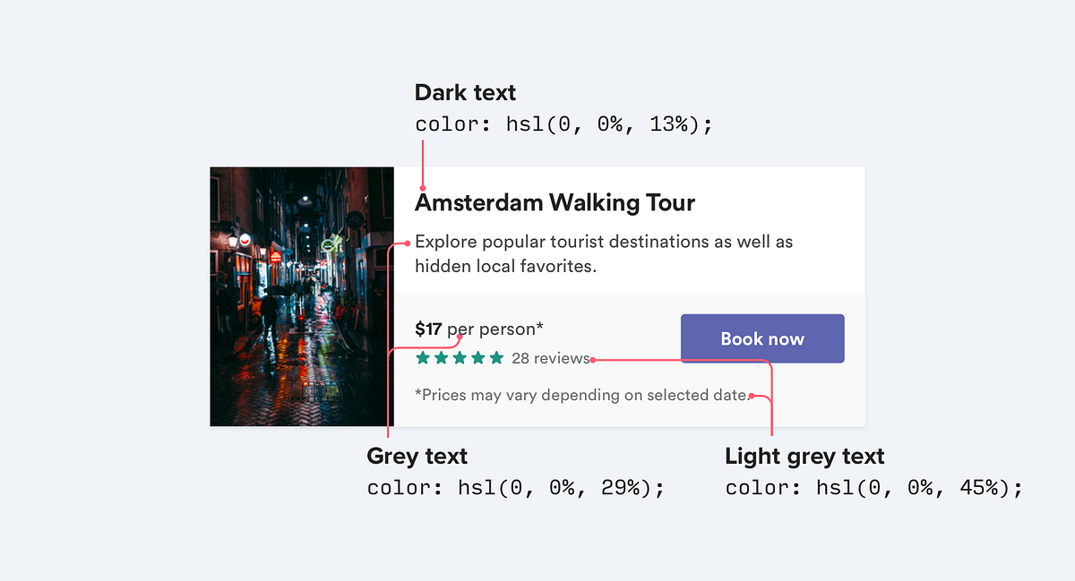
Color impacts everything from how a user feels when they interact with a design, to how they use the design, to whether they can fully see and understand it. Quite simply, color is a lot more than a decorative tool; color is central to user experience.
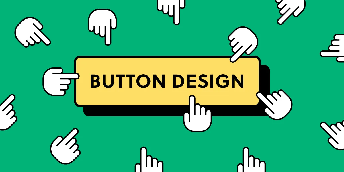
Buttons are one of the most common UI elements making it possible for users to interact with apps and sites, and take action.
Web magazine about user experience matters, providing insights and inspiration for the user experience community
Web magazine about user experience matters, providing insights and inspiration for the user experience community
W3Schools offers free online tutorials, references and exercises in all the major languages of the web. Covering popular subjects like HTML, CSS, JavaScript, Python, SQL, Java, and many, many more.
Read about creating a wireframe for digital products. Learn the exact stepsand see the benefits of starting design with wireframing.

Motion is a powerful tool to attract users’ attention. When designing an animation consider its goal, its frequency of occurrence, and its mechanics.
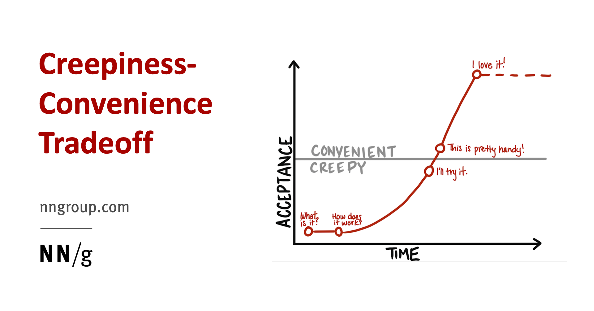
As people consider whether to use the new "creepy" technologies, they do a type of cost-benefit analysis weighing the loss of privacy against the benefits they will receive in return.
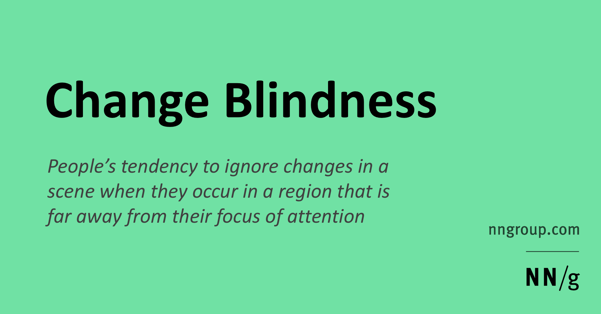
Significant changes in a web page can remain unnoticed when they lack strong cues, due to the limitations of human attention.

Human cognition is complex, and many factors play into instant impressions. Design psychology is coming to the forefront as more and more companies are using neuroscience to design better user experiences. Great user experience design isn’t magic—it’s science.
Too much personalization leads to homogeneous experiences for users and can generate content fatigue and lack of diversity.
A fully interactive prototype created in UXPin can reduce confusion on expectations as both you and the customer are visualizing the same end product.
The CIT is a research method for systematically obtaining recalled observations of significant events or behaviors from people who have first-hand experience.
Design elements that appear similar in some way — sharing the same color, shape, or size — are perceived as related, while elements that appear dissimilar are perceived as belonging to separate groups.

Use this glossary to quickly clarify key terms and concepts related to visual design.
Web magazine about user experience matters, providing insights and inspiration for the user experience community
Web magazine about user experience matters, providing insights and inspiration for the user experience community
User Experience (UX) Design is the process of creating experiences that aren't just attractive to look at, but that also work well for our users. In this guide we round up some of the articles on Smashing that can help you to create beautiful sites and applications that also help people to get things done.

Despite great diversity in the workflows and end users supported by complex applications, these 8 design guidelines are generally applicable.
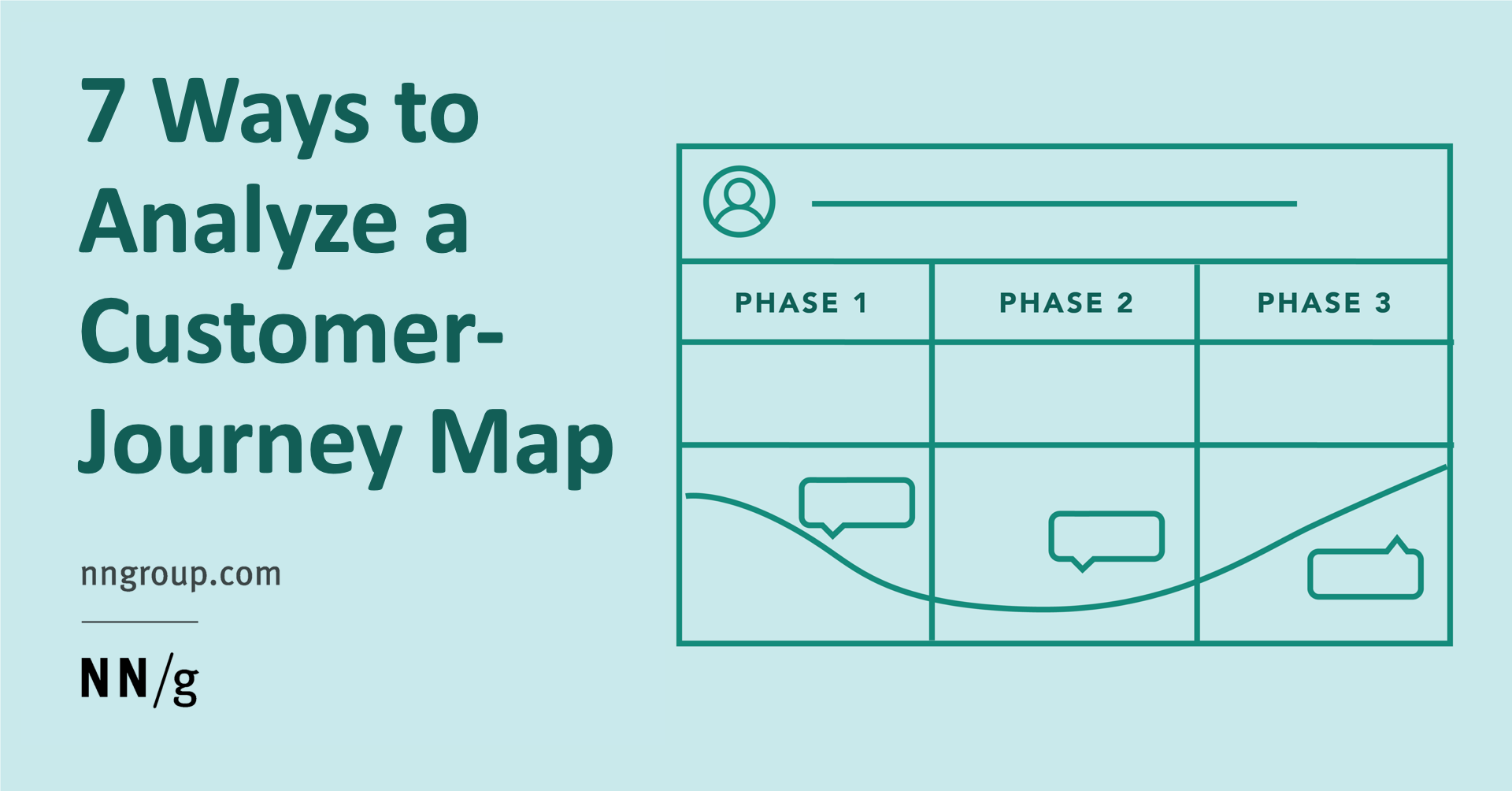
Evaluate your journey map to identify low and high points, failures to set expectations, unnecessary or too long steps, channel transitions, and moments of truth. Use this information to find opportunities for improving the journey.

Thematic analysis, an approach used to analyze qualitative data, is central to credible research and can be used to improve UX design by uncovering user needs, motivations, and behaviors. #Research #Product #Design #UX #Web #B2B

UX designers use a lot of different research techniques, such as interviews and workshops. They summarize research findings into user stories and user flows and communicate their thinking and solutions to the teams. But somewhere in all of this, there are real people for whom the products are being designed for. In order to create better products, designers must understand what’s going on in the user’s world. And that’s where storyboards come in. In this article, Nick Babich will focus on storyboards as a means to explore solutions to UX issues, as well as to communicate these issues and solutions to others.

Tracked analytics metrics should reflect change in the user experience. Vanity metrics appear impressive, but their fluctuations are not actionable.
Are you using UI animation to make your products exciting and accessible? Draw inspiration from these four UI animations.
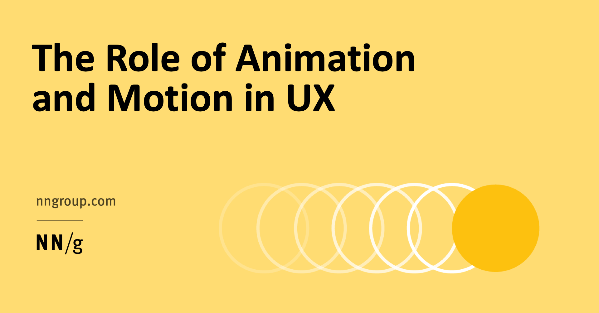
Animation in UX must be unobtrusive, brief, and subtle. Use it for feedback, state-change and navigation metaphors, and to enhance signifiers.

Sixty percent of first-time visitors leave a website in less than fifteen seconds. Yet, there is an often overlooked usability factor that improves visitor retention—scannability. These UI design tips for using research, science, and strategy to layout content help convert short-term visitors to long-lasting users.
Let’s make 2021... fast! An annual front-end performance checklist, with everything you need to know to create fast experiences on the web today, from metrics to tooling and CSS/JavaScript techniques.

Even if a website is spotless from the UI viewpoint, it could still deliver poor user experiences. Apart from their technical knowledge, UX developers
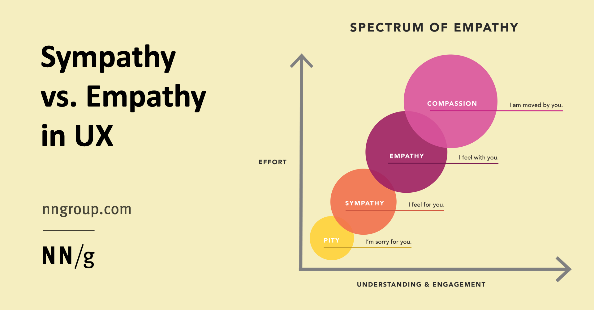
The majority of UX professionals practice sympathy instead of empathy for their users.

What makes a web UI pattern timeless? Adherence to web layout best practices that result in a combination of user-friendliness and adaptability to changing trends and technology. #design #ui #design #ux #web #product
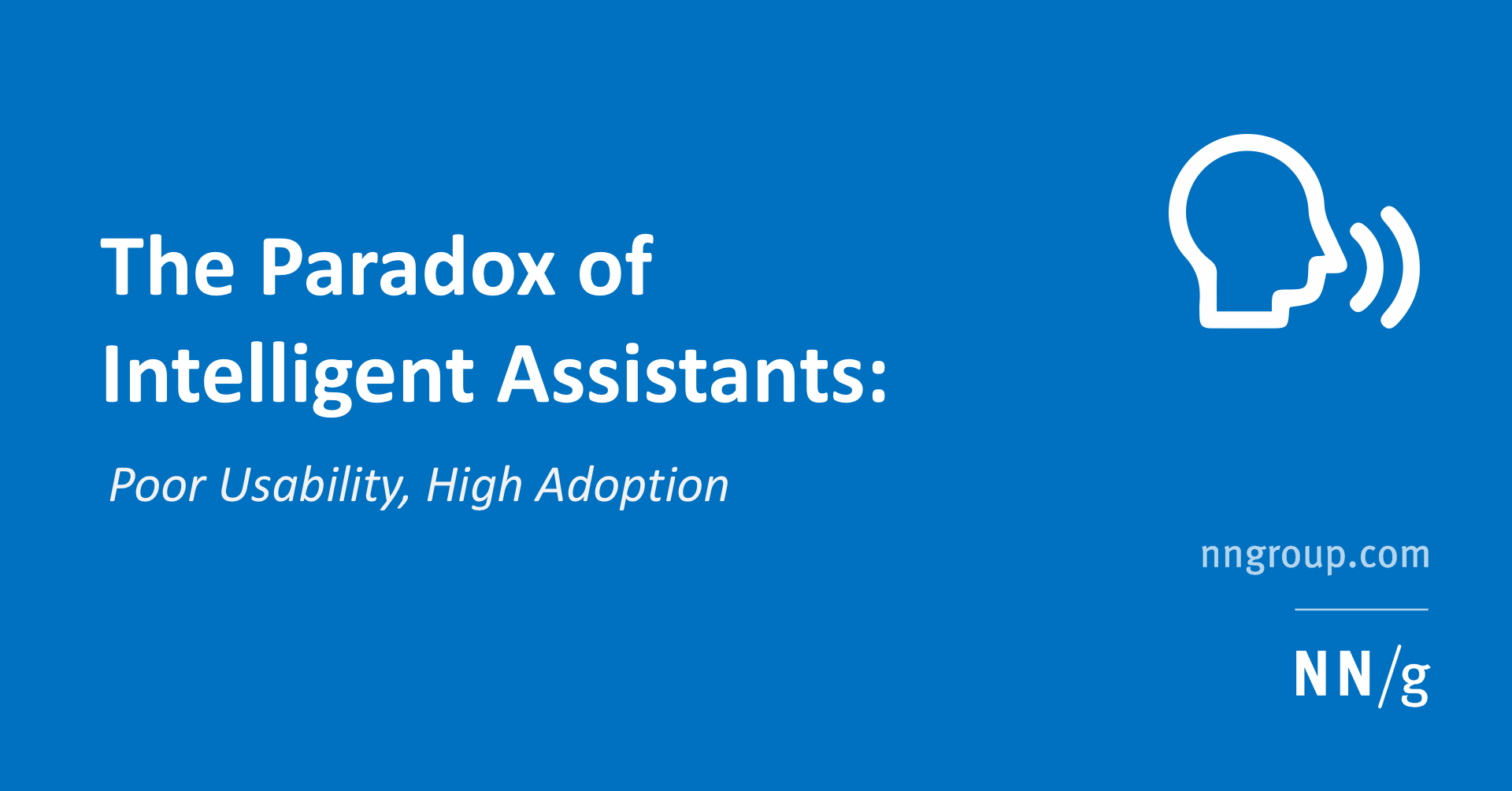
Frequent users of Siri, Alexa, and Google Assistant report attempting low-complexity tasks such as simple fact retrievals, weather forecast, navigation, playing music, setting timers.

Quantitatively evaluate a product or service’s user experience by using metrics to gauge its relative performance against a meaningful standard.
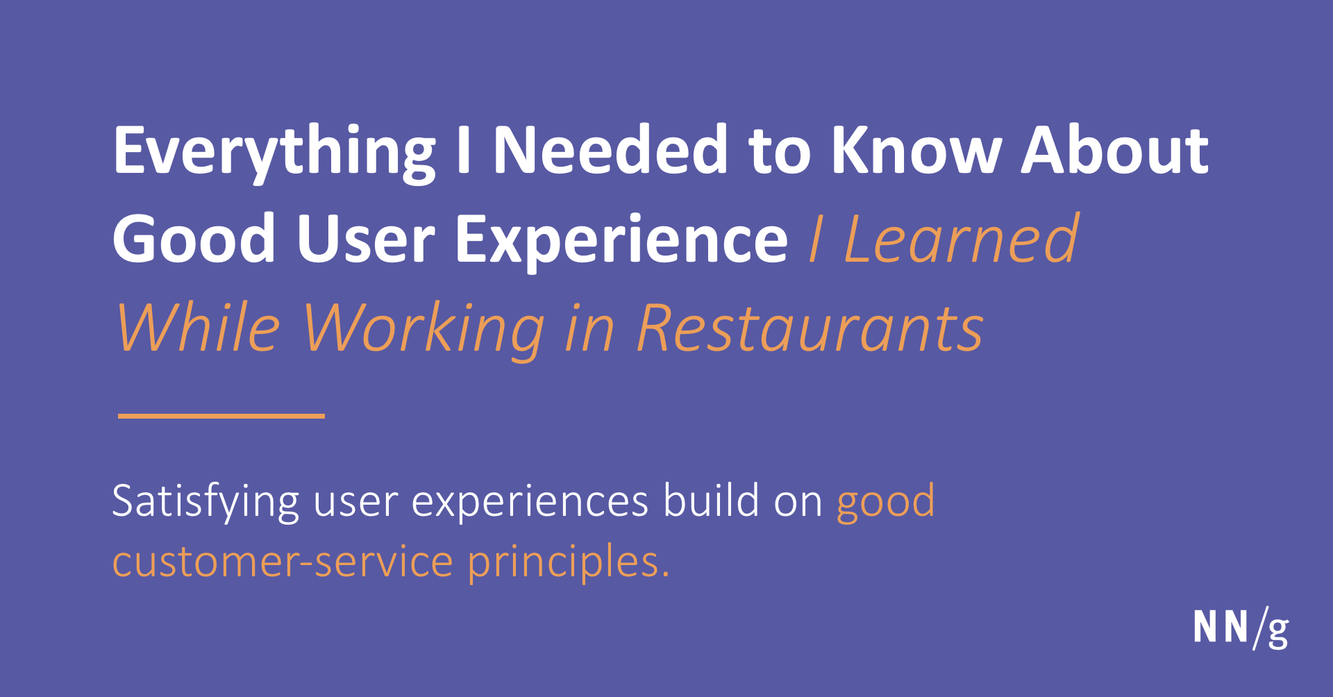
Good UX has great customer service at its base. Restaurants provide many instructive examples for designers.
Test your usability knowledge by taking our quiz. All questions and answers are based on articles that we published last year.

Users are likely to methodically scan comparison tables row by row, from right to left and back again.
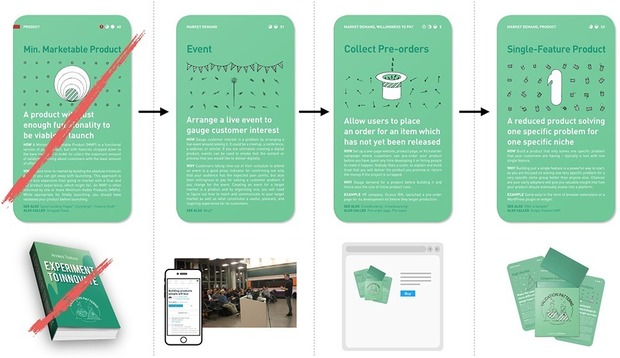
Experimenting with creative UX methods. Creativity plays an important role, but your designs must drive results to make products successful.

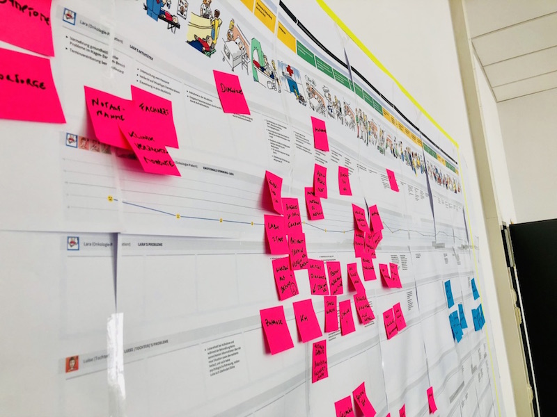
Sticky notes strengthen team dynamics and represent an egalitarian, concise means for expressing ideas in UX design projects.
Building a learnable website is much tougher than it sounds.One thinks one’s design is clear and comprehensible; however, a design that might be obvious for you, might be perceived totally different by a user with a different set of experiences. Therefore, the goal is to design a clear user path…
Web magazine about user experience matters, providing insights and inspiration for the user experience community
Web magazine about user experience matters, providing insights and inspiration for the user experience community
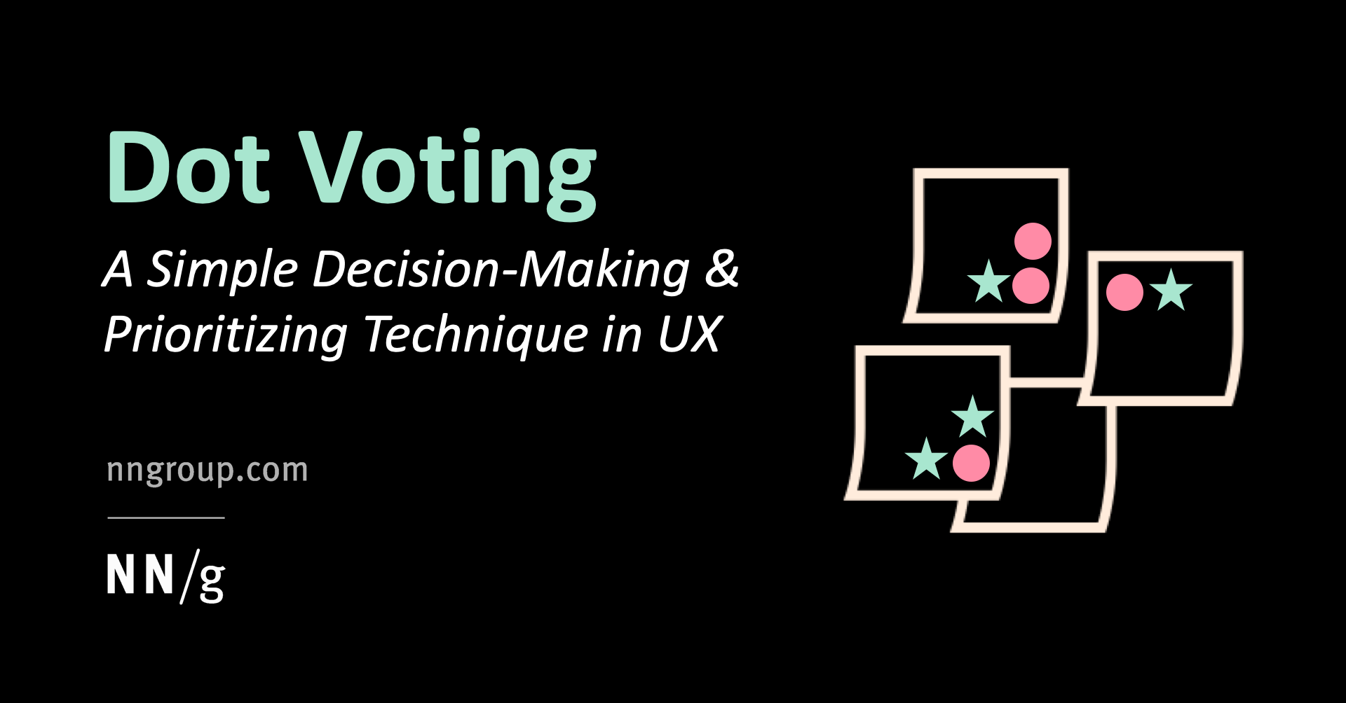
By placing colored dots, participants in UX workshops, activities, or collaborative sessions individually vote on the importance of design ideas, features, usability findings, and anything else that requires prioritization.
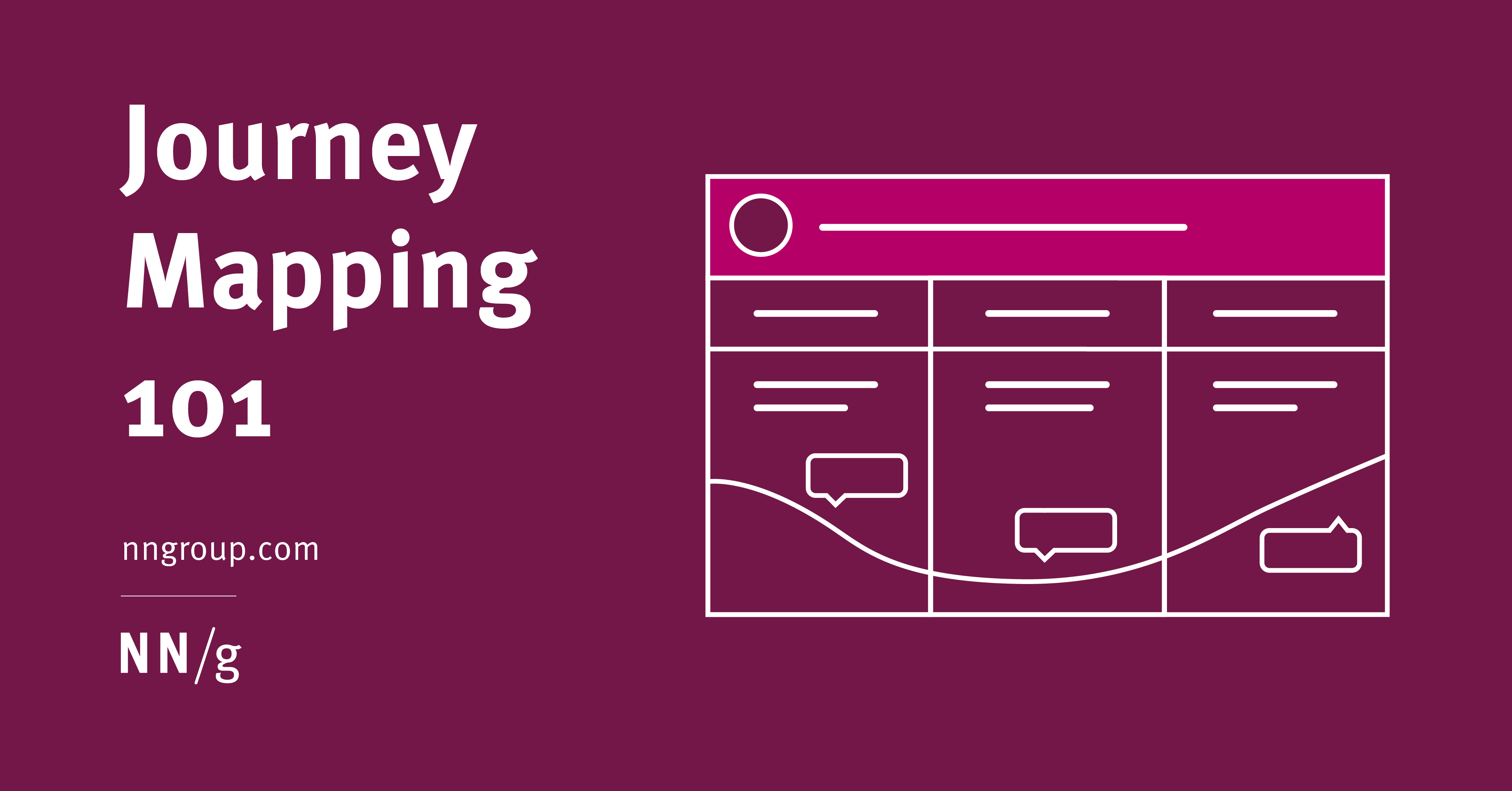
A journey map is a visualization of the process that a person goes through in order to accomplish a goal.
UX researchers can learn a lot from hospital patients through empathetic interviews — but that alone is not enough. Instead, you need to pay particular attention to how your users’ clinical context influences their perceptions, trust, and the care they receive. If you are a UX researcher about to embark on a project with hospitalized patients and you want to avoid missing out on deep concerns and problems of users, then maybe this article can help you strengthen your awareness for particular challenges of clinical UX.

Streamline users’ path to products by providing clear, differentiating product information at all levels — from the homepage to product listing pages.

For most teams, approaching persona creation qualitatively is the right balance of effort vs. value, but very large or very small organizations might benefit from statistical or lightweight approaches, respectively.
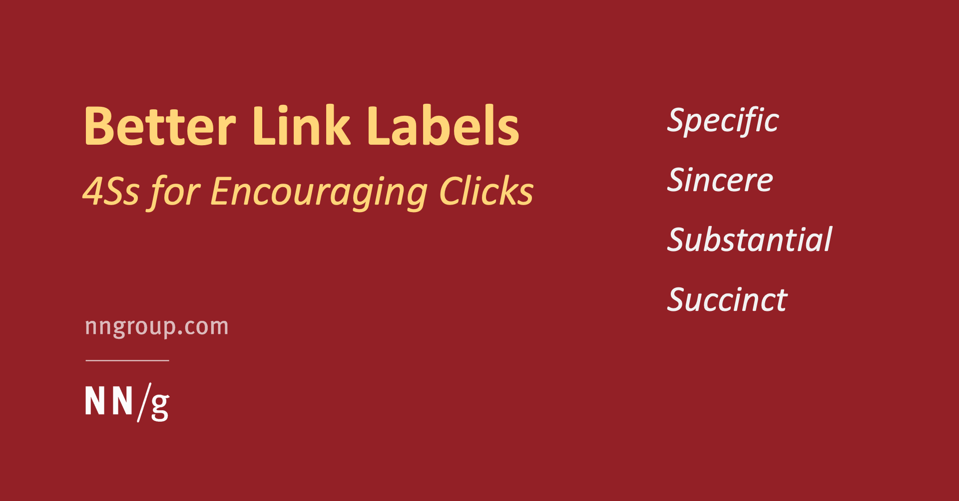
Specific link text sets sincere expectations and fulfills them, and is substantial enough to stand alone while remaining succinct.

In cognitive mapping sessions, users are asked to produce a visual representation of their mental models. Cognitive mapping guides conversation and acts as a facilitation aid.
Even if your target demographics are very broad, you should still identify specific groups of users within that audience to use for UX research and design.
Web magazine about user experience matters, providing insights and inspiration for the user experience community
Here’s a list of great books, movies, and tv series that designers liked in 2019. It’s probably not the most objective, but surely very interesting.
Compositional flow determines how the eye is led through a design: where it looks first, where it looks next, where the eye pauses, and how long it stays. You have a lot of control over where people look when they’re viewing a webpage you’ve designed. On a text-heavy and graphic-light page, a visitor’s eye likely follows something like a Z-pattern or F-pattern across and down the page. However, as soon as you design page elements and add graphics, those patterns no longer apply. Your visitor’s eye will follow the flow, movement and rhythm you create.

UX research provides invaluable insight into what people need and value. Not only will UX research reduce the risk of a wrong guess, but it’ll also uncover new opportunities for innovation. #ux #uxresearch #ProductDesign
Web magazine about user experience matters, providing insights and inspiration for the user experience community
Use Hick’s Law to examine how many functions you should offer at any part of your website & how this will affect your users’ overall approach to decision making.

When researchers carry out usability testing, they have often observed that users overlook a change on the screen otherwise considered obvious and highly

Visual direction is the perceived direction of forces acting on and exerted by elements. A visually heavy element will attract the eye to it. The direction is a cue to the viewer’s eye to move elsewhere. We refer to this force as visual weight and to the perceived direction of visual forces as visual direction. Both are important concepts to understand if you want to create hierarchy, flow, rhythm and balance in your composition. Many intrinsic characteristics can be modified to make an element visually weightier or lighter.

Forcing users to browse PDF files causes frustration and slow task completion, compared to standard webpages. Use PDF only for documents that users will print. In those cases, following 10 basic guidelines will minimize usability problems.
When we refer to patterns like the F-pattern, Gutenberg layout, or layer-cake pattern in web design, what we’re talking about is how readers scan the content on a page. As you can see from these eye-tracking studies from NNG, the F-pattern isn’t always an explicit “F” shape.Instead, it refers to a…
Web magazine about user experience matters, providing insights and inspiration for the user experience community
Demanding that users register or log in before they can use an app or see website information has high interaction cost and defies the reciprocity principle.
With repeated practice, users develop imprecise memory of objects and content in a UI, but still need additional visual and textual signals to help them find a specific item.
A visual language is just like any other form of communication. Elements from color to style to type of photos or illustrations establish what a brand or company is. A visual language includes both the written and spoken elements of a website or brand, as well as every design technique, photo,…
Consider how your audience will be using the visuals to determine the optimal camera angle, set the right tone, choose the right props, and maintain attention.
Let’s make 2021... fast! An annual front-end performance checklist, with everything you need to know to create fast experiences on the web today, from metrics to tooling and CSS/JavaScript techniques.

Benchmark your UX by first determining appropriate metrics and a study methodology. Then track these metrics across different releases of your product by running studies that follow the same established methodology.
Web magazine about user experience matters, providing insights and inspiration for the user experience community
It’s tempting to add Lorem ipsum to early designs. Unfortunately, this can create more problems than it solves. UXPin helps you avoid this.
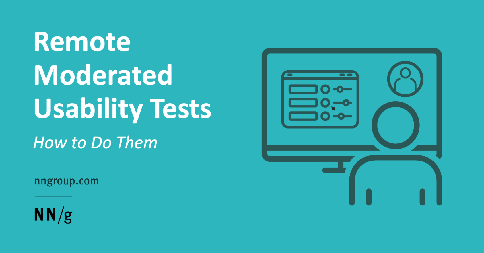
The key to good remote moderated testing is to be thoroughly prepared and organized. Follow these 7 steps to ensure your study’s success.

Gestalt principles are important to understand. They sit at the foundation of everything we do visually as designers. They describe how everyone visually perceives objects. This article is part of a new series about design principles that can serve both as a refresher for seasoned designers and reference for newcomers to the industry. Hopefully, the content covered here isn't too obvious and self-explanatory, but it's always great to have a nice quick refresher every now and again, isn't it?

Emphasis is relative. For one element to stand out, another has to serve as the background from which the first is to stand out. Some elements need to dominate others in order for your design to display any sort of visual hierarchy. By varying the visual weight of some elements and the visual direction of others, you can establish different levels of dominance. Three levels is ideal; they’re all that most people can discern. Designing different levels of emphasis or dominance will create a visual hierarchy in your design, with more important information being more visually prominent. It will help you communicate with visitors quickly and efficiently.
Showing that some things are the same and some are different is the first step in visual communication. It’s the primary way that viewers derive meaning. Contrast and similarity have different functions. They are used in varying degree and in combination. You’ll always see some of both because neither exists without the other. Changing one means also changing the other. They are clues to design elements. The goal is to contrast similar layers. The way we structure contrasting and similar elements creates hierarchy, flow and compositional balance.
Announcing a set of checklists to help you create smart interface design patterns. Totally free if you sign up for our friendly newsletter. These checklists are based on the work Vitaly has been doing for many years, exploring and examining examples of desktop and mobile interfaces. Learning what works and what doesn’t in usability tests and user interviews.

Create an effective hiring process by borrowing techniques used in UX workshops.
Bootcards- UI Framework được xây dựng dựa với mục đích áp dụng những template dạng thẻ cho các yếu tố thành phần của thiết kế website
Generate or browse beautiful color combinations for your designs.
Web magazine about user experience matters, providing insights and inspiration for the user experience community

Do you have what it takes to be an outstanding UX Developer in 2022? Add these tricks to your arsenal...
A blinking cursor follows us everywhere in the digital world, but who invented it and why? From block printing to the Apple II, this is the forgotten history of the blinking cursor
A meaningful user experience is what can set your site apart from others. But what makes an experience truly meaningful? And how to achieve that? The tools, tips, and resources in this post not only help you to come up with a UX strategy that works for you and your team but also to circumvent potential UX pitfalls.
Product design mastery in one weekly e-mail. Practical lessons, resources and news in just 5 minutes a week.
The ultimate showcase of the best high-quality free HTML website templates on the internet. Free Download without registration!
Making an accessible site means making it for ‘almost’ everyone. And the good news is that its very easy to make an acceptably accessible…
A fun way to discover interesting color combinations.

Be a strategic thinker by recognizing opportunities at scale with seemingly small and insignificant data.

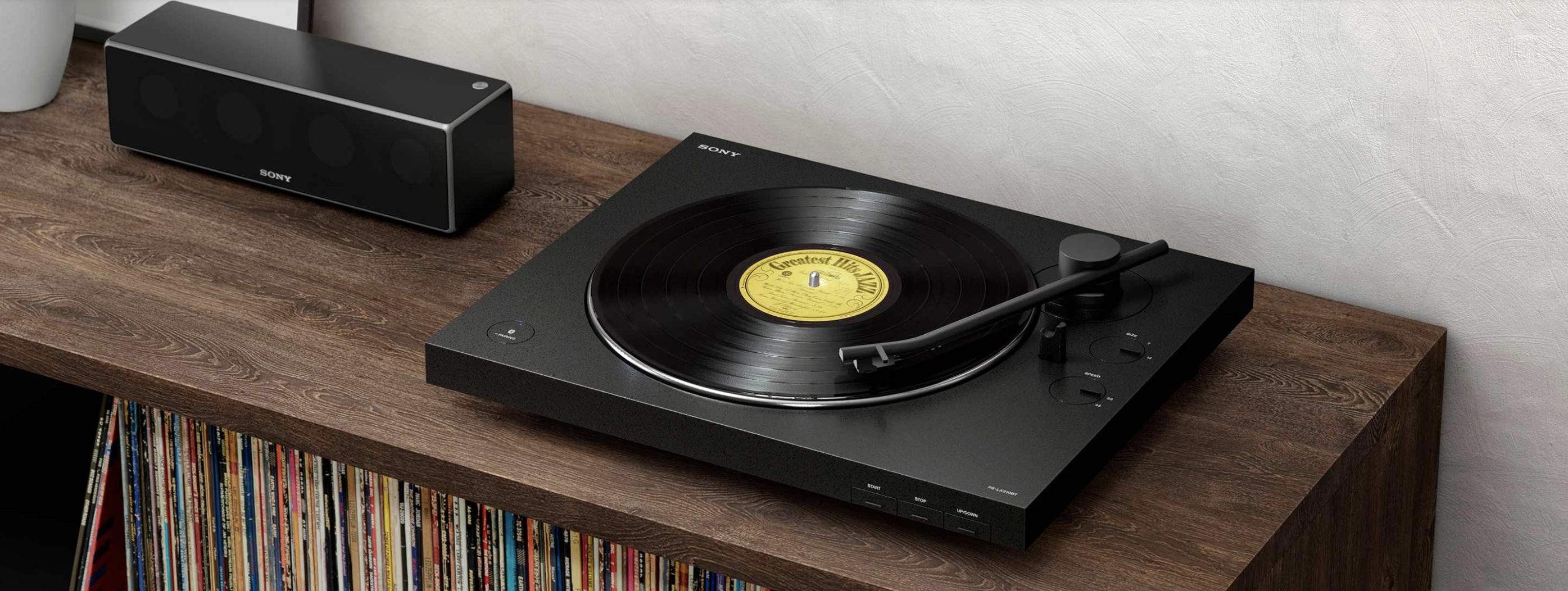
If listeners today can stream just about any song they want, why are so many music aficionados still buying records? Ryan Raffaelli and Gold Rush Vinyl CEO Caren Kelleher discuss the resurgence of vinyl.

Most U.S. news organizations won't let readers cancel online. The Federal Trade Commission wants that to change.
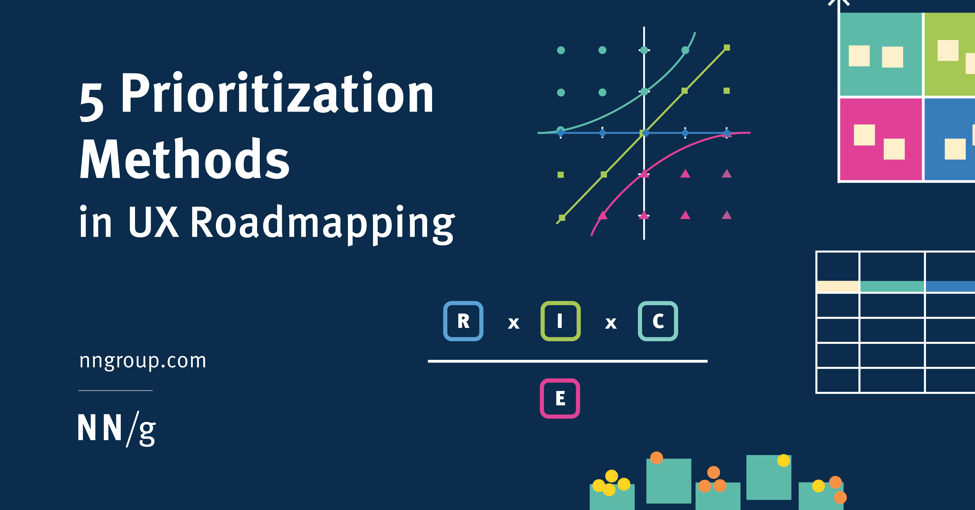
The best prioritization method depends on project context, team culture, and success criteria.

Unsure where to start? Use this collection of links to our articles and videos to learn about the components of DesignOps and get started implementing DesignOps activities.
Building white label products is more profitable than starting a new design every time. Learn how to properly implement white labelling.

Learn techniques from visual design, interface design, and UX design. Web UI is analyzed from over 33 companies.
User experience and user interface tools can help with every stage of website and mobile-app design — from early whiteboard brainstorming to testing your prototype with end-users. Here is a list of useful UX and UI design tools.

Yearning organizers, genuine solopreneurs, and sprouting visual creators all need a convincing...
Affinity diagrams are especially helpful in the design process. See how this method can help you organize and plan product ideas.

If designers want to get more agile, they should learn how to make small things, get feedback and embrace experimentation, iteration and refactoring.
HTML line spacing matters in UX design. Read all you need to know about line height and how it can help your UX.

Even people with limited drawing abilities can learn to sketch a wireframe if they learn a few common conventions used to represent various design elements.
What decisions a designer will run into while designing learning experiences.
In these testimonial page examples, you’ll see how UX designers help clients provide social proof for their products and services.
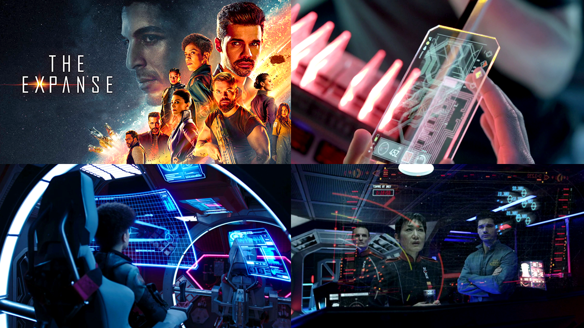
Here’s a look at the various FUI designs from the sci-fi series The Expanse . Special thanks to Brian Benton who suggested this and provided some great links as well! A lot of the images have been collected from this massive image dump from drainsmith and further below we have some insights and
As a designer, you never stop learning and these UX/UI articles are perfect for staying up to date on the latest in the design world.

Pain points are problems that occur at the different levels of the customer experience: interaction level, customer-journey level, or relationship level.
Sample files to accompany the FT's Chart Doctor column - Financial-Times/chart-doctor
Learn all about aspect ratios in UX/UI design, including how they affect images, videos, and responsive layouts across devices.
A short excursion into the world of human visual information processing

Taxonomies may be thought of as hierarchies of categories to group and organize information to be found when browsing, or as a structured set of terms used to tag content so that it can be retrieved efficiently and accurately. Sometimes the same taxonomy may serve both purposes, and sometimes two different taxonomies are used, one for each purpose, for the same content or site. Taxonomies are not new, in fact there has been a lot written about them, including an

Persistent headers can be useful to users if they are unobtrusive, high-contrast, minimally animated, and fit user needs.

How design can manipulate and coerce you online
What happens when you set fontSize: 32 in your favorite editor
Do you need to make a prototype for a website or app? The effectiveness of these random name generator benefits may surprise you.
As a web designer, you’re not really in the business of building websites that your clients will love. I know that may seem counterintuitive, but think about how vast the differences often are between your clients’ personal aesthetics and what actually works to turn visitors into customers.
Get a selection of good threads from Twitter every day

Teams consistently overlook speed. Instead, they add more features (which ironically make things slower). Products bloat over time and performance goes downhill.
Whilst learning web development, most of us don’t have much design experience or access to a UI desig...

These were my favorite product management and UX articles of 2020, which is the 5th year I’ve compiled this list. Though 2020 was a…

140 votes, 14 comments. 177K subscribers in the ProductManagement community. Product Management
If the recent discrimination allegations against Pinterest are leaving you uninspired (if not quesy), here are some great alternatives.
Web magazine about user experience matters, providing insights and inspiration for the user experience community

Customers can’t buy from a brand they don’t notice
Customers can’t buy from a brand they don’t notice
What’s so great about Baymard and why aren’t there more organizations on the same level?

Consumer needs spark consumer journeys. How can marketers identify those needs and address them? The latest consumer research from Google will help.

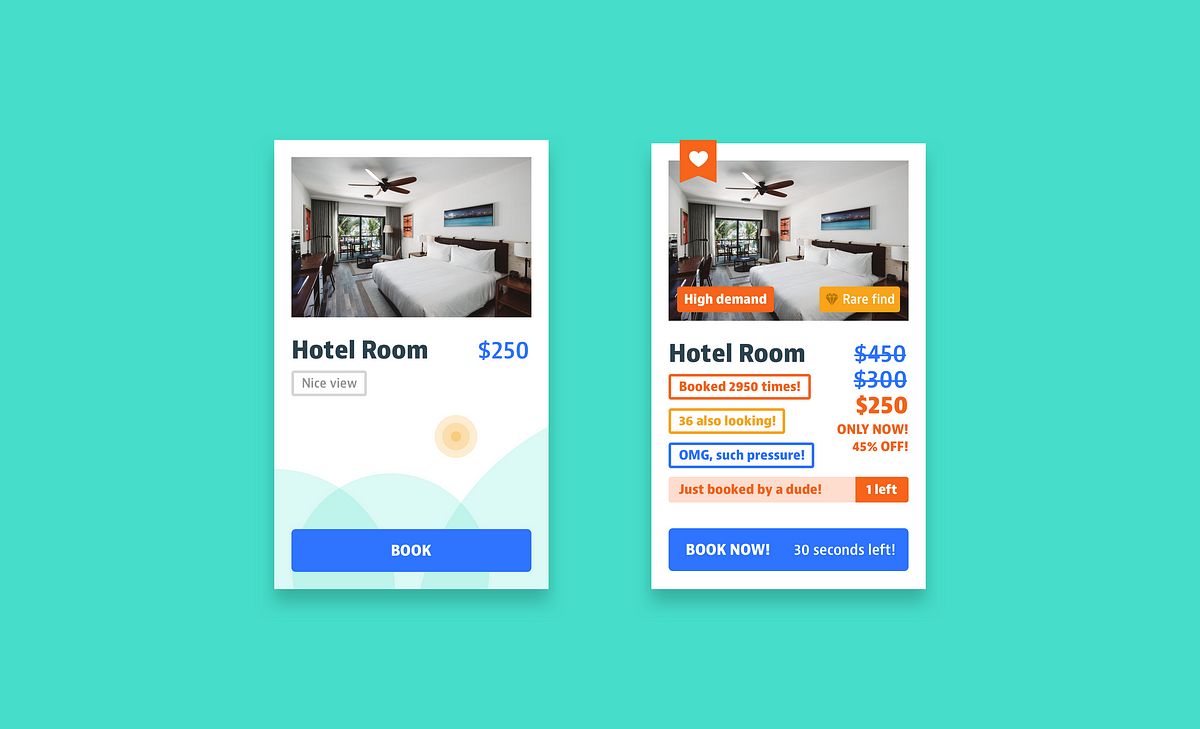
A large-scale academic study that analyzed more than 53,000 product pages on more than 11,000 online stores found widespread use of user interface "dark patterns" -- practices meant to mislead customers into making purchases based on false or misleading information. from a report: The study -- prese...

Buyer Experience Benchmarking of 5 Top eCommerce Sites Dec 2018 Ken Leaver
Human cognition is complex, and many factors play into instant impressions. Design psychology is coming to the forefront as more and more companies are using neuroscience to design better user experiences. Great user experience design isn’t magic—it’s science.
When we think about the data we hold on our services, the first thing that comes to mind is often website analytics. But there are other valuable and occasionally overlooked types of data that can be really useful to user researchers.
The advantages and disadvantages of heuristic evaluation plus step by step instructions for running a successful inspection of your design's usability.
Learn exactly what persuasive techniques you need to use to build habit-forming products.

Technology makes seemingly inconvenient tasks easier — but at what cost?

A new battle is brewing to be the default of every choice we make. As modern interfaces like voice remove options, augmented reality…
Google's data viz team, formed just last year, has put out best practices for designing charts.
Questions that ensure you consider e̶v̶e̶r̶y̶t̶h̶i̶n̶g̶ a few things when designing a new feature.

How a user-first culture led to a decade of eureka moments at Google UX
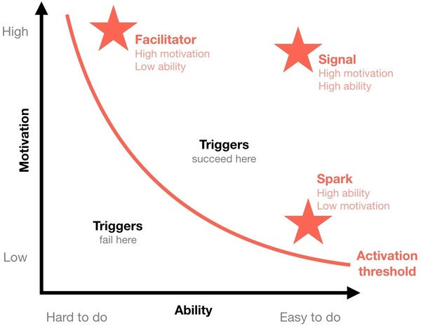
Whether you are helping your users establish habits, engage in something new or unknown, onboard, or just want to motivate your users into giving your product a try, the Fogg Behavior Model can guide you.
One of my life goals is to publish a book about how to build great products. I hope to help others learn from my hard-earned lessons to get ahead of the game. Ultimately, I want to help product builders to kick ass at what they love to do.

Our desire to give back wanes rapidly with time - Why if you want people to return a favor, you need to act fast

“That’s just one person” and “Our real users aren’t like that” are common objections to findings from qualitative usability testing. Address these concerns proactively to ensure your research is effective.
What makes UI engineering difficult?
What if clearing trackers was as easy as cleaning your computer screen?
