matplotlib


Master fast, powerful ways to visualize data with these compact, ready-to-use Python one-liners.
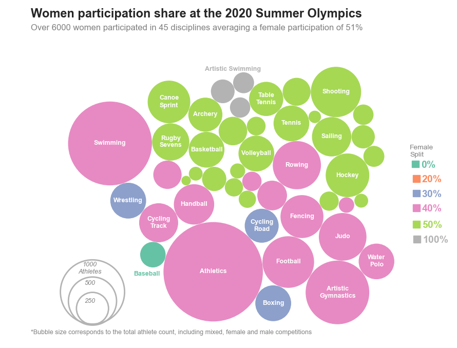
Ever wished to design those beautiful Tableau based packed bubble charts? Follow along for a tutorial on the Matplotlib solution

Use Python’s statistical visualization library Seaborn to level up your analysis.
Consistently beautiful plots with less code and minimal effort
Utilising Python’s Matplotlib to Create Advanced Data Visualisations
A quick guide on how to make clean-looking, interactive Python plots to validate your data and model

Learn how to quickly create a presentation-ready plot to aid your data storytelling
A Great Alternative to Pie Charts for Data Visualisation
A data visualization technique for 2-dimensional time series data using imageio

We look at how to create the 12 most useful graphs and charts in Python and Streamlit
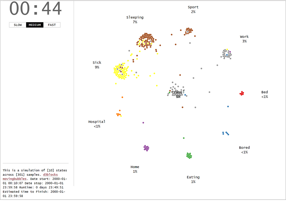
The MovingBubble chart is one of those mind-blowing charts to look at. Learn how to create them using your own data set and Python!

Creating eye-catching graphs with Python to use instead of bar charts.
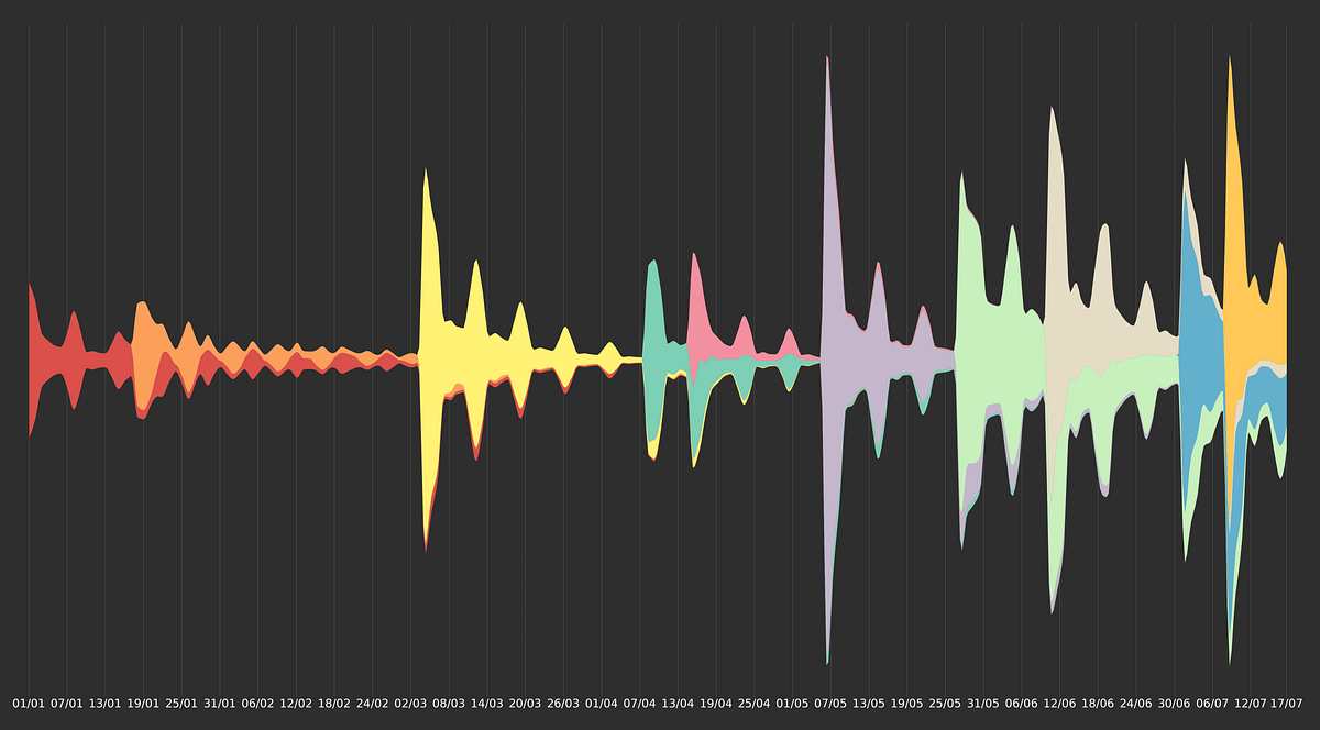
The good-looking cousin of stacked area charts
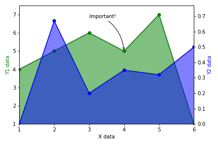
Easily adding arrows, multiple axes, gradient fill, and more
Should you bypass Matplotlib?
Publication-quality data representation library based on Matplotlib. - alopezrivera/mpl_plotter

Create PDF reports with beautiful visualizations in 10 minutes or less.
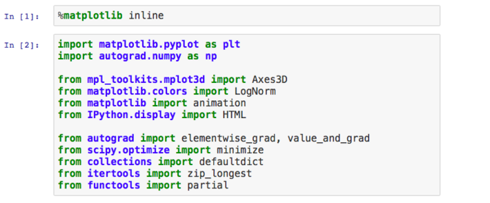
This article was written by Louis Tiao. In this series of notebooks, we demonstrate some useful patterns and recipes for visualizing animating optimization algorithms using Matplotlib. We shall restrict our attention to 3-dimensional problems for right now (i.e. optimizing over only 2 parameters), though what follows can be extended to higher dimensions… Read More »Visualizing and Animating Optimization Algorithms with Matplotlib
Confused about which Visualization Tool to Use? I Broke Down the Pros and Cons of Each Libary for You
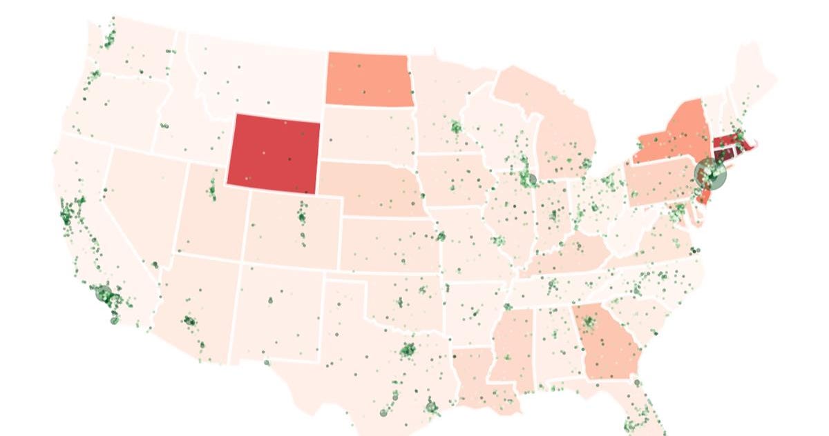
Open source tools and techniques for visualizing data on custom maps

In real life, data preprocessing is really a pain for most data scientists. But with the help of data visualization libraries, it actually…
Plotting heatmaps, contour plots, and 3D plots with Python
What if you can create a scatter plot for categorical features?
An intuitive library to add plotting functionality to scikit-learn objects. - reiinakano/scikit-plot

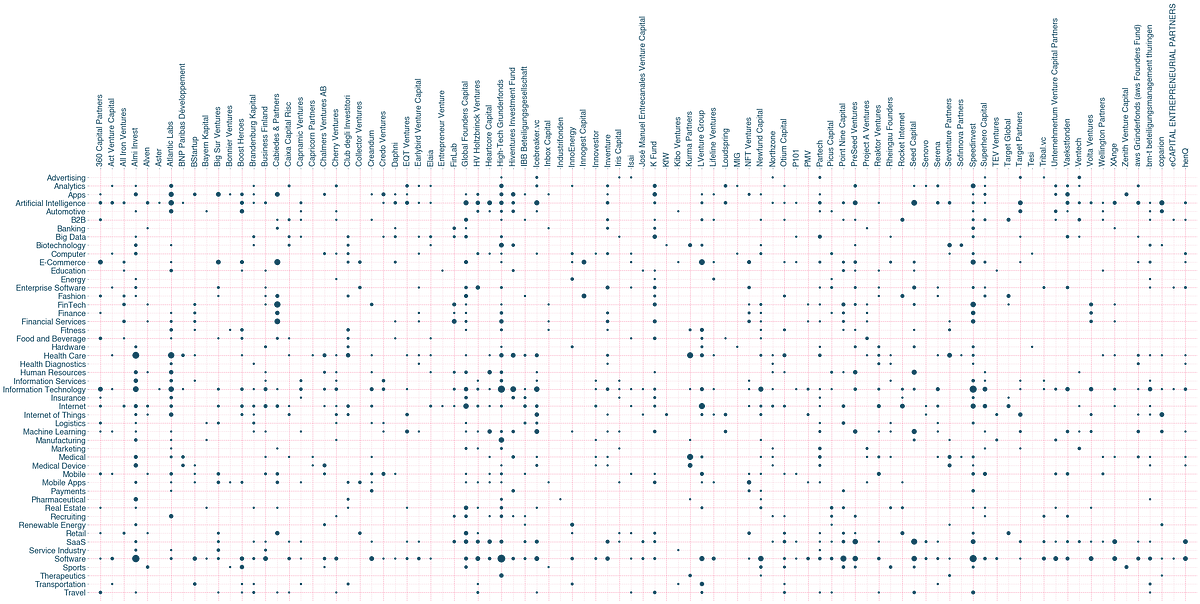
The Python Graph Gallery displays hundreds of charts made with Python, always with explanation and reproduciible code