seaborn


Master fast, powerful ways to visualize data with these compact, ready-to-use Python one-liners.

Use Python’s statistical visualization library Seaborn to level up your analysis.

Using a heatmap to visualise a confusion matrix, time-series movements, temperature changes, correlation matrix and SHAP interaction values
Simple and easy pieces of code to enhance your seaborn scatter plots
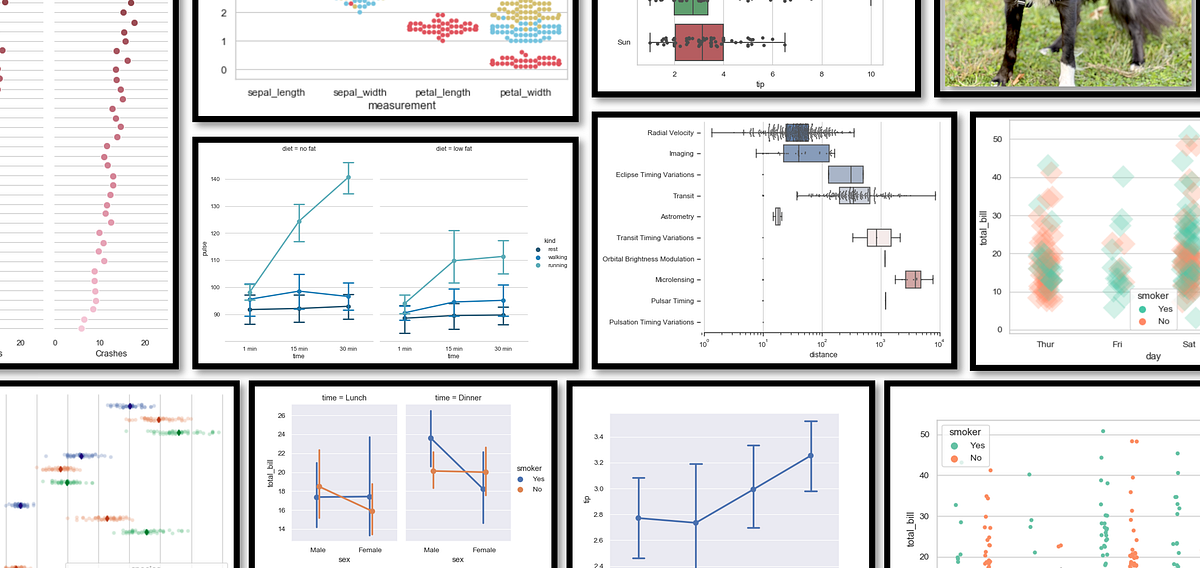
Learn how to visualize data using Seaborn’s axes-level and figure-level plots
Exploring some of the best visualization options for data science projects with the Seaborn library
Sourced from O'Reilly ebook of the same name.
Should you bypass Matplotlib?
But really should know
In real life, data preprocessing is really a pain for most data scientists. But with the help of data visualization libraries, it actually…
Seaborn is one of the most used visualization libraries and I enjoy working with it. In my latest projects, I wanted to visualize multiple…
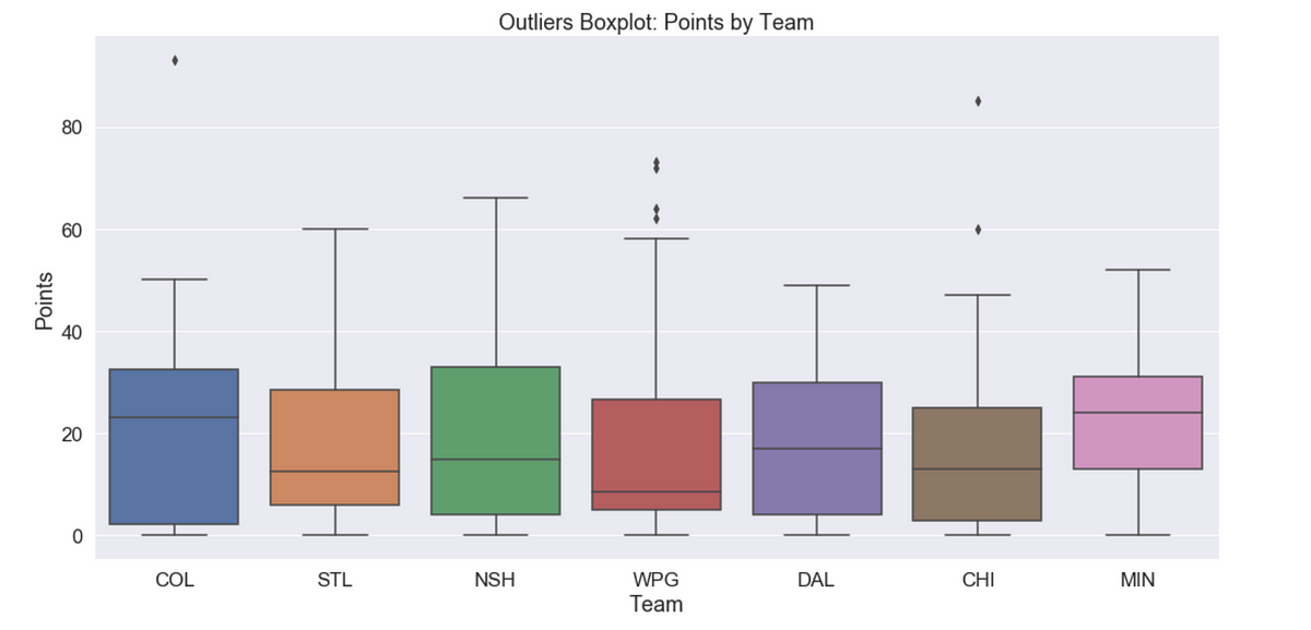
A walkthrough of many Seaborn tools using NHL Statistics
In this step-by-step Python Seaborn tutorial, you'll learn how to use one of Python's most convenient libraries for data visualization.