visualization

An underrated strategy for urbanist persuasion, powered by open source tools

Deriving the basic mathematical properties of the Smith chart from electrical engineering
In this article, I'll explain how to automate 80% of the initial analysis and generate an EDA report with just one line of Python code.

Master fast, powerful ways to visualize data with these compact, ready-to-use Python one-liners.

This collection of tutorials from our sister site Statology center on data visualization. Learn more about visualizing your data right here.

Gentle step-by-step guide through the abstract and complex universe of Fragment Shaders.

This Sprint focuses on Yellowbrick, a Python visualization library that extends the scikit-learn API to incorporate visual diagnostics in your machine learning workflow.
A 2D cloth Verlet simulation made in Rust
Apache ECharts, a powerful, interactive charting and visualization library for browser
Create diagrams and visualizations using text and code.
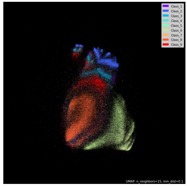
Motivation • Dimensionality reduction is vital to the analysis of high dimensional data, i.e. data with many features. It allows for better understa…
Generation of diagrams like flowcharts or sequence diagrams from text in a similar manner as markdown - mermaid-js/mermaid
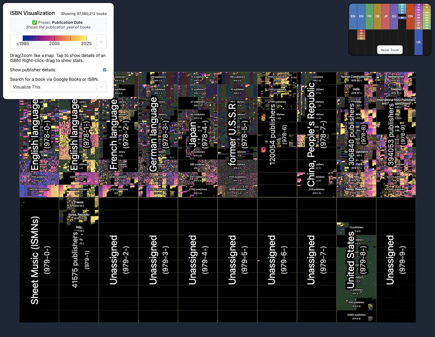
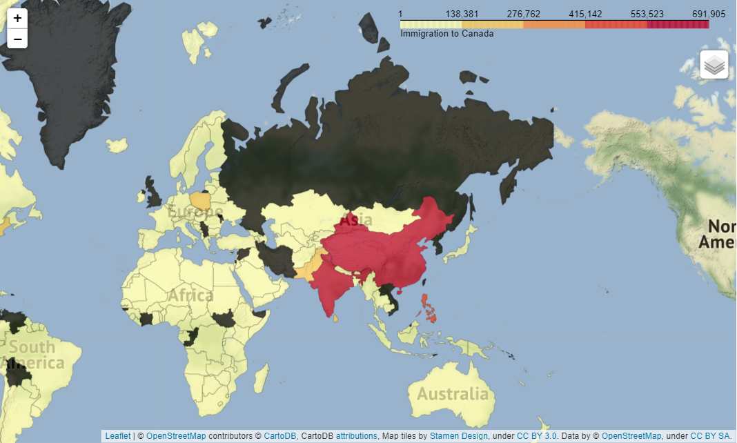
To show a catalog of almost 100 million books in one view, phiresky mapped them based on International Standard Book Numbers, or ISBNs, with an interactive visualization.
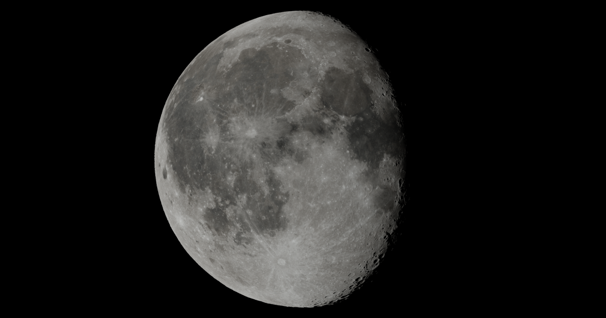
Interactive article about the Moon
A list of the most powerful R packages to create stunning graphs.
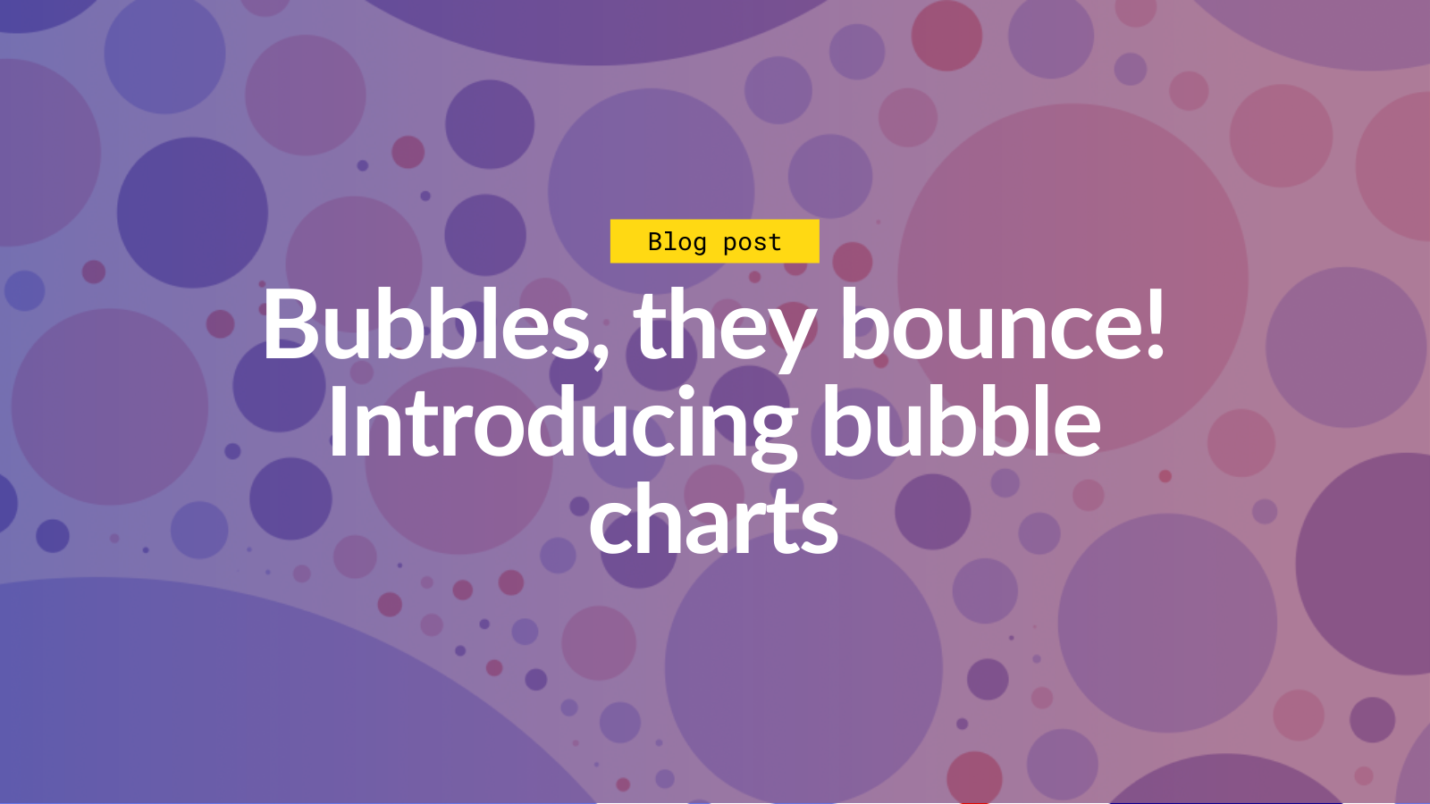
Ever wished to design those beautiful Tableau based packed bubble charts? Follow along for a tutorial on the Matplotlib solution

Create your first run chart and start interpreting your data using just four rules. Your go-to QI resource.
So, you’ve mastered the basics of ggplot2 animation and are now looking for a real-world challenge? You’re in the right place. After reading this one, you’ll know how to download and visualize stock data change through something known as race charts. You can think of race charts as dynamic visualizations (typically bar charts) that display […] The post appeared first on appsilon.com/blog/.

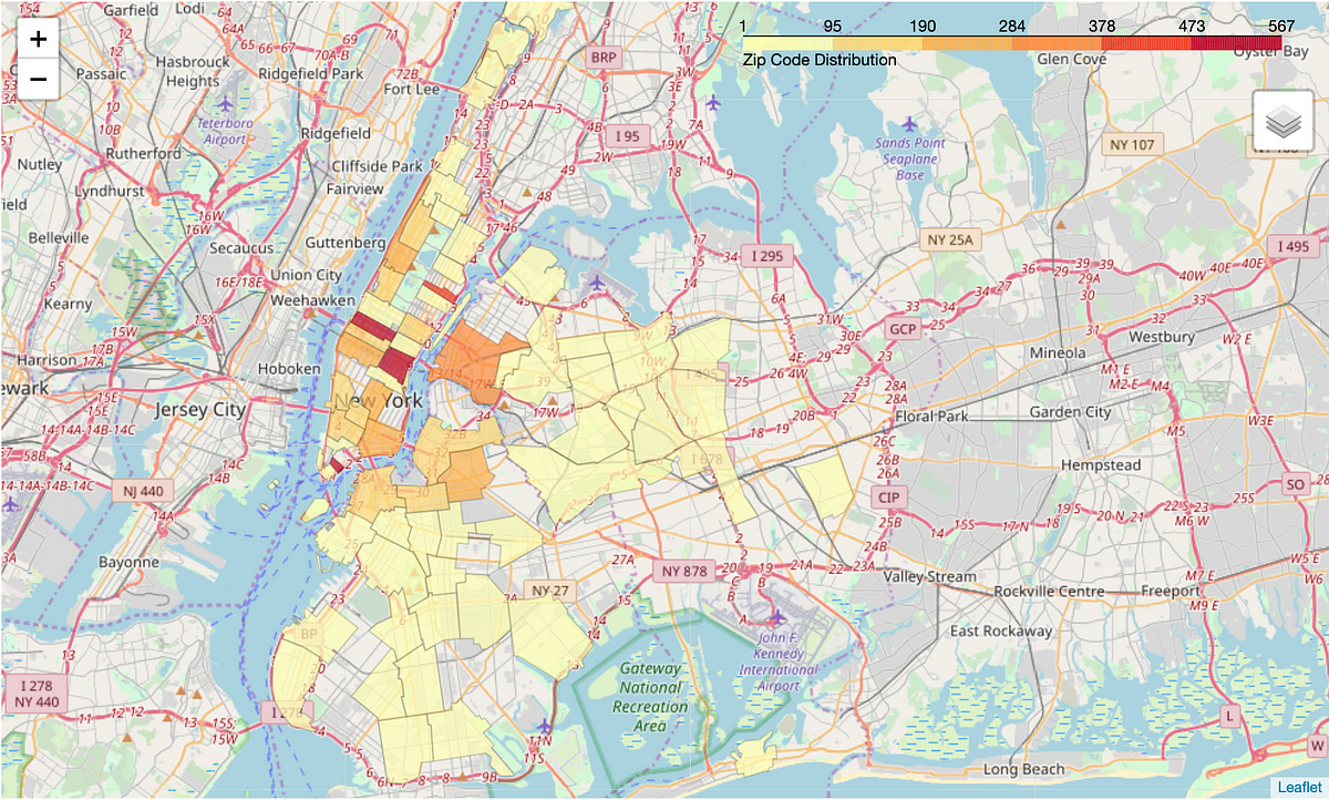
Something a llttle different: Hexbin maps by Jerry Tuttle I recently became acquainted with hexbin maps, so I thought I would experiment with one. In a hexbin map, each geographical region is represented by an equall...
Decent Patterns is a collective effort to further the adoption of decentralized technologies by providing open tooling and resources for the community.

Can designers defend pursuing beauty when communicating science or innovation?
Decent Patterns is a collective effort to further the adoption of decentralized technologies by providing open tooling and resources for the community.
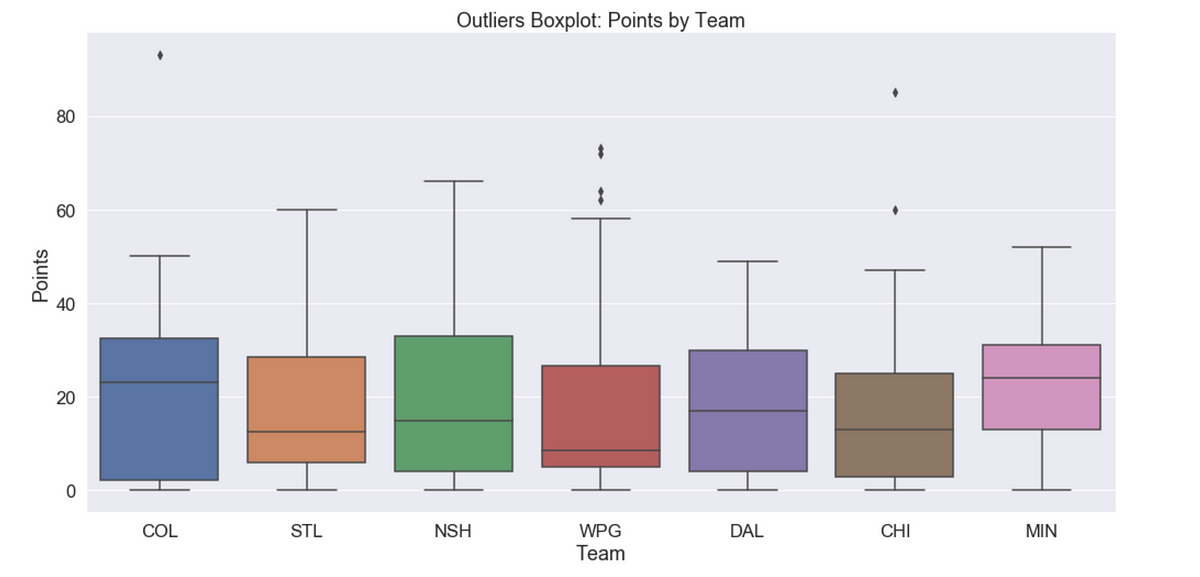
Box plots are a very common tool in data visualization to show how your data is distributed. But they have a crucial flaw. Let’s find out what that flaw is. And if you’re interested in the video version of this blog post, you can find it here: ...
true

In this article, I'll take you through some advanced data visualization concepts you should know to enhance your graphs.
Bubble charts are an engaging way to visualize groups of people or events. Flourish allows you to create interactive bubble charts with multiple image and label options.
Easily document cables and wiring harnesses.
Create diagrams and visualizations using text and code.

Diagrams are the cornerstone of software development, illuminating complex systems and fostering...

Bloom effects are typically used to enhance the brightness and lighting effects of images or scenes,...

Use Python’s statistical visualization library Seaborn to level up your analysis.


Learn graphical text analysis with NLTK
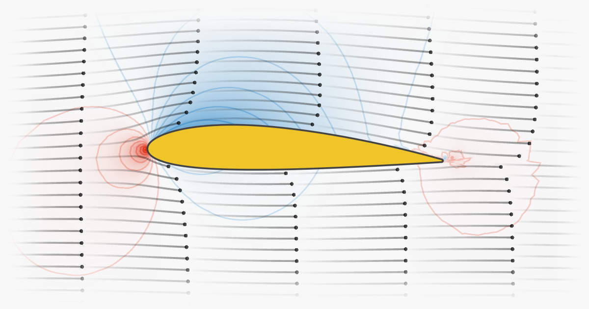
Interactive article explaining the physics of an airfoil and what makes airplanes fly
Community website for Apache Superset™, a data visualization and data exploration platform
Matrix Product Interpretations and Visualizations: Learn Linear Algebra from scratch. Build a foundation for Machine Learning and other key technologies.
For me, mathematics cultivates a perpetual state of wonder about the nature of mind, the limits of thoughts, and our place in this vast cosmos (Clifford A. Pickover - The Math Book: From Pythagoras to the 57th Dimension, 250 Milestones in the History of Mathematics) I am a big fan of Clifford Pickover and I
Consistently beautiful plots with less code and minimal effort

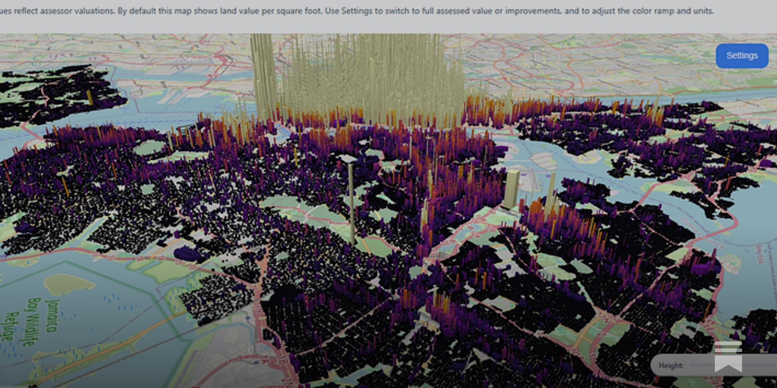
Turn a government PDF into a financial planning tool

Use 3D to visualize matrix multiplication expressions, attention heads with real weights, and more.
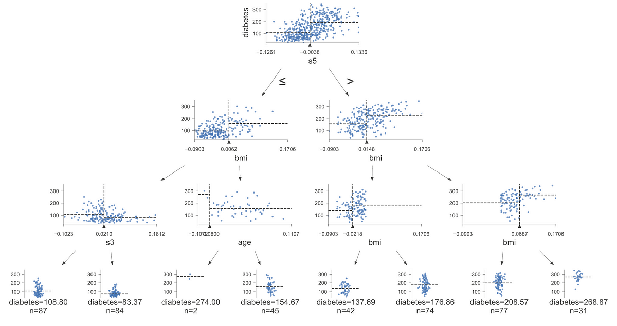
How to visualize decision tree models with this useful library

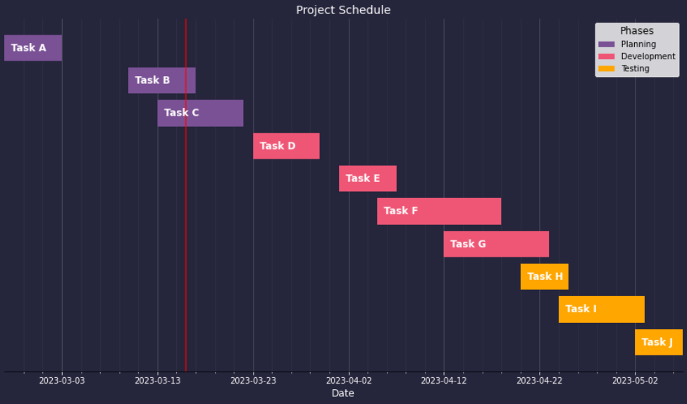
This is the good stuff for March.

Learn how to design beautiful tables in R! Join our workshop on Designing Beautiful Tables in R which is a part of our workshops for Ukraine series. Here’s some more info: Title: Designing Beautiful Tables in R Date: Thursday, April 27th, 18:00 – 20:00 CEST (Rome, Berlin, Paris timezone) Speaker: Tanya Shapiro is a freelance … Continue reading Designing Beautiful Tables in RDesigning Beautiful Tables in R was first posted on March 25, 2023 at 3:28 pm.

DISCLAIMER: This blog post was written by a human with the help of AI Hypotrochoids and epitrochoids...
Voilà turns Jupyter notebooks into standalone web applications
Utilising Python’s Matplotlib to Create Advanced Data Visualisations
Charts are a powerful tool for data visualization, but with so many chart types available, it can be...
A quick guide on how to make clean-looking, interactive Python plots to validate your data and model
An Introduction to the PyGWalker Library for Easy Data Visualisation
A React+D3 animated bubble chart.

Written by Mads Stoumann✏️ Not so long ago, these beautiful posters showed up in an advertisement on...

Learn how to quickly create a presentation-ready plot to aid your data storytelling
A Great Alternative to Pie Charts for Data Visualisation
A practical introduction.
Better alternatives to scatter, bar, and line plots.
A command line tool that draw plots on the terminal. - red-data-tools/YouPlot

Four ways how to use drawing to get more ideas: Study, Explore, Develop, and Show. They will boost your creativity.

Obsidian Canvas gives you infinite space to research, brainstorm, diagram, and lay out your ideas.

Step 1. Create a grid Use d3.geoGraticule10 to create lines of constant longitude and latitude. Step 2. Apply clipping Set projection.clipAngle to 90° to show only the front hemisphere. Stroke the outline of the sphere to better separate the globe from the background. Step 3. Apply a radial gradient Apply a radial gradient to simulate lighting on a diffuse surface. Appendix

D3’s projections use adaptive sampling to increase the accuracy of projected lines and polygons while still performing efficiently. Without sampling, only the input vertices of polygons are projected. This results in the artifacts (visible above) due to projected lines becoming curves. Uniform sampling improves the appearance by adding interstitial samples between input vertices. It is inefficient because most samples are not needed, and even areas of extreme distortion still exhibit artifacts! Adaptive sam
The JavaScript library for bespoke data visualization
Some Unique Data Visualization Techniques for Getting High-Level Insight into the Data
Posted by Mahima Pushkarna, Senior Interaction Designer, and Andrew Zaldivar, Senior Developer Relations Engineer, Google Research As machine learn...

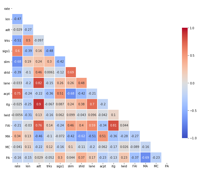
Using a heatmap to visualise a confusion matrix, time-series movements, temperature changes, correlation matrix and SHAP interaction values
Simple and easy pieces of code to enhance your seaborn scatter plots

A guide on how to make different types of maps using Python
Interactive article explaining how sound works.
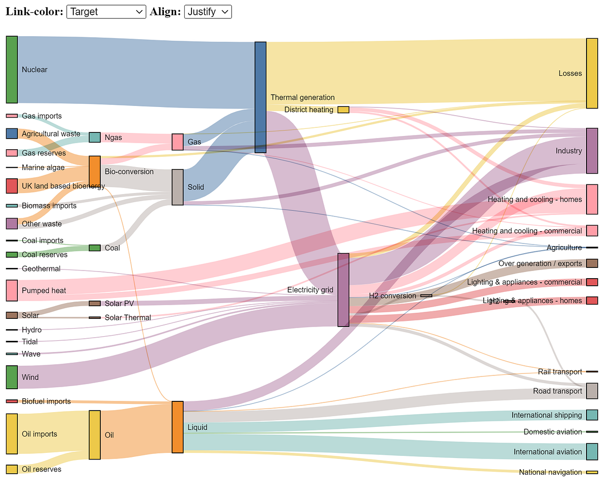
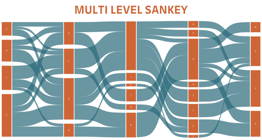
The Sankey chart is a great way to discover the most prominent contributions just by looking at how individual items flow across states.

We look at how to create the 12 most useful graphs and charts in Python and Streamlit
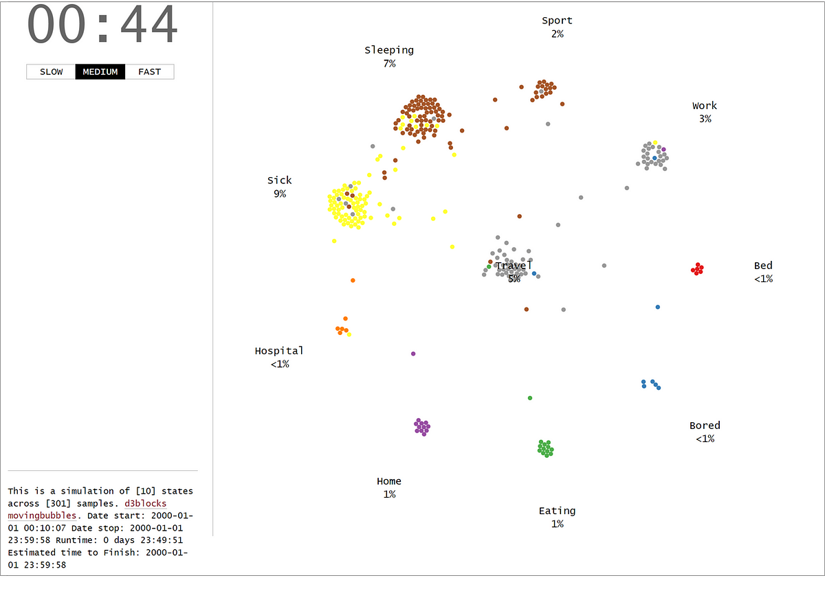
The MovingBubble chart is one of those mind-blowing charts to look at. Learn how to create them using your own data set and Python!

Mix and match plots to get more information from a scatter plot
A guide to making visualizations that accurately reflect the data, tell a story, and look professional.
Create interactive, and stand-alone charts that are built on the graphics of d3 javascript (d3js) but configurable with Python.

Let’s catch those high-dimensional outliers

Effective interactive data visualizations in R

Creating eye-catching graphs with Python to use instead of bar charts.
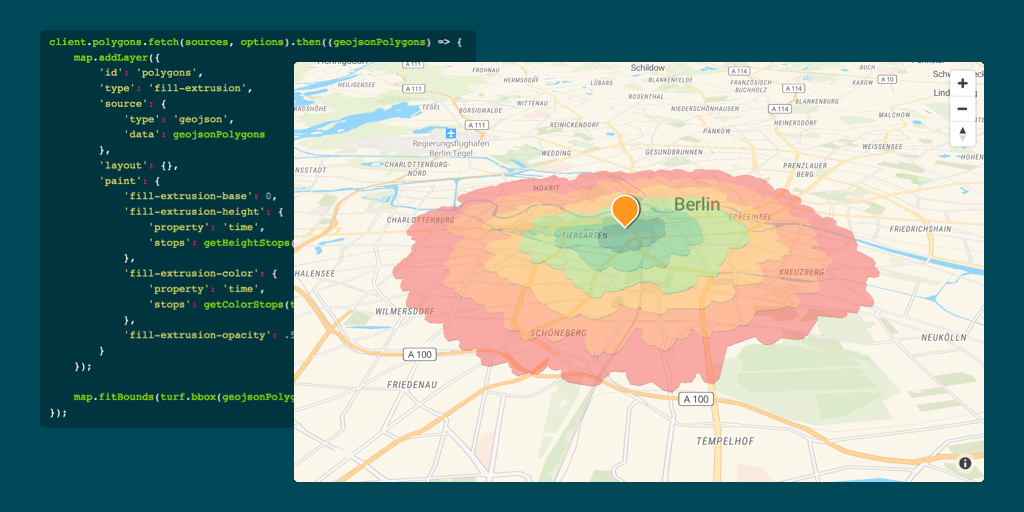
Build the next generation of Location Intelligence applications with the Targomo API

Learn how to create isochrones for different transport modes with our free isochrone map generator, Isochrone API or software plugins.
The good-looking cousin of stacked area charts
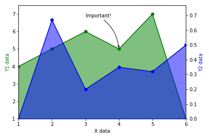
Easily adding arrows, multiple axes, gradient fill, and more
DOT rendering programs and utilities.
Create a variety of data visualizations with hierarchical data

Animation can help people make sense of all the data at their fingertips.

Here’s the good stuff for June.

This chart shows the relationship between idle and eruption times for Old Faithful. See also the importable chart component version of this example.
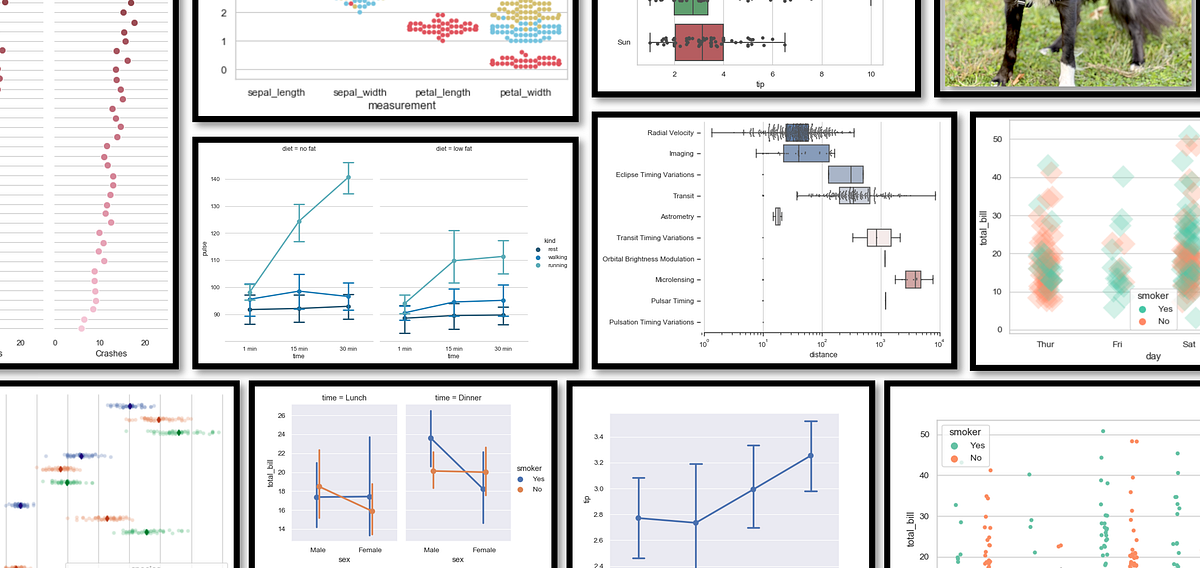
All the data in the world won’t do anyone any good if we can’t make sense of it. Or better yet, make it sing. Here are some stunning examples of data visualization in the wild, and some pointers on how to start making your own.

A Sankey diagram is a collection of nodes which are connected with each other to show data flow or hierarchical data connected from one to another.
Data visualization breaks down complex data values into simple and flexible elements that you can easily deal with without being worried.
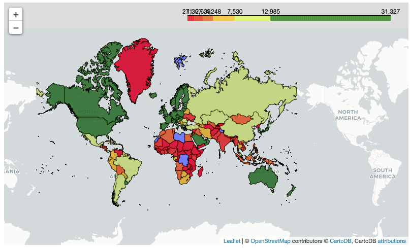
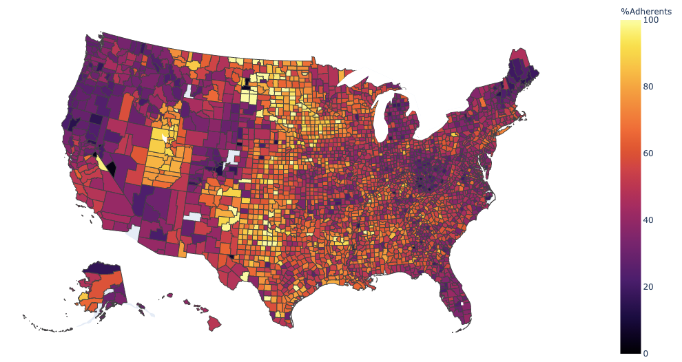
Using the Folium Package to Create Stunning Choropleths

Adobe Photoshop is still the king of the graphics software industry, by name if not in practice. It is still the bread and butter of artists, designers, illustrators, and creatives, even when there are more focused applications available, like ones for making comics or manga, for example. Despite its popularity, getting legitimate access to Photoshop
How to make choropleths with different data structures in Python

Smart SVG techniques, from generative SVG grids to SVG paths with masks, grainy SVG gradients, cut-out effects and fractional SVG stars. Let’s look at some magical SVG techniques that you can use right away.

SVG is an awesome and incredibly powerful image format. This tutorial gives you an overview of SVG by explaining all you need to know in a simple way
Learn how to visualize data using Seaborn’s axes-level and figure-level plots
Exploring some of the best visualization options for data science projects with the Seaborn library
Download D3 Tips and Tricks v3.x ebook for free
This cookbook contains more than 150 recipes to help scientists, engineers, programmers, and data analysts generate high-quality graphs quickly—without having to comb through all the details of R’s graphing systems. Each recipe tackles a specific problem with a solution you can apply to your own project and includes a discussion of how and why the recipe works.

If the recent discrimination allegations against Pinterest are leaving you uninspired (if not quesy), here are some great alternatives.
R graphics tutorial: scatterplots with anti-aliasing, using the Cairo library. Two lines of code to make much better visualizations in R.
Based on scatterplot by Myriam Barnes. A simple to viz categories in a scatter plot. - bjpcjp/category-scatterplot
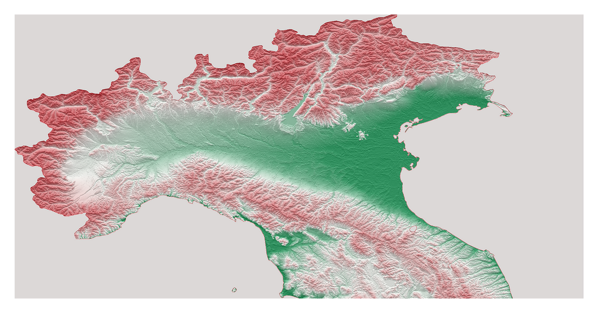
Who needs GIS when you can build eye-catching 3D topography maps with Python?

Also known as ridgelines, use the method to create a compact visualization where you can easily identify major patterns and outliers.
Interactive Tools for Machine Learning, Deep Learning and Math - Machine-Learning-Tokyo/Interactive_Tools
Create breathtaking visuals and “see” your data

Using “Kneedle” algorithmus detecting knees with Python package “kneed”
Visualize flow between nodes in a directed acyclic network. - d3/d3-sankey
Should you bypass Matplotlib?

Scroll down to see how to interpret a plot created by a great tool for comparing two classes and their corpora.

Data analysis and visualization have always been extremely important issues in the professional environment and a fundamental tool for decision-making in companies. In this environment, Microsoft…
Publication-quality data representation library based on Matplotlib. - alopezrivera/mpl_plotter
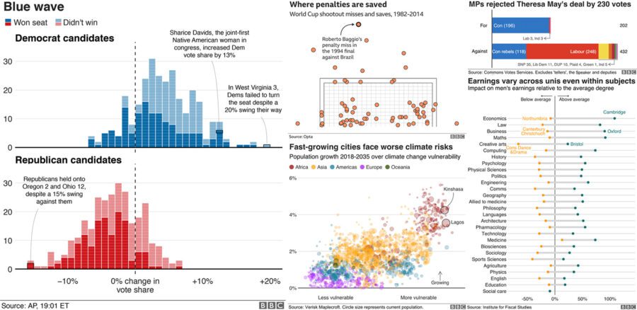
Sample files to accompany the FT's Chart Doctor column - Financial-Times/chart-doctor
A short excursion into the world of human visual information processing

I recently wrote a post about visualizing weather data from NOAA. We walked through processing the data and making some basic interactive maps with Plotly. In this article I want to use the same data…
A D3 project showing a barchart that allows user interactions
Intuitive Math Descriptions

Create PDF reports with beautiful visualizations in 10 minutes or less.
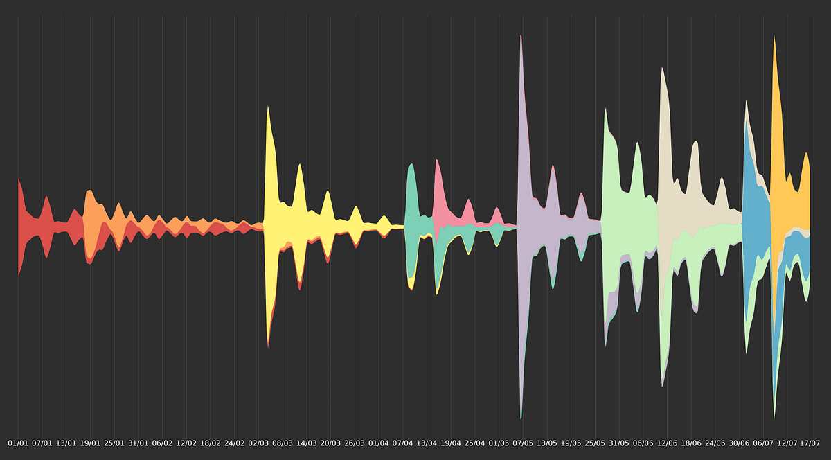
Strip charts are extremely useful to make heads or tails from dozens (and up to several hundred) of time series over very long periods of…
Sample files to accompany the FT's Chart Doctor column - Financial-Times/chart-doctor
A heatmap is a graphical representation of data in which data values are represented as colors. That is, it uses color in order to…

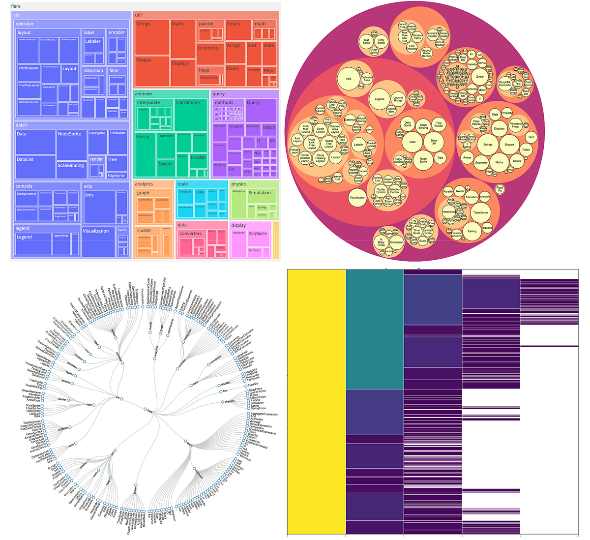
Creating usable, readable treemaps is difficult. They are a complex, area-based data visualization for hierarchical data that can be hard to interpret precisely.

Looking for a good D3 example? Here’s a few (okay, …) to peruse. Animation D3’s data join, interpolators, and easings enable flexible animated transitions between views while preserving object constancy. Interaction D3’s low-level approach allows for performant incremental updates during interaction. And D3 supports popular interaction methods including dragging, brushing, and zooming. Analysis D3 is for more than visualization; it includes tools for quantitative analysis, such as data transformation, rand

How to build a treemap with Javascript and D3.js: from the most basic example to highly customized examples.
Learn to Develop Choropleth Map Easily Using Python’s Folium Library
Library of impossible figures. There's greyscale and wireframe versions of figures.
Create stunning visualizations for Pandas DataFrames
Working notes & digital experiments
If the recent discrimination allegations against Pinterest are leaving you uninspired (if not quesy), here are some great alternatives.
I have been working as a Data Analyst for almost 5 years now but, in this time I have mostly used business intelligence software for all…
Materials from our SIGGRAPH '20 paper.
Confused about which Visualization Tool to Use? I Broke Down the Pros and Cons of Each Libary for You
But really should know

A circular chart shows proportion and position relationships implemented in Python Plotly

Estimated population by county, 2016. See also the bubble map as an alternative presentation of this data, and an alternative implementation with Observable Plot. Data: American Community Survey This dataset comes from the U.S. Census API and contains three columns: the estimated population (as a string), the two-digit state FIPS code, and the three-digit county FIPS code. Since this dataset doesn’t include the positions of the counties, this centroid helper method is used. It takes a (already projected) Ge
Choropleth Maps using Plotly to track COVID 19 cases.
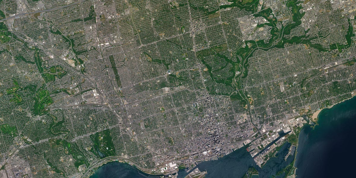
Ultra high resolution satellite and elevation imagery
A step by step guide on creating and plotting Voronoi diagrams in Python

A Picture is worth a thousand words. Literally! there are 2200+ words in this picture. 😱
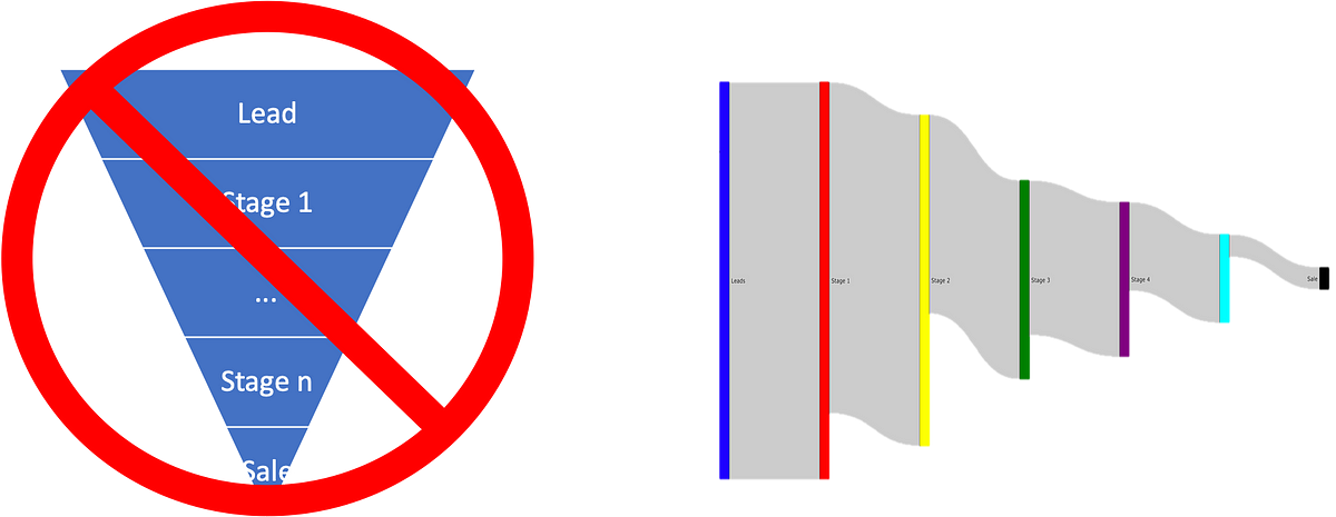
Traditional sales visualizations miss critical information about what is happening in the sales process.
A Walkthrough on Hyperspectral Image Analysis Using Python.

Histograms and Kernel Density Estimators explained with bricks and sandpiles
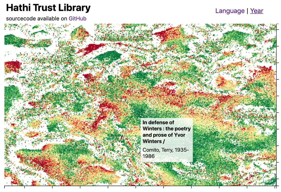
This blog post introduces the WebGL components which we recently added to D3FC, this suite of components make it easy to render charts with very large numbers of datapoints using D3. Throughout this post I'll describe the creation of the following visualisation, which displays 1 million books from the Hathi Trust library
The new tools shows the potential of data visualizations for understanding features in a neural network.
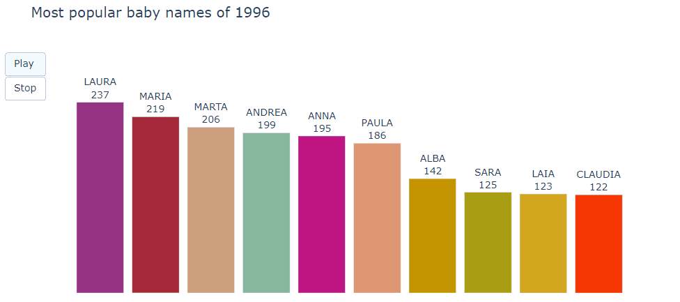
Most common baby names in Barcelona
In real life, data preprocessing is really a pain for most data scientists. But with the help of data visualization libraries, it actually…
Seaborn is one of the most used visualization libraries and I enjoy working with it. In my latest projects, I wanted to visualize multiple…
Plotting heatmaps, contour plots, and 3D plots with Python
What if you can create a scatter plot for categorical features?
A walkthrough of many Seaborn tools using NHL Statistics

a hub for learning through play

Create better population pyramids that allow for improved comparisons between sexes and populations.

This treemap supports zooming: click any cell to zoom in, or the top to zoom out.

"Enter into picture Swarmplots, just like their name." https://lttr.ai/MJtZ #datavisualization #awesomevisualization #seaborn #python

This zoomable time series area chart shows the number of flights per day. The effect of the September 11, 2001 attacks on air travel is evident.
Five Hundred and Seven Mechanical Movements, now Animated for the Internet.
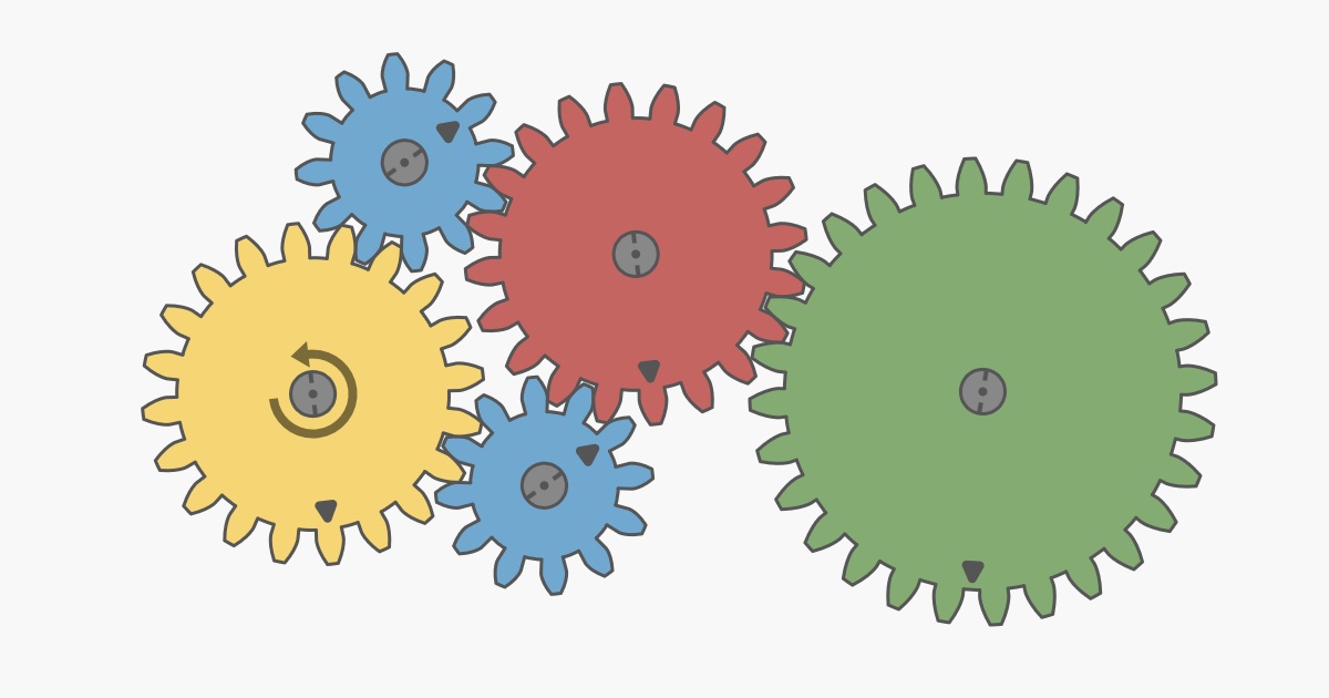
Interactive article explaining how mechanical gears work.
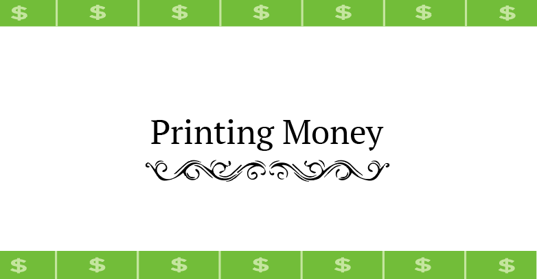
Visualize the flow of money

This is a pedagogical implementation of an animated bar chart race. Read on to learn how it works, or fork this notebook and drop in your data! The data for the race is a CSV with columns date (in YYYY-MM-DD format), name, value and optionally category (which if present determines color). To replace the data, click the file icon
Plotnine Tracking Example · GitHub

A map of over 18,000 asteroids in the Solar System.
In my previous blog post, I explained how I take lecture notes using Vim and LaTeX. In this post, I’ll talk about how I draw figures for my notes using Inkscape and about my custom shortcut manager.Some examples First, let me show you some examples of figures…

Bokeh is a Python library for creating interactive visualizations for modern web browsers. It helps you build beautiful graphics, ranging from simple plots to complex dashboards with streaming data...

Emergence is the story of natural laws and processes, their inherent beauty, and their action to yield the universe, us and the world we live in.
Anaconda is the birthplace of Python data science. We are a movement of data scientists, data-driven enterprises, and open source communities.
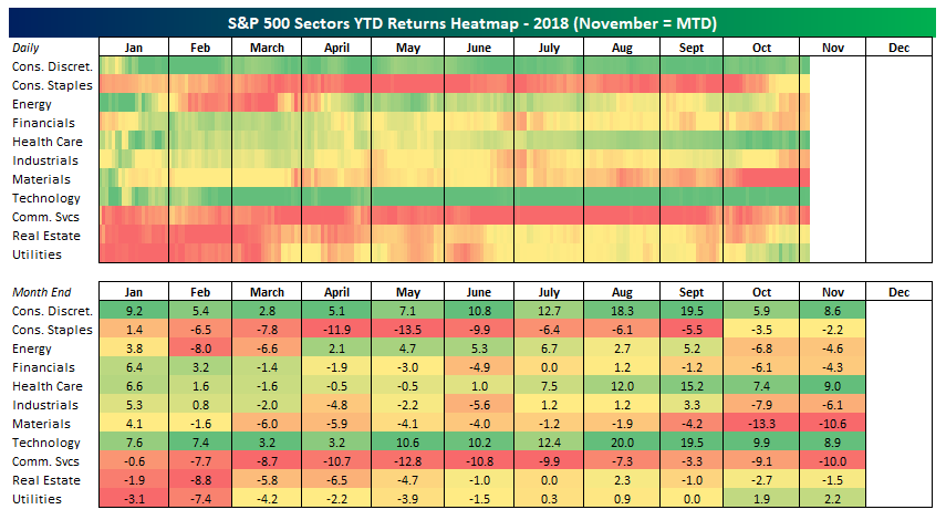
Stock market rotation has been a pretty big theme this year but you wouldn't necessarily know it from our sector performance heatmap.
An intuitive library to add plotting functionality to scikit-learn objects. - reiinakano/scikit-plot

The end-to-end solution for creating expressive data apps, dashboards, and reports. Discover richer insights in your data today.
R Language Tutorials for Advanced Statistics
If you have tried to communicate research results and data visualizations using R, there is a good chance you will have come across one of its great limitations. R is painful when you need to...

Stay up-to-date on the latest data science and AI news in the worlds of artificial intelligence, machine learning, deep learning, implementation, and more.
An introduction to parfit

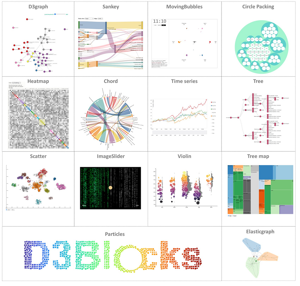
The Python Graph Gallery displays hundreds of charts made with Python, always with explanation and reproduciible code