d3
Create With Data
true
Orthographic shading / D3 | Observable

Step 1. Create a grid Use d3.geoGraticule10 to create lines of constant longitude and latitude. Step 2. Apply clipping Set projection.clipAngle to 90° to show only the front hemisphere. Stroke the outline of the sphere to better separate the globe from the background. Step 3…
Adaptive Sampling

D3’s projections use adaptive sampling to increase the accuracy of projected lines and polygons while still performing efficiently. Without sampling, only the input vertices of polygons are projected. This results in the artifacts (visible above) due to projected lines becoming…
D3.js - Data-Driven Documents
The JavaScript library for bespoke data visualization
How to Create Storytelling Moving Bubbles Charts in d3js with Python.
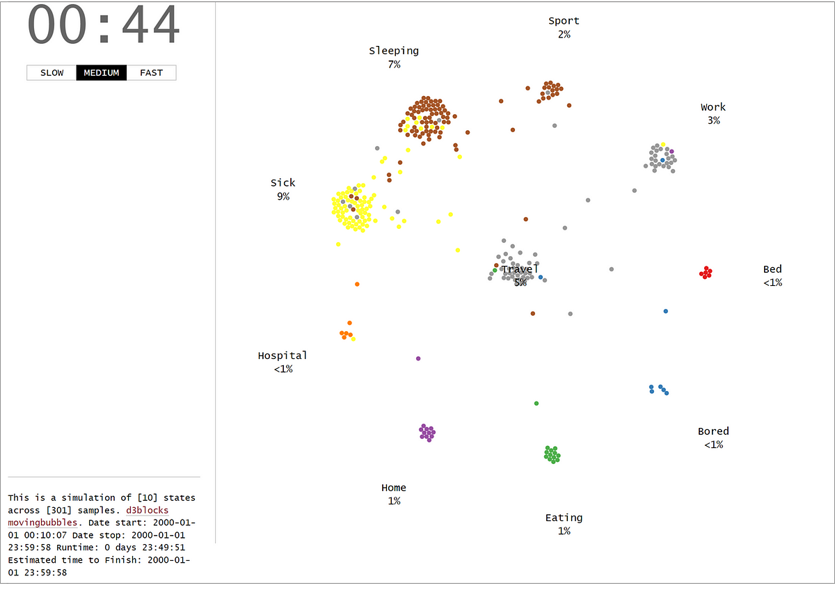
The MovingBubble chart is one of those mind-blowing charts to look at. Learn how to create them using your own data set and Python!
D3Blocks: The Python Library to Create Interactive and Standalone D3js Char
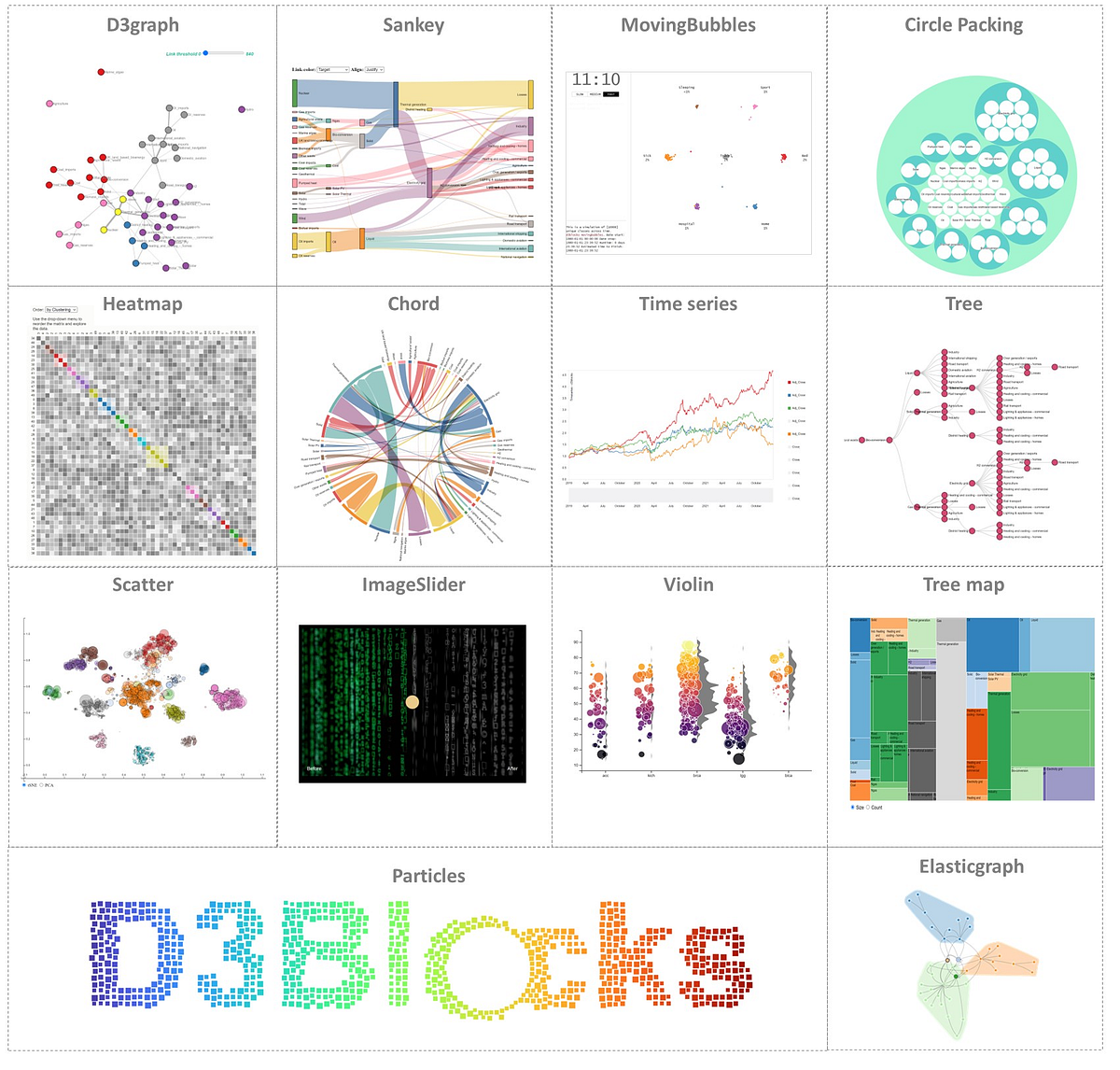
Create interactive, and stand-alone charts that are built on the graphics of d3 javascript (d3js) but configurable with Python.
D3 Tips and Tricks v3.x

Download D3 Tips and Tricks v3.x ebook for free
Amelia Wattenberger
D3 in Depth

D3 is the most commonly used JavaScript library for visualization on the web, but there’s a bit of learning curve, especially for those new to programming. Peter Cook hopes to make this begin…
D3list
The Hitchhiker’s Guide to d3.js
The landscape for learning d3 is rich, vast and sometimes perilous. You may be intimidated by the long list of functions in d3’s API…
How (and why) to use D3 with React | HackerNoon
If you’re planning to build a React app with more than a few simple data visualizations, you’ll probably want to pick an approach that:
Making a map in d3 js v 5
wbkd/awesome-d3: A list of D3 libraries, plugins and utilities
A list of D3 libraries, plugins and utilities.
d3/d3-sankey: Visualize flow between nodes in a directed acyclic network.
Visualize flow between nodes in a directed acyclic network. - d3/d3-sankey
newline-sandbox/d3-user-interactions
A D3 project showing a barchart that allows user interactions
Gallery / D3 / Observable

Looking for a good D3 example? Here’s a few (okay, …) to peruse. Animation D3’s data join, interpolators, and easings enable flexible animated transitions between views while preserving object constancy. Interaction D3’s low-level approach allows for performant incremental…
Treemap | the D3 Graph Gallery

How to build a treemap with Javascript and D3.js: from the most basic example to highly customized examples.
D3 6.0

D3 6.0 embraces modern JavaScript (ES2015) to help you work with data! 🥳 D3 now uses native collections (Map and Set) and accepts iterables. d3.group and d3.rollup are powerful new aggregation functions that replace d3.nest and work great with d3-hierarchy and d3-selection…
Rendering One Million Datapoints with D3 and WebGL
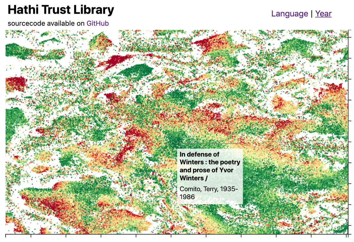
This blog post introduces the WebGL components which we recently added to D3FC, this suite of components make it easy to render charts with very large numbers of datapoints using D3. Throughout this post I'll describe the creation of the following visualisation, which displays 1…
Learn D3: A guided tour of your first steps using D3, by Mike Bostock

A guided tour of your first steps using D3.
Introduction to D3 / MIT Visualization Group / Observable

So far in 6.859, we've primarily been working with visual analysis grammars like Vega-Lite or VizQL (Tableau). These grammars break visualization design down into a process of specifying mappings (or visual encodings) between data fields and the properties of graphical objects…
Zoomable Treemap

This treemap supports zooming: click any cell to zoom in, or the top to zoom out.
Zoomable Area Chart

This zoomable time series area chart shows the number of flights per day. The effect of the September 11, 2001 attacks on air travel is evident.
Bar Chart Race, Explained

This is a pedagogical implementation of an animated bar chart race. Read on to learn how it works, or fork this notebook and drop in your data! The data for the race is a CSV with columns date (in YYYY-MM-DD format), name, value and optionally category (which if present…
✚ How to Make a Tiled Bar Chart with D3.js

Show individual data points by splitting bars into smaller cells.
D3 circle scattering