Book of Shapes
A curated gallery of generative patterns. Discover, customize, and download unique algorithmic art.
A curated gallery of generative patterns. Discover, customize, and download unique algorithmic art.
An interface as well as documentation to the GraphViz program and DSL
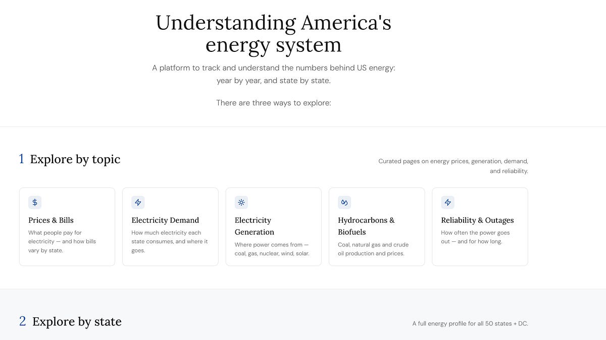
Trying to make some of the richest energy data in the world accessible and understandable.


An overview of techniques I’ve used to generate random gradient images.

Move over, ChatGPT and Gemini. Anthropic's AI chatbot can perform some fantastically useful feats—if you know what to ask.
Section 2 of Chapter 5: Why the diagram succeeds when a sentence may fail, and how different modalities work in cognition?
An interactive introduction to the chart at the heart of RF engineering.

High‑quality 3D medical imaging data is the foundation of modern radiology AI, but access to it is often constrained by data scarcity, privacy restrictions…
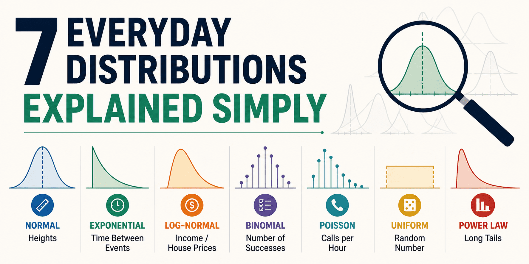
This article is a quick, everyday tour of seven distributions you'll actually recognize once you know what to look for. No heavy math. No gatekeeping.
The "Everything's Equally Likely" Pattern
The "How Many Successes?" Counter
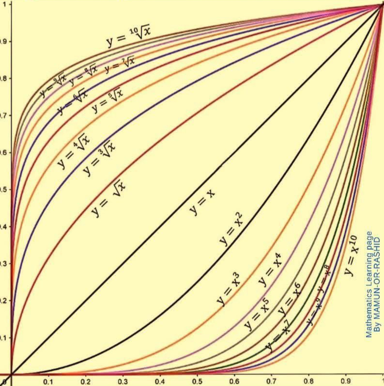
Beauty in mathematics is not only in solving problems. It is in seeing structure, symmetry, and quiet unity where most people only see numbers.
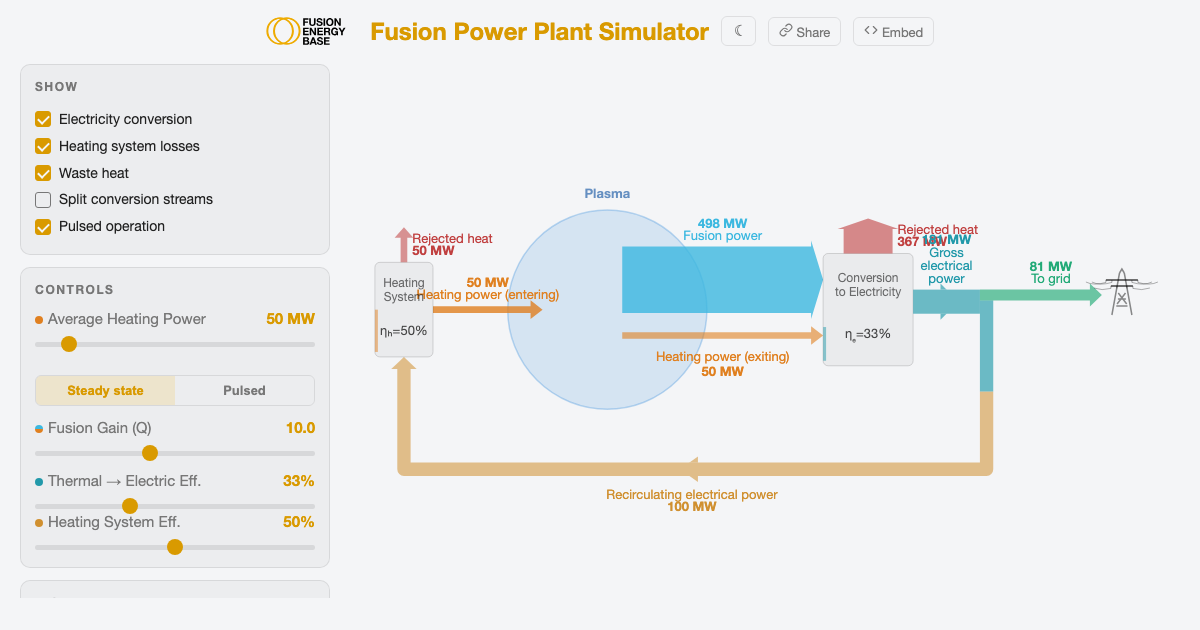
Interactive diagram showing energy flows in a fusion power plant. Adjust Q, conversion efficiency, and heating system efficiency to explore how plasma gain translates to net electricity.
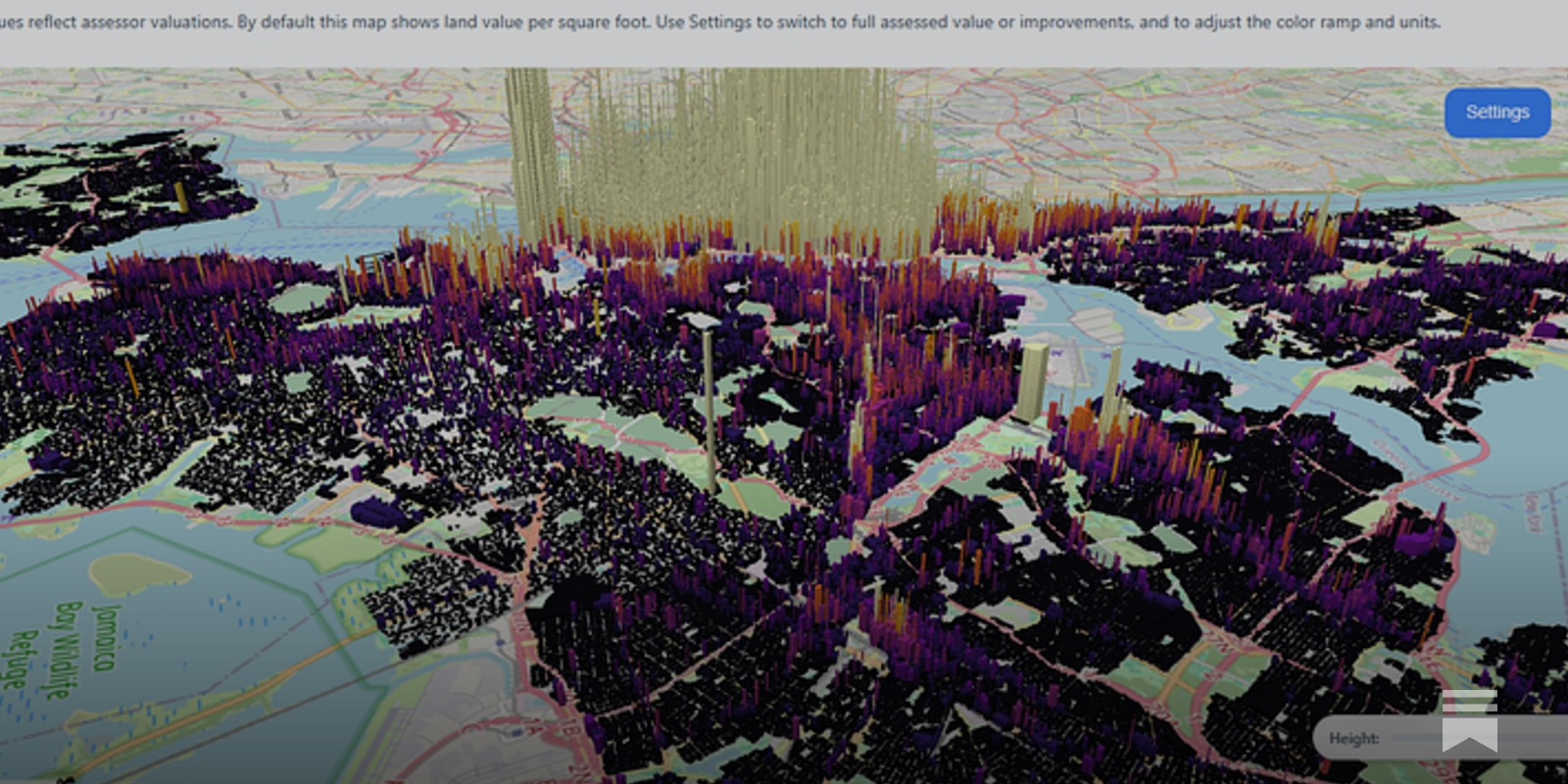
An underrated strategy for urbanist persuasion, powered by open source tools

Deriving the basic mathematical properties of the Smith chart from electrical engineering
In this article, I'll explain how to automate 80% of the initial analysis and generate an EDA report with just one line of Python code.

Master fast, powerful ways to visualize data with these compact, ready-to-use Python one-liners.

This collection of tutorials from our sister site Statology center on data visualization. Learn more about visualizing your data right here.
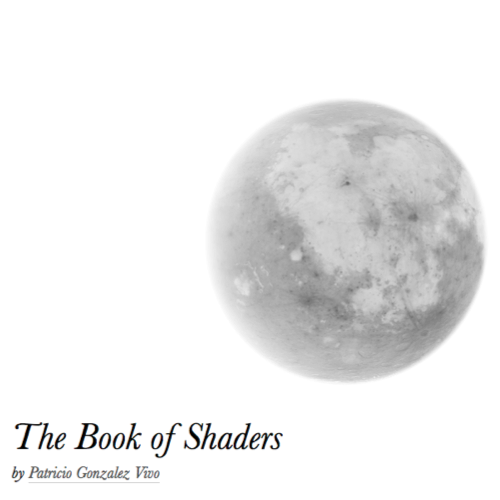
Gentle step-by-step guide through the abstract and complex universe of Fragment Shaders.
This Sprint focuses on Yellowbrick, a Python visualization library that extends the scikit-learn API to incorporate visual diagnostics in your machine learning workflow.
A 2D cloth Verlet simulation made in Rust
Apache ECharts, a powerful, interactive charting and visualization library for browser
Create diagrams and visualizations using text and code.
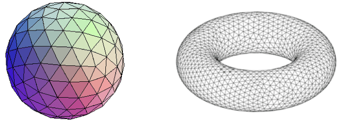
Motivation • Dimensionality reduction is vital to the analysis of high dimensional data, i.e. data with many features. It allows for better understa…
Generation of diagrams like flowcharts or sequence diagrams from text in a similar manner as markdown - mermaid-js/mermaid
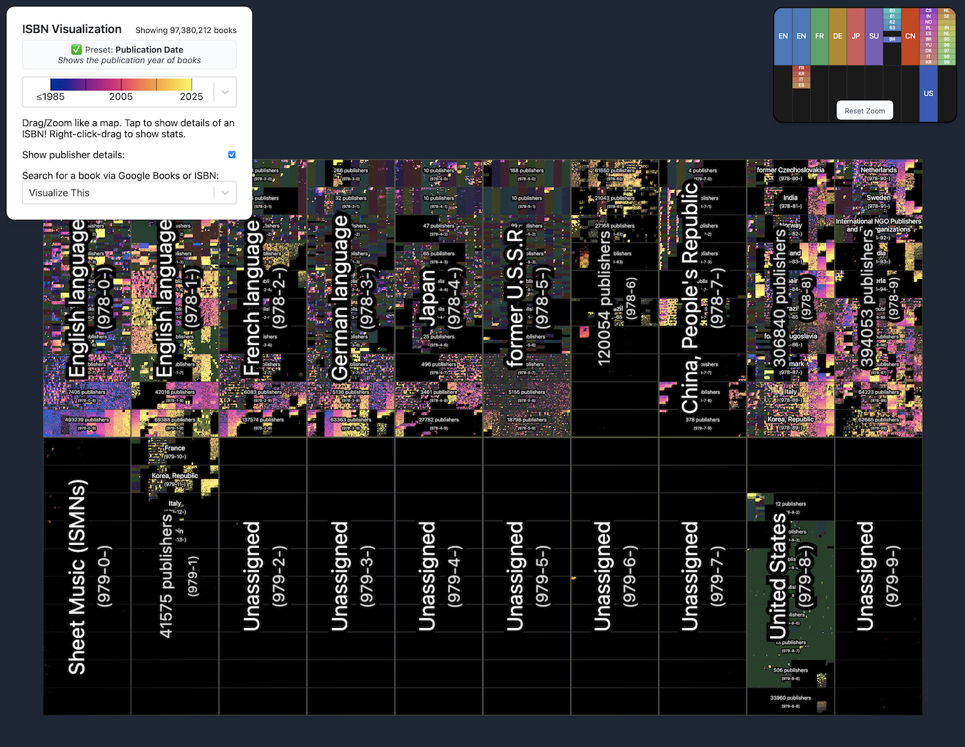
To show a catalog of almost 100 million books in one view, phiresky mapped them based on International Standard Book Numbers, or ISBNs, with an interactive visualization.
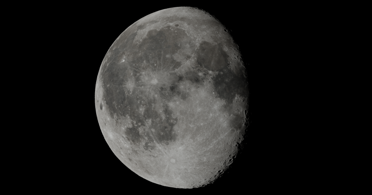
Interactive article about the Moon
A list of the most powerful R packages to create stunning graphs.
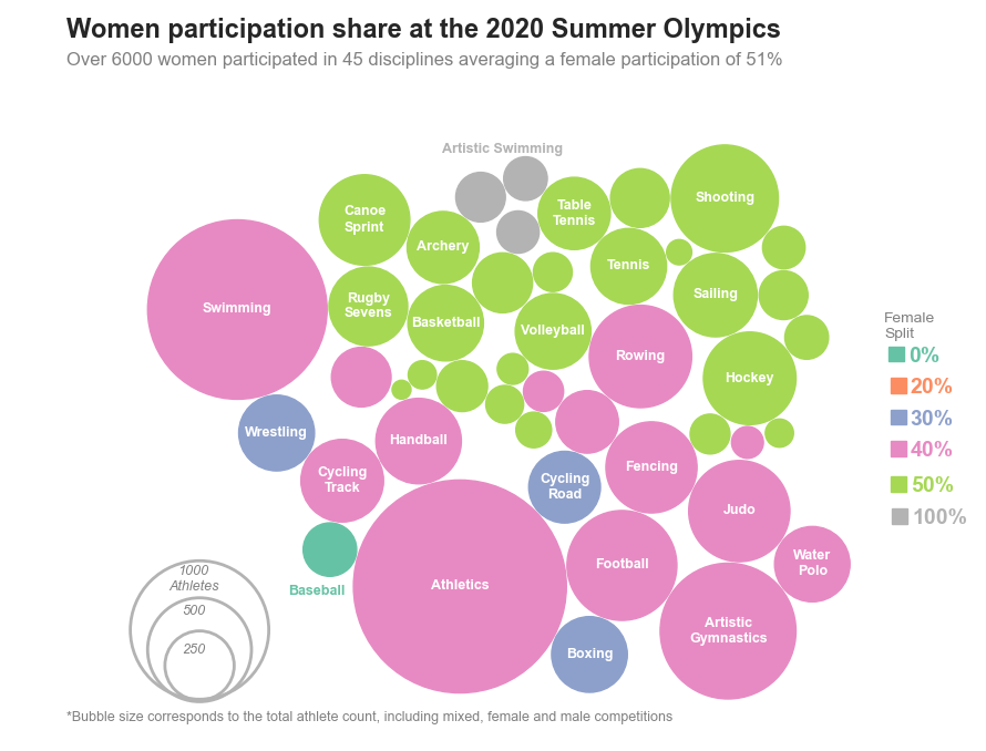
Ever wished to design those beautiful Tableau based packed bubble charts? Follow along for a tutorial on the Matplotlib solution

Create your first run chart and start interpreting your data using just four rules. Your go-to QI resource.
So, you’ve mastered the basics of ggplot2 animation and are now looking for a real-world challenge? You’re in the right place. After reading this one, you’ll know how to download and visualize stock data change through something known as race charts. You can think of race charts…

Something a llttle different: Hexbin maps by Jerry Tuttle I recently became acquainted with hexbin maps, so I thought I would experiment with one. In a hexbin map, each geographical region is represented by an equall...
Decent Patterns is a collective effort to further the adoption of decentralized technologies by providing open tooling and resources for the community.
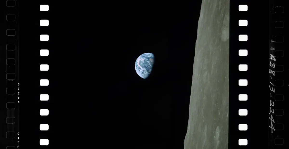
Can designers defend pursuing beauty when communicating science or innovation?
Decent Patterns is a collective effort to further the adoption of decentralized technologies by providing open tooling and resources for the community.
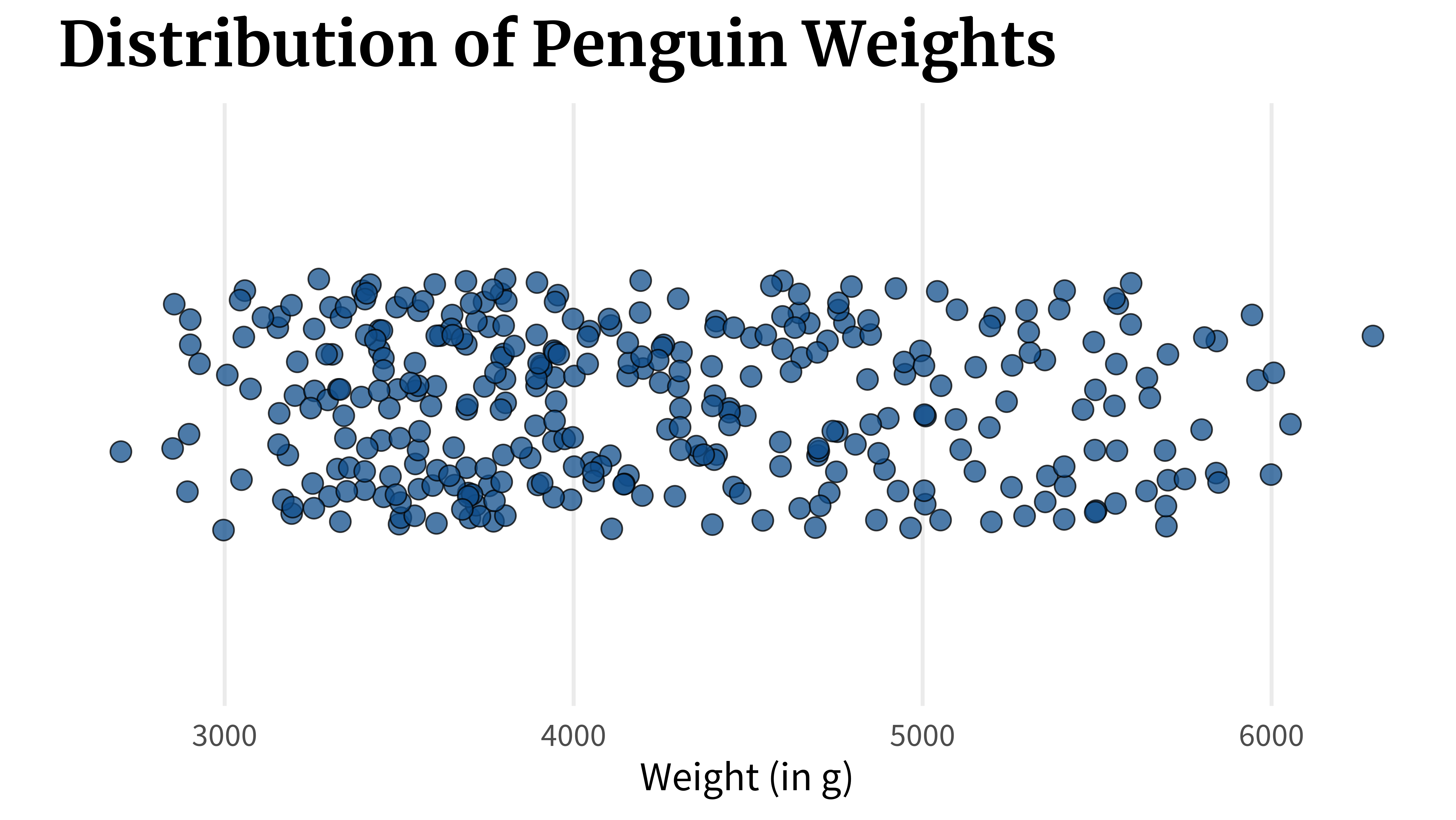
Box plots are a very common tool in data visualization to show how your data is distributed. But they have a crucial flaw. Let’s find out what that flaw is. And if you’re interested in the video version of this blog post, you can find it here: ...
true

In this article, I'll take you through some advanced data visualization concepts you should know to enhance your graphs.
Bubble charts are an engaging way to visualize groups of people or events. Flourish allows you to create interactive bubble charts with multiple image and label options.
Easily document cables and wiring harnesses.
Create diagrams and visualizations using text and code.

Diagrams are the cornerstone of software development, illuminating complex systems and fostering...
Bloom effects are typically used to enhance the brightness and lighting effects of images or scenes,...
Use Python’s statistical visualization library Seaborn to level up your analysis.


Learn graphical text analysis with NLTK