Airfoil – Bartosz Ciechanowski
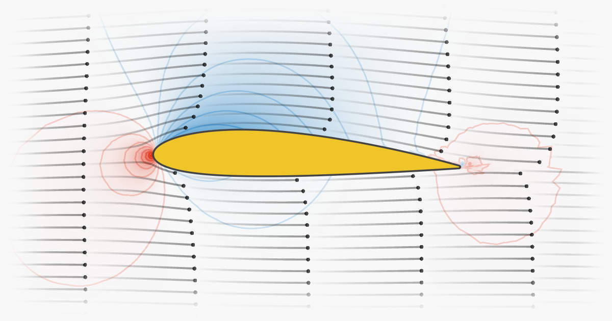
Interactive article explaining the physics of an airfoil and what makes airplanes fly
Interactive article explaining the physics of an airfoil and what makes airplanes fly
Community website for Apache Superset™, a data visualization and data exploration platform
Matrix Product Interpretations and Visualizations: Learn Linear Algebra from scratch. Build a foundation for Machine Learning and other key technologies.
For me, mathematics cultivates a perpetual state of wonder about the nature of mind, the limits of thoughts, and our place in this vast cosmos (Clifford A. Pickover - The Math Book: From Pythagoras to the 57th Dimension, 250 Milestones in the History of Mathematics) I am a big…
Consistently beautiful plots with less code and minimal effort

Turn a government PDF into a financial planning tool

Use 3D to visualize matrix multiplication expressions, attention heads with real weights, and more.
How to visualize decision tree models with this useful library

This is the good stuff for March.

Learn how to design beautiful tables in R! Join our workshop on Designing Beautiful Tables in R which is a part of our workshops for Ukraine series. Here’s some more info: Title: Designing Beautiful Tables in R Date: Thursday, April 27th, 18:00 – 20:00 CEST (Rome, Berlin, Paris…

DISCLAIMER: This blog post was written by a human with the help of AI Hypotrochoids and epitrochoids...
Voilà turns Jupyter notebooks into standalone web applications
Utilising Python’s Matplotlib to Create Advanced Data Visualisations
Charts are a powerful tool for data visualization, but with so many chart types available, it can be...
A quick guide on how to make clean-looking, interactive Python plots to validate your data and model
An Introduction to the PyGWalker Library for Easy Data Visualisation
A React+D3 animated bubble chart.

Written by Mads Stoumann✏️ Not so long ago, these beautiful posters showed up in an advertisement on...
Learn how to quickly create a presentation-ready plot to aid your data storytelling
A Great Alternative to Pie Charts for Data Visualisation
A practical introduction.
Better alternatives to scatter, bar, and line plots.
A command line tool that draw plots on the terminal. - red-data-tools/YouPlot

Four ways how to use drawing to get more ideas: Study, Explore, Develop, and Show. They will boost your creativity.

Obsidian Canvas gives you infinite space to research, brainstorm, diagram, and lay out your ideas.

Step 1. Create a grid Use d3.geoGraticule10 to create lines of constant longitude and latitude. Step 2. Apply clipping Set projection.clipAngle to 90° to show only the front hemisphere. Stroke the outline of the sphere to better separate the globe from the background. Step 3…

D3’s projections use adaptive sampling to increase the accuracy of projected lines and polygons while still performing efficiently. Without sampling, only the input vertices of polygons are projected. This results in the artifacts (visible above) due to projected lines becoming…
The JavaScript library for bespoke data visualization
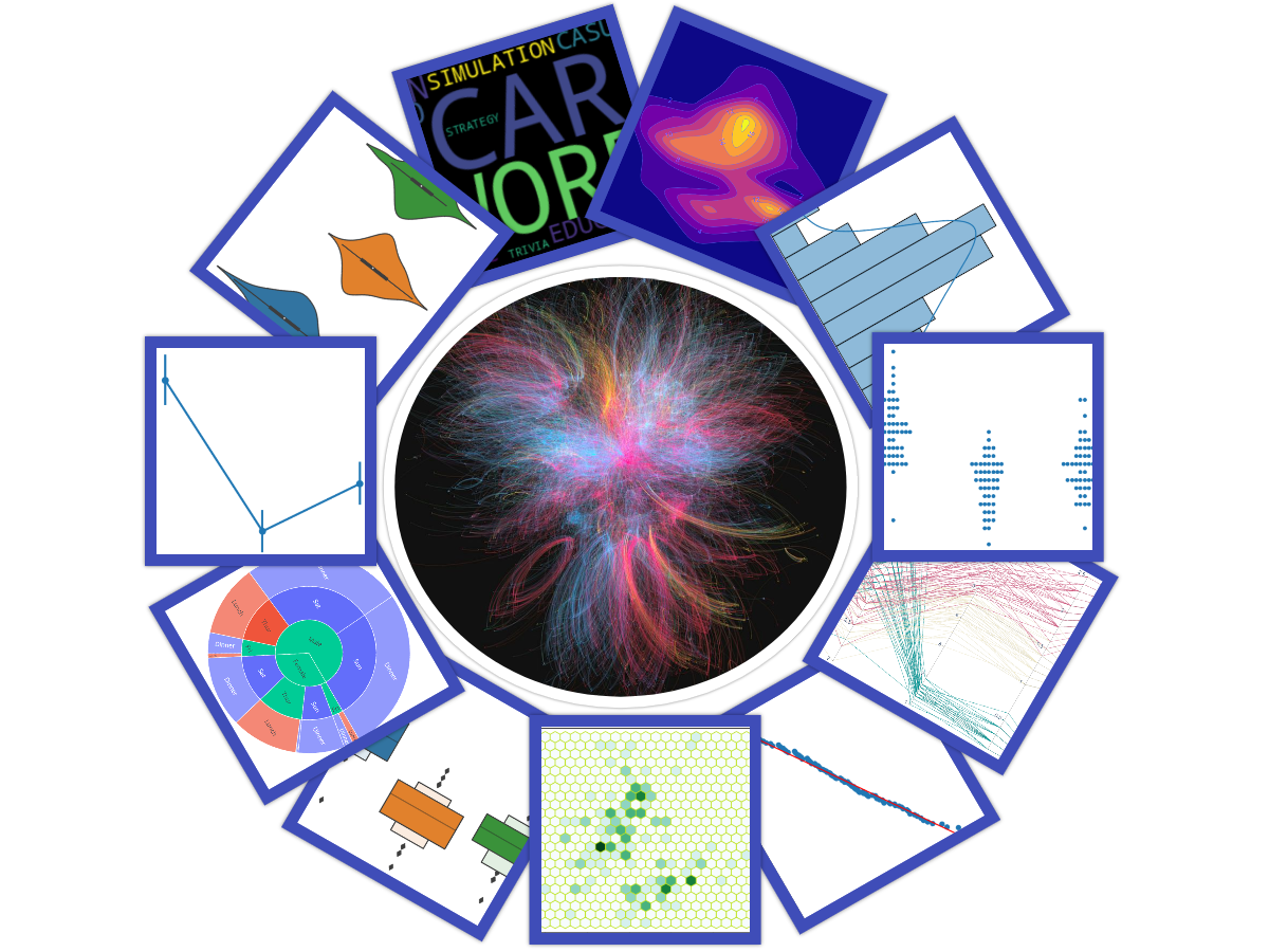
Some Unique Data Visualization Techniques for Getting High-Level Insight into the Data

Posted by Mahima Pushkarna, Senior Interaction Designer, and Andrew Zaldivar, Senior Developer Relations Engineer, Google Research As machine learn...

Using a heatmap to visualise a confusion matrix, time-series movements, temperature changes, correlation matrix and SHAP interaction values
Simple and easy pieces of code to enhance your seaborn scatter plots
A guide on how to make different types of maps using Python
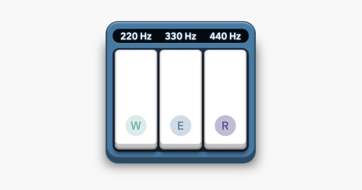
Interactive article explaining how sound works.
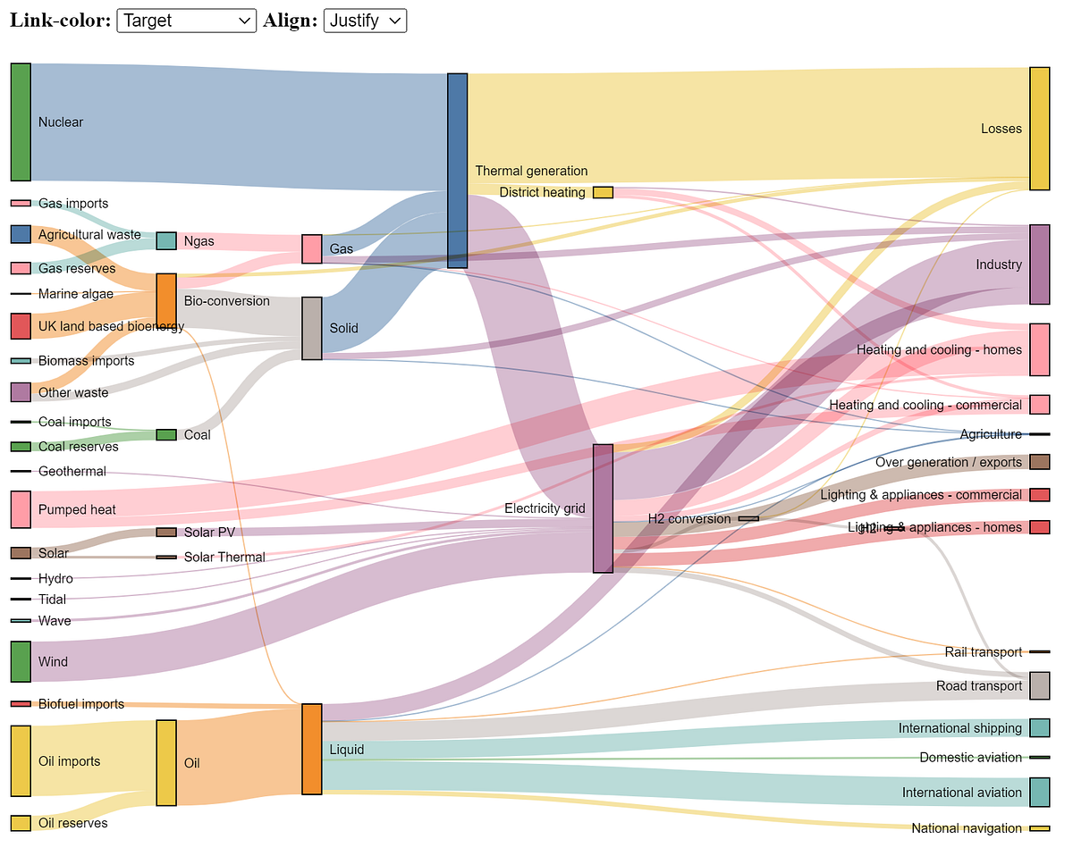
The Sankey chart is a great way to discover the most prominent contributions just by looking at how individual items flow across states.

We look at how to create the 12 most useful graphs and charts in Python and Streamlit
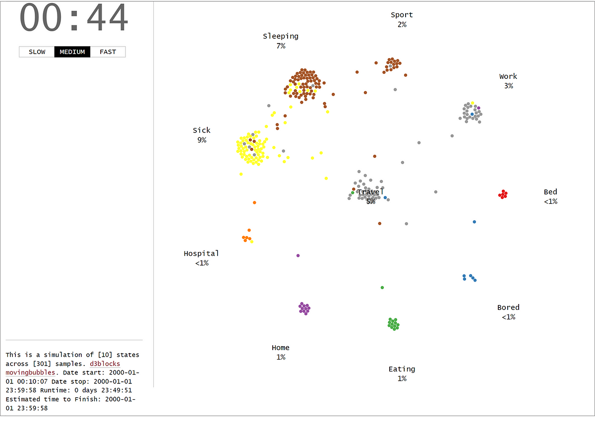
The MovingBubble chart is one of those mind-blowing charts to look at. Learn how to create them using your own data set and Python!

Mix and match plots to get more information from a scatter plot
A guide to making visualizations that accurately reflect the data, tell a story, and look professional.
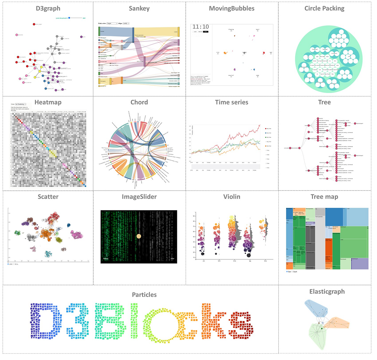
Create interactive, and stand-alone charts that are built on the graphics of d3 javascript (d3js) but configurable with Python.

Let’s catch those high-dimensional outliers
Effective interactive data visualizations in R

Creating eye-catching graphs with Python to use instead of bar charts.
Build the next generation of Location Intelligence applications with the Targomo API

Learn how to create isochrones for different transport modes with our free isochrone map generator, Isochrone API or software plugins.
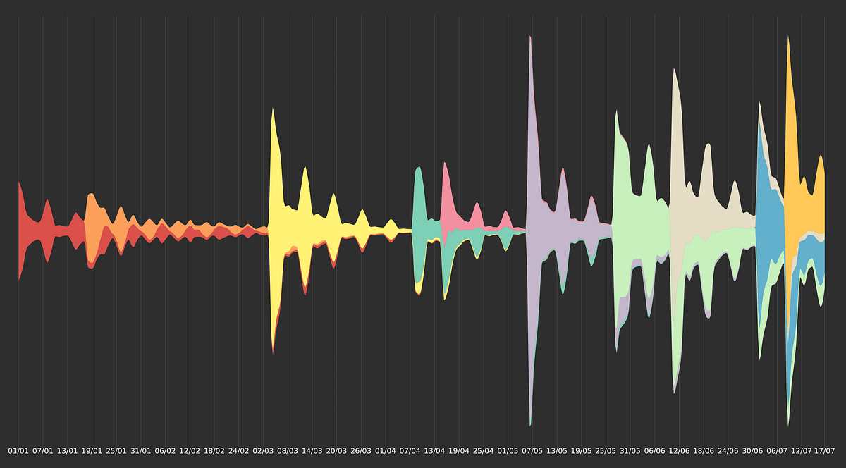
The good-looking cousin of stacked area charts