4 Quick Tricks For Better Plots in Matplotlib
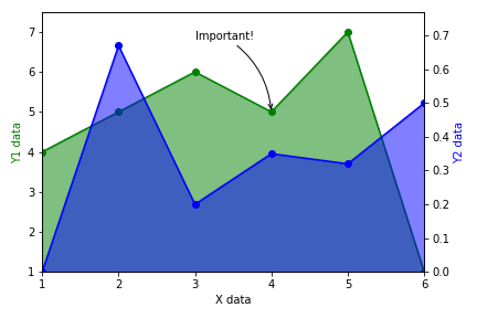
Easily adding arrows, multiple axes, gradient fill, and more
Easily adding arrows, multiple axes, gradient fill, and more
DOT rendering programs and utilities.
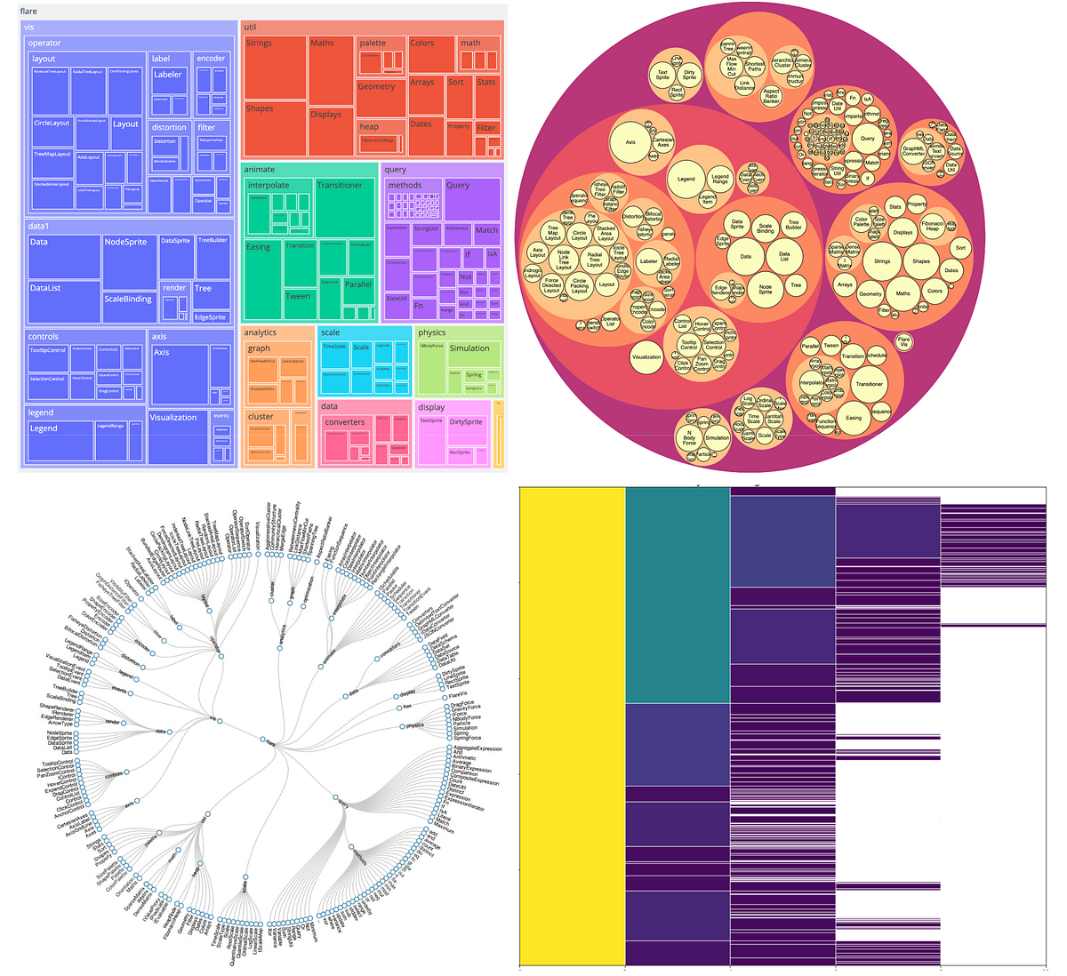
Create a variety of data visualizations with hierarchical data

Animation can help people make sense of all the data at their fingertips.

Here’s the good stuff for June.

This chart shows the relationship between idle and eruption times for Old Faithful. See also the importable chart component version of this example.
All the data in the world won’t do anyone any good if we can’t make sense of it. Or better yet, make it sing. Here are some stunning examples of data visualization in the wild, and some pointers on how to start making your own.

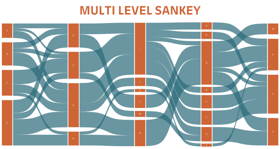
A Sankey diagram is a collection of nodes which are connected with each other to show data flow or hierarchical data connected from one to another.
Data visualization breaks down complex data values into simple and flexible elements that you can easily deal with without being worried.
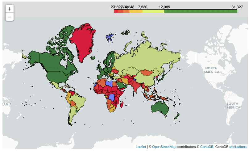
Using the Folium Package to Create Stunning Choropleths

Adobe Photoshop is still the king of the graphics software industry, by name if not in practice. It is still the bread and butter of artists, designers, illustrators, and creatives, even when there are more focused applications available, like ones for making comics or manga…
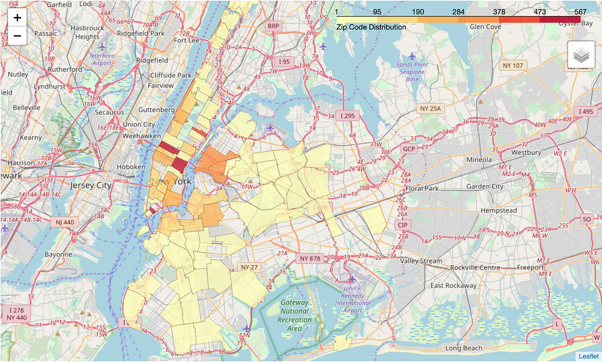
How to make choropleths with different data structures in Python

Smart SVG techniques, from generative SVG grids to SVG paths with masks, grainy SVG gradients, cut-out effects and fractional SVG stars. Let’s look at some magical SVG techniques that you can use right away.
SVG is an awesome and incredibly powerful image format. This tutorial gives you an overview of SVG by explaining all you need to know in a simple way
Learn how to visualize data using Seaborn’s axes-level and figure-level plots
Exploring some of the best visualization options for data science projects with the Seaborn library
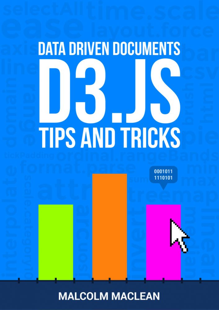
Download D3 Tips and Tricks v3.x ebook for free
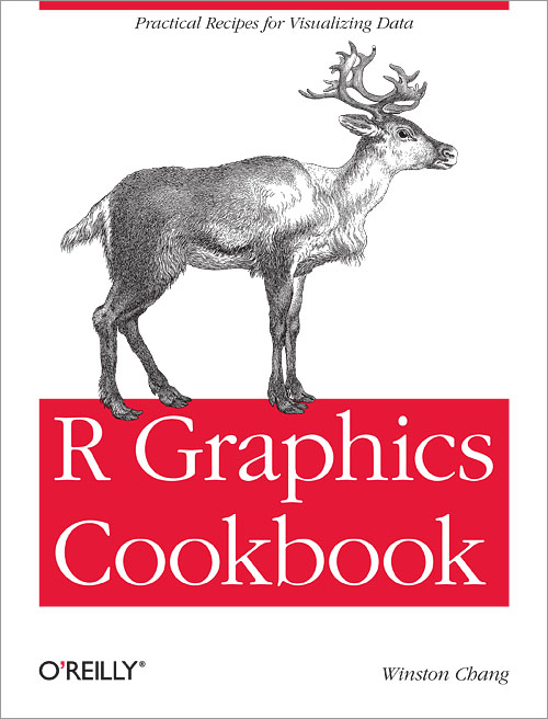
This cookbook contains more than 150 recipes to help scientists, engineers, programmers, and data analysts generate high-quality graphs quickly—without having to comb through all the details of R’s graphing systems. Each recipe tackles a specific problem with a solution you can…

If the recent discrimination allegations against Pinterest are leaving you uninspired (if not quesy), here are some great alternatives.
R graphics tutorial: scatterplots with anti-aliasing, using the Cairo library. Two lines of code to make much better visualizations in R.
Based on scatterplot by Myriam Barnes. A simple to viz categories in a scatter plot. - bjpcjp/category-scatterplot
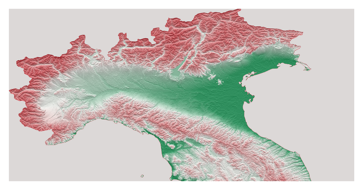
Who needs GIS when you can build eye-catching 3D topography maps with Python?

Also known as ridgelines, use the method to create a compact visualization where you can easily identify major patterns and outliers.
Interactive Tools for Machine Learning, Deep Learning and Math - Machine-Learning-Tokyo/Interactive_Tools
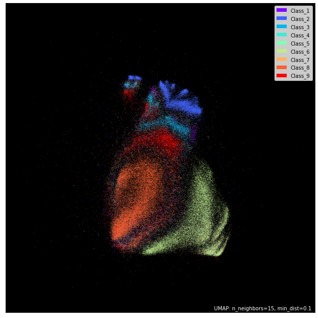
Create breathtaking visuals and “see” your data

Using “Kneedle” algorithmus detecting knees with Python package “kneed”
Visualize flow between nodes in a directed acyclic network. - d3/d3-sankey
Should you bypass Matplotlib?
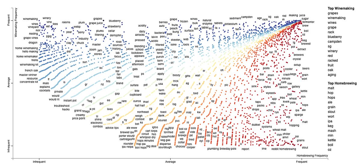
Scroll down to see how to interpret a plot created by a great tool for comparing two classes and their corpora.

Data analysis and visualization have always been extremely important issues in the professional environment and a fundamental tool for decision-making in companies. In this environment, Microsoft…
Publication-quality data representation library based on Matplotlib. - alopezrivera/mpl_plotter
Sample files to accompany the FT's Chart Doctor column - Financial-Times/chart-doctor
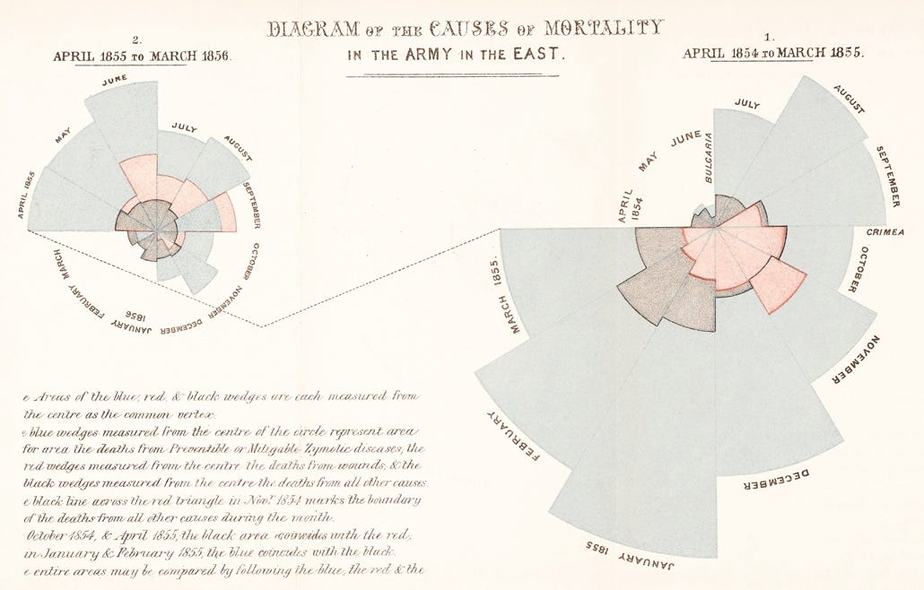
A short excursion into the world of human visual information processing

I recently wrote a post about visualizing weather data from NOAA. We walked through processing the data and making some basic interactive maps with Plotly. In this article I want to use the same data…
A D3 project showing a barchart that allows user interactions
Intuitive Math Descriptions

Create PDF reports with beautiful visualizations in 10 minutes or less.
Strip charts are extremely useful to make heads or tails from dozens (and up to several hundred) of time series over very long periods of…
Sample files to accompany the FT's Chart Doctor column - Financial-Times/chart-doctor
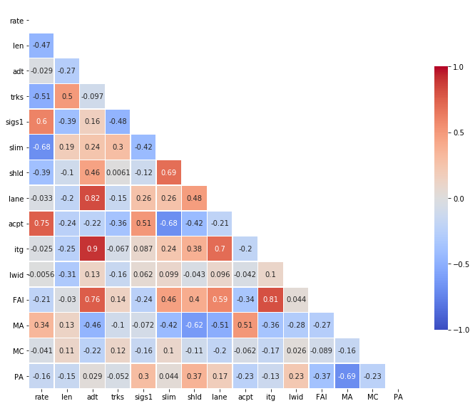
A heatmap is a graphical representation of data in which data values are represented as colors. That is, it uses color in order to…

Creating usable, readable treemaps is difficult. They are a complex, area-based data visualization for hierarchical data that can be hard to interpret precisely.

Looking for a good D3 example? Here’s a few (okay, …) to peruse. Animation D3’s data join, interpolators, and easings enable flexible animated transitions between views while preserving object constancy. Interaction D3’s low-level approach allows for performant incremental…

How to build a treemap with Javascript and D3.js: from the most basic example to highly customized examples.