A Step by Step Guide to Interactive Choropleth Map in Python
Learn to Develop Choropleth Map Easily Using Python’s Folium Library
Learn to Develop Choropleth Map Easily Using Python’s Folium Library
Library of impossible figures. There's greyscale and wireframe versions of figures.
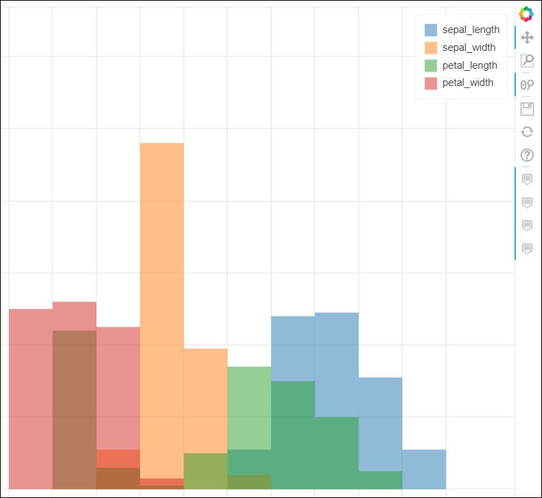
Create stunning visualizations for Pandas DataFrames
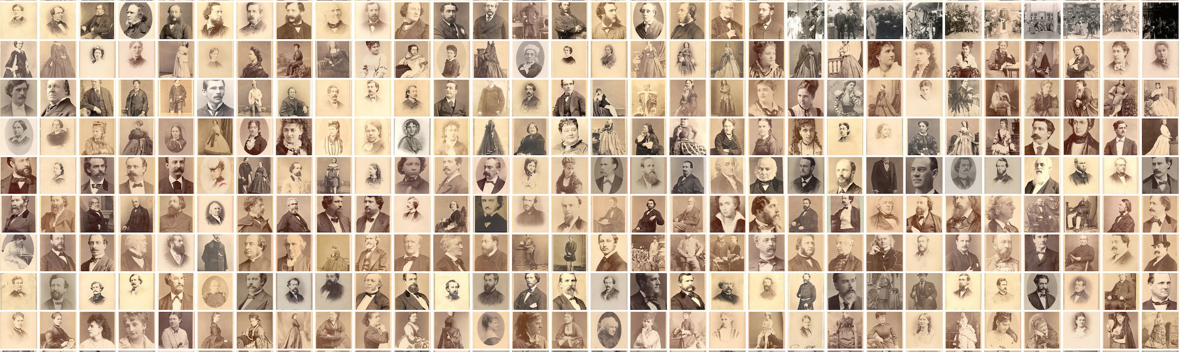
Working notes & digital experiments

If the recent discrimination allegations against Pinterest are leaving you uninspired (if not quesy), here are some great alternatives.
I have been working as a Data Analyst for almost 5 years now but, in this time I have mostly used business intelligence software for all…
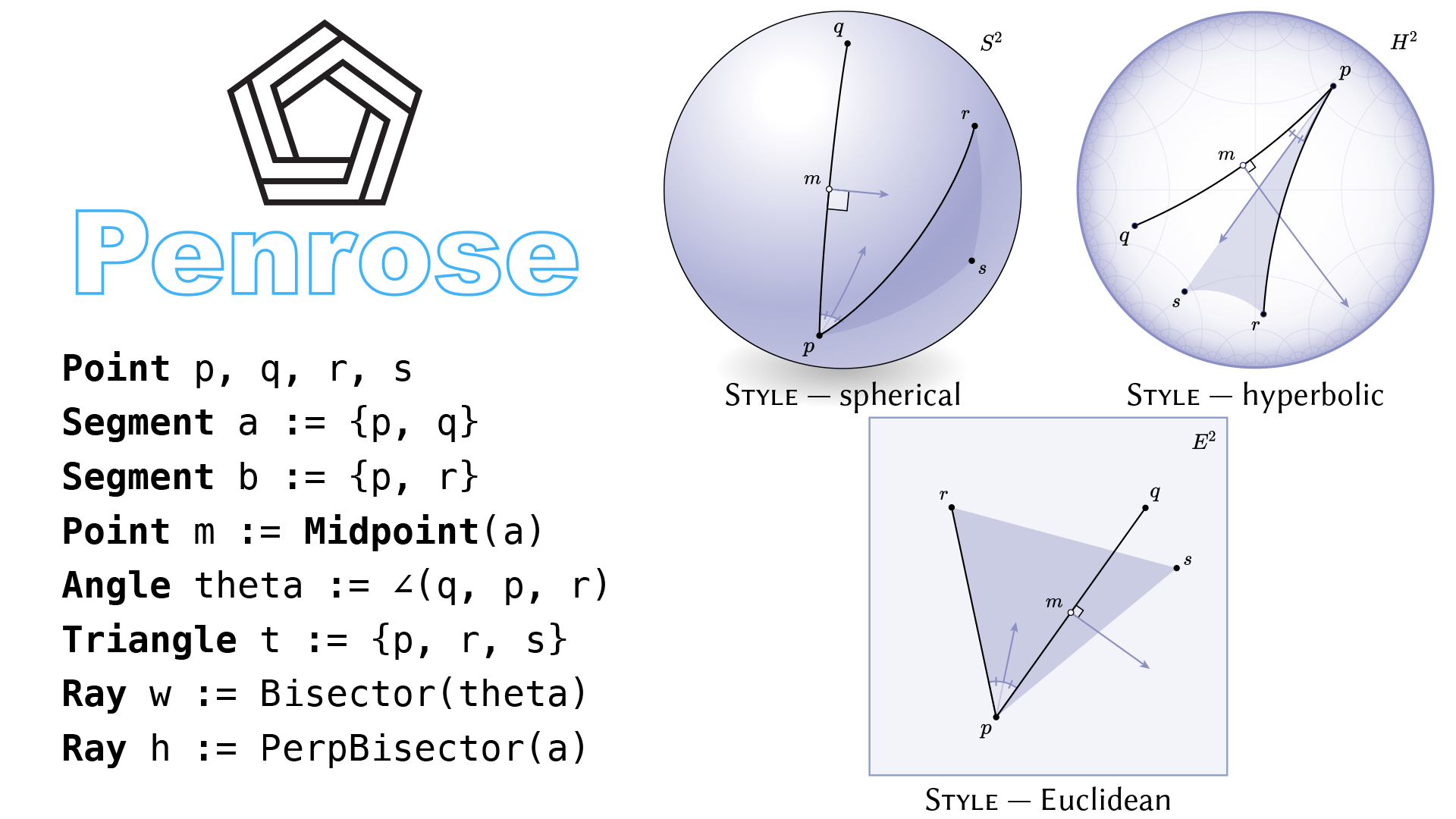
Materials from our SIGGRAPH '20 paper.
Confused about which Visualization Tool to Use? I Broke Down the Pros and Cons of Each Libary for You
But really should know

A circular chart shows proportion and position relationships implemented in Python Plotly

Estimated population by county, 2016. See also the bubble map as an alternative presentation of this data, and an alternative implementation with Observable Plot. Data: American Community Survey This dataset comes from the U.S. Census API and contains three columns: the…
Choropleth Maps using Plotly to track COVID 19 cases.
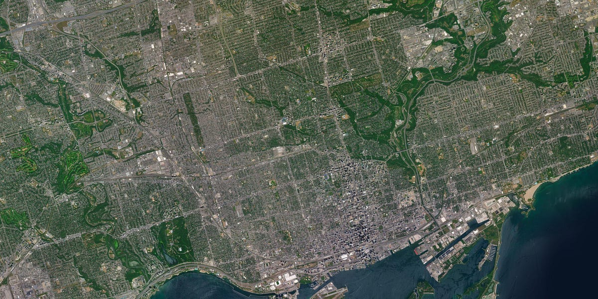
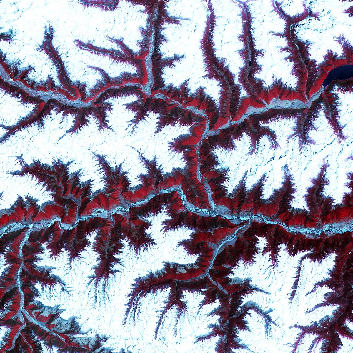
Ultra high resolution satellite and elevation imagery
A step by step guide on creating and plotting Voronoi diagrams in Python

A Picture is worth a thousand words. Literally! there are 2200+ words in this picture. 😱
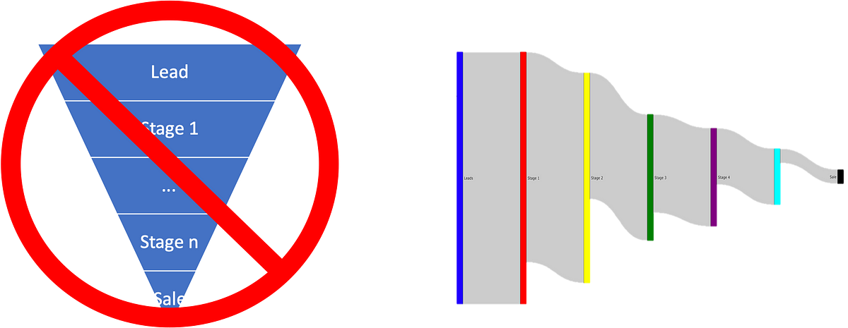
Traditional sales visualizations miss critical information about what is happening in the sales process.
A Walkthrough on Hyperspectral Image Analysis Using Python.
Histograms and Kernel Density Estimators explained with bricks and sandpiles
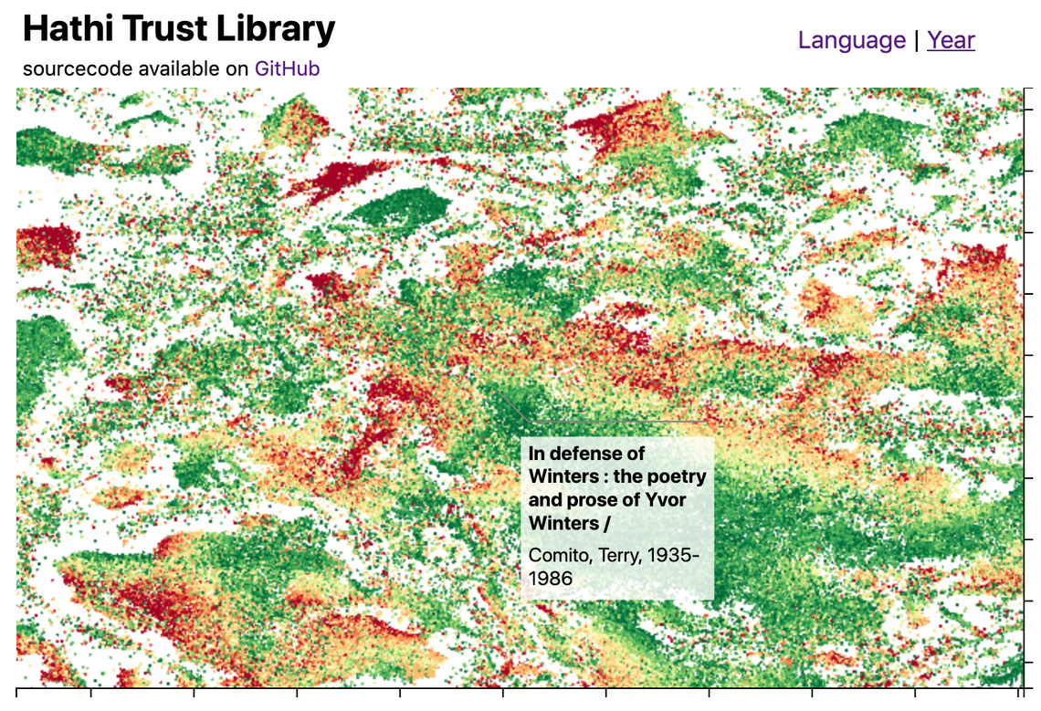
This blog post introduces the WebGL components which we recently added to D3FC, this suite of components make it easy to render charts with very large numbers of datapoints using D3. Throughout this post I'll describe the creation of the following visualisation, which displays 1…
The new tools shows the potential of data visualizations for understanding features in a neural network.
Most common baby names in Barcelona
In real life, data preprocessing is really a pain for most data scientists. But with the help of data visualization libraries, it actually…
Seaborn is one of the most used visualization libraries and I enjoy working with it. In my latest projects, I wanted to visualize multiple…
Plotting heatmaps, contour plots, and 3D plots with Python
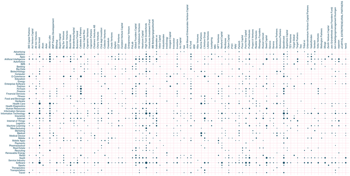
What if you can create a scatter plot for categorical features?
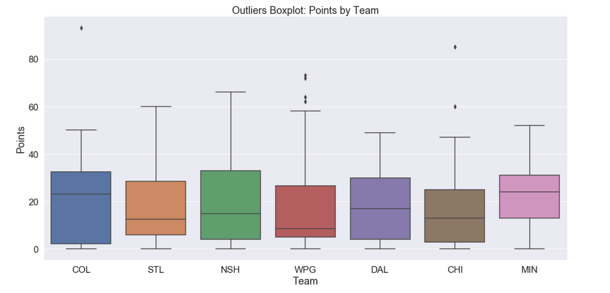
A walkthrough of many Seaborn tools using NHL Statistics

Create better population pyramids that allow for improved comparisons between sexes and populations.
a hub for learning through play

This treemap supports zooming: click any cell to zoom in, or the top to zoom out.

This zoomable time series area chart shows the number of flights per day. The effect of the September 11, 2001 attacks on air travel is evident.
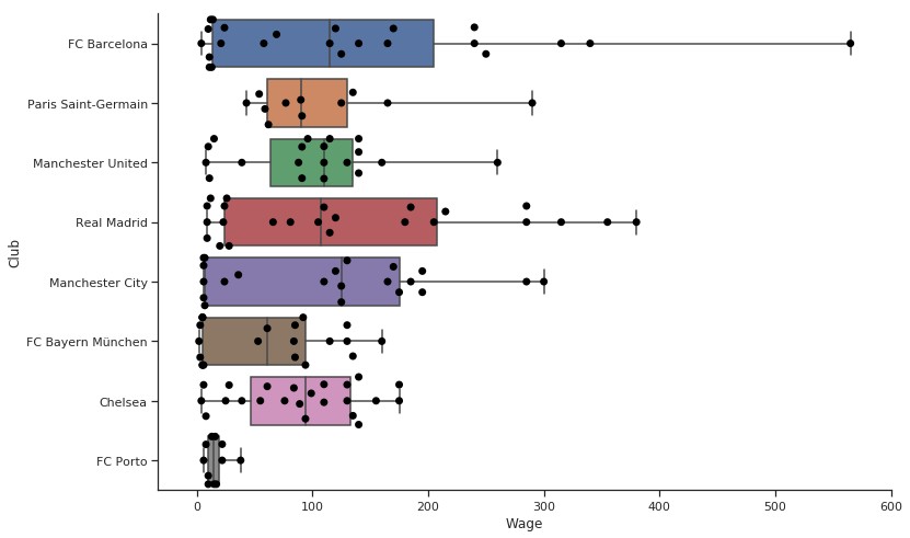
"Enter into picture Swarmplots, just like their name." https://lttr.ai/MJtZ #datavisualization #awesomevisualization #seaborn #python
Five Hundred and Seven Mechanical Movements, now Animated for the Internet.
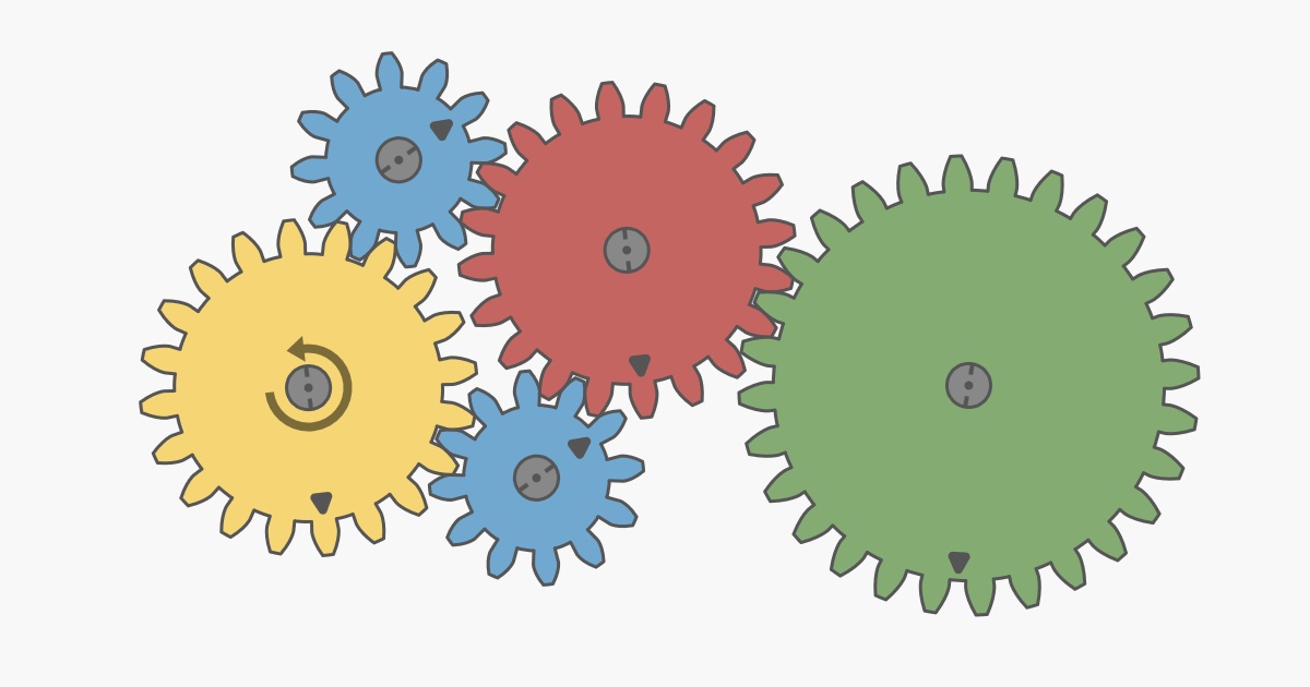
Interactive article explaining how mechanical gears work.
Visualize the flow of money

This is a pedagogical implementation of an animated bar chart race. Read on to learn how it works, or fork this notebook and drop in your data! The data for the race is a CSV with columns date (in YYYY-MM-DD format), name, value and optionally category (which if present…
Plotnine Tracking Example · GitHub
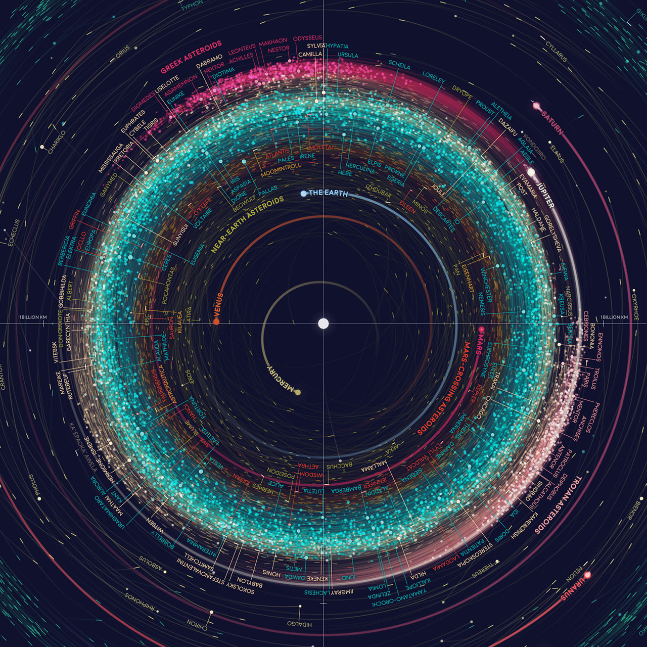
A map of over 18,000 asteroids in the Solar System.
In my previous blog post, I explained how I take lecture notes using Vim and LaTeX. In this post, I’ll talk about how I draw figures for my notes using Inkscape and about my custom shortcut manager.Some examples First, let me show you some examples of figures…
Bokeh is a Python library for creating interactive visualizations for modern web browsers. It helps you build beautiful graphics, ranging from simple plots to complex dashboards with streaming data...
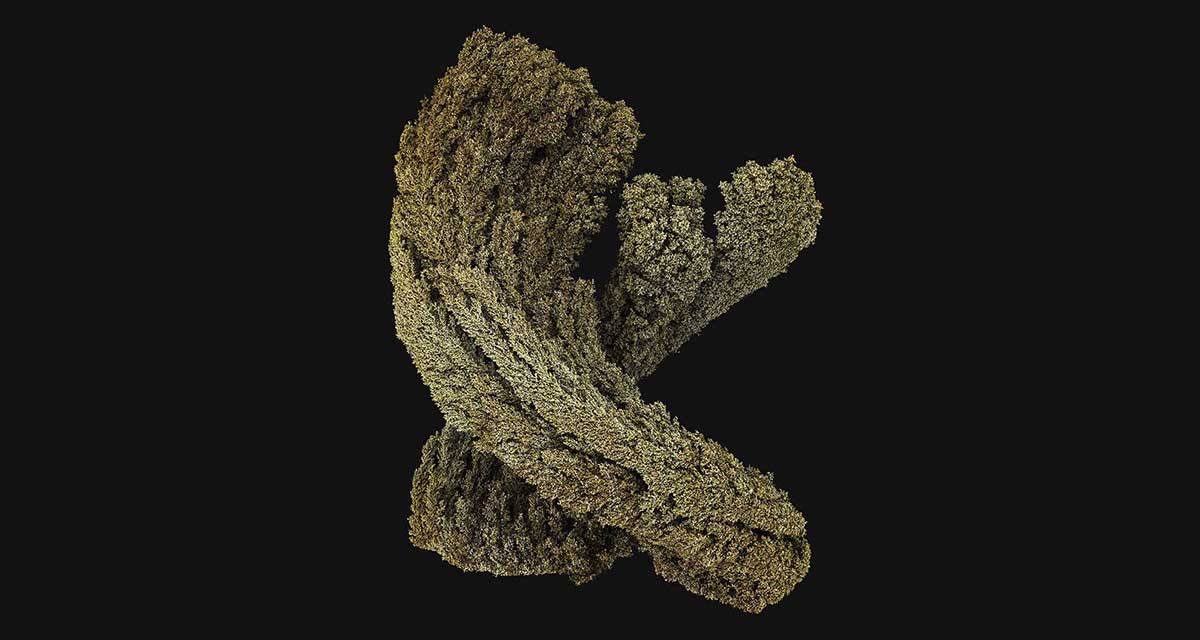
Emergence is the story of natural laws and processes, their inherent beauty, and their action to yield the universe, us and the world we live in.
Anaconda is the birthplace of Python data science. We are a movement of data scientists, data-driven enterprises, and open source communities.
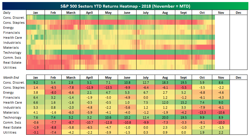
Stock market rotation has been a pretty big theme this year but you wouldn't necessarily know it from our sector performance heatmap.
An intuitive library to add plotting functionality to scikit-learn objects. - reiinakano/scikit-plot