A Practical Guide To Naming Things — Smashing Magazine

A practical guide to naming UI components, with useful resources, naming conventions, and structures.
A practical guide to naming UI components, with useful resources, naming conventions, and structures.
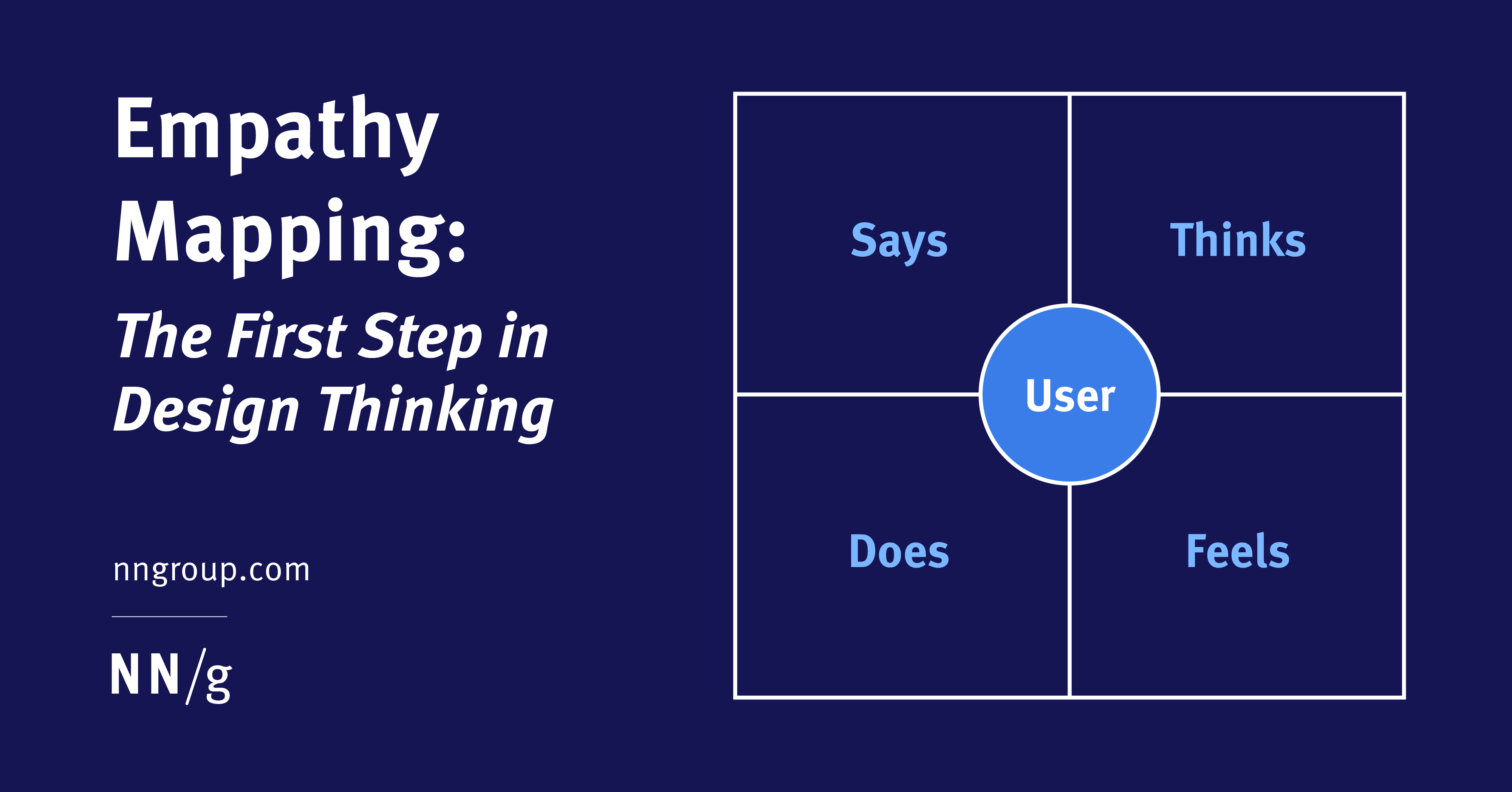
Visualizing user attitudes and behaviors in an empathy map helps UX teams align on a deep understanding of end users.

At 2:30 in the morning, the night clerk at the hotel is a great help if you’ve locked yourself out of your room. But if you want to complain about the hours of the gym, the hotel’s envi…

Most users dismiss the first step of a product tour within seconds. Here is why that happens, what users do instead, and the one pattern that actually drives activation.
Each nudge in your design is a silent choice about who you are designing for, the user or the business. This article deconstructs the psychology of micro-signals such as defaults, color hierarchy, and progress indicators and identifies where helpful guidance ends and…

A deep exploration of how aspect ratios shape perception, visual rhythm, and usability in modern interfaces. From grids to galleries to video players, this article dissects how proportion silently governs how users see, feel, and interact with content.
In an era of AI-generated-everything, AI-fatigued users want designs that look like they were made by a person.
In our increasingly digitized world, design is no longer just about beauty and usability — it’s about responsibility. Every checkbox ticked by default, every pre-selected plan, and every silent subscription carries a weight that goes beyond UI — it reflects the ethical stance of…
Success in modern UX isn’t about having the most content. It’s about having the most findable content. Yet even with more data and better tools than ever, internal search often fails, leaving users to rely on global search engines to find a single page on a local site. Why does…
Well-written informational microcopy should be clear, concise, and have character.
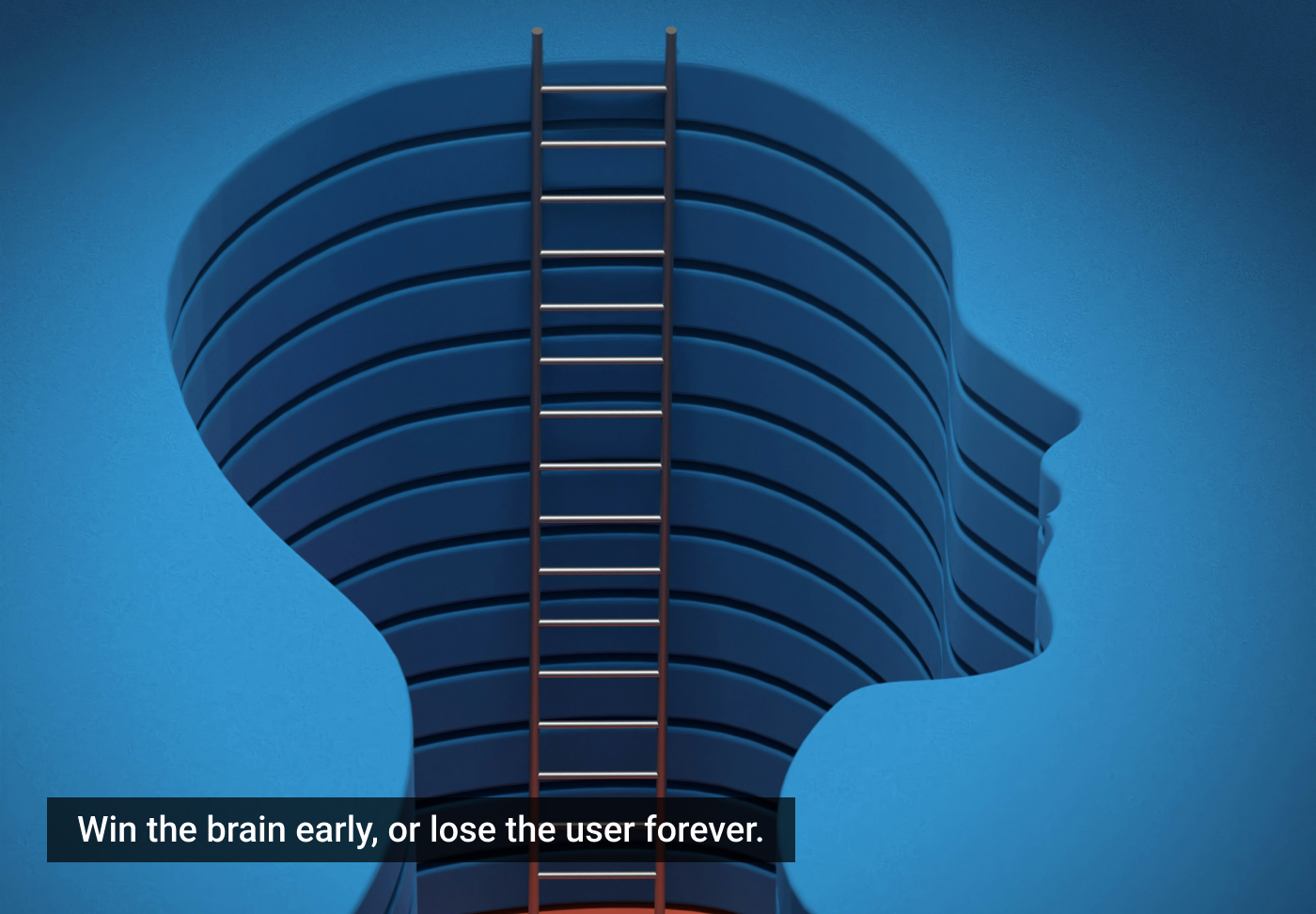
Your users judge your product before they understand it. Within the first 30 seconds, the brain has already made a decision. No feature, no UI polish, and no clever copy can override a broken first impression. Here's what's really happening inside the user's mind, and how to win…
What happens if you rebuild a single tooltip using the browser’s native model without the aid of a library? The Popover API turns tooltips from something you simulate into something the browser actually understands. Opening and closing, keyboard interaction, Escape handling, and…

Most teams worry about small changes to UI when users stop using the product. But research shows that the real problem is psychological friction. This is when your brain has hidden mental interruptions that make you think, "Maybe later." This article looks at the four types of…

Your product isn't failing because of bad design. It's failing because your team is designing in clarity while your users are drowning in chaos. The gap between how you think users behave and how they actually feel their way through your product is quietly breaking every flow…
The study guides and glossaries that were most popular in 2025.
Meet TARS — a simple, repeatable, and meaningful UX metric designed specifically to track the performance of product features. Upcoming part of the Measure UX & Design Impact (use the code 🎟 IMPACT to save 20% off today).

Unsure where to start? Use this collection of links to our articles and videos to learn how users interact with the web and how to design effective web user experiences.
The resources here are grouped under the following topics:
General Consideration on Web Usage Viewing Behaviors on the Web Eyetracking Gaze Patterns Web Interaction Design Content on the Web Link Usability Web Navigation Site Searching Crossplatform Experience Web Visual Design Web Design Trends Web Ecommerce
These 10 user-experience articles published in 2025 were those that our audience read the most.
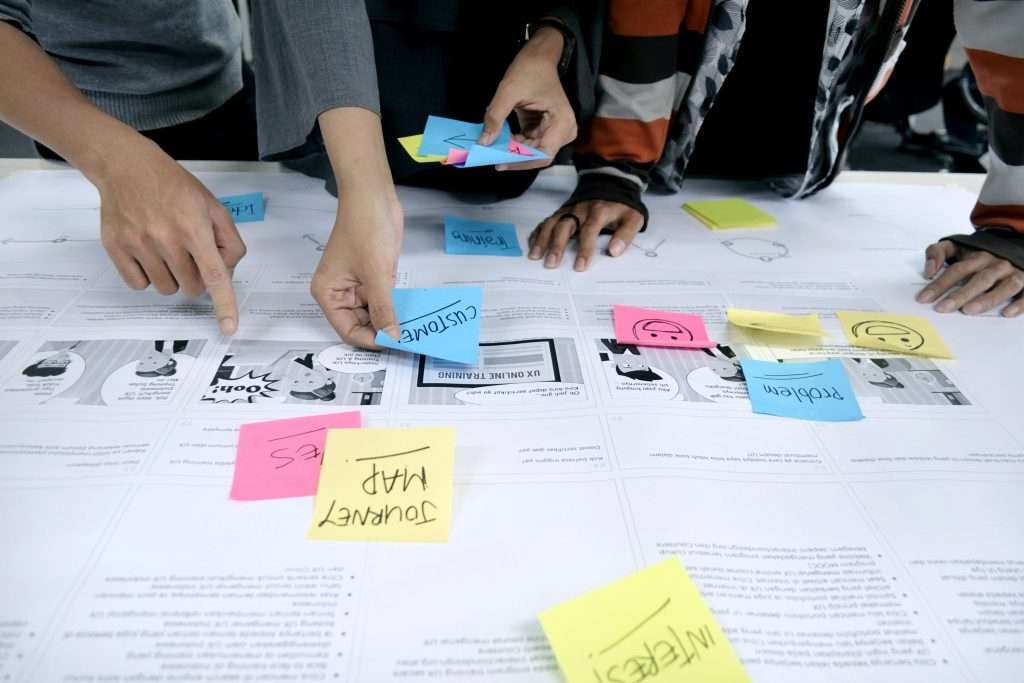
Mastering the Art of Customer Journey Mapping: A Step-by-Step Guide
Customer Persona
Phases

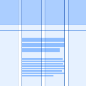
To create visually appealing designs, align typography and elements to a grid, establish a clear visual hierarchy, use color strategically, and be consistent in your application of various design elements.
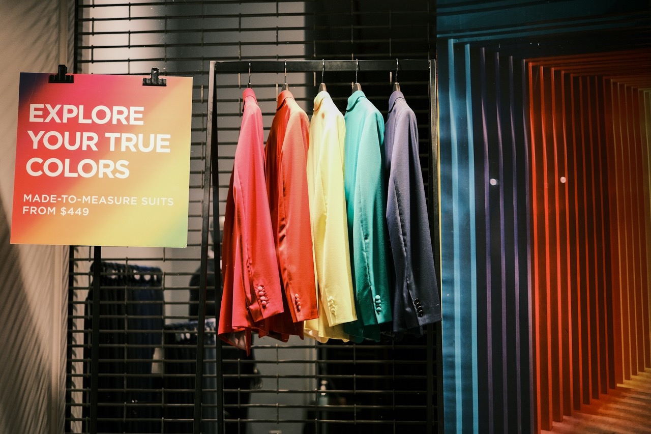
Step into a flagship on Oxford Street or a pop-up in Manchester and the same truth applies: what shoppers see first shapes what they do next. Visual cues, whether bold colour blocking, angled shelving, or lighting accents, are the quiet persuaders of retail. They do more than…
Streaming services like Netflix rely on hero carousels and thumbnail previews to guide viewers quickly to featured titles. The platform does not overwhelm users with choices. It uses visual hierarchy to make decisions feel effortless. Social media apps such as Instagram and TikTok use colour…
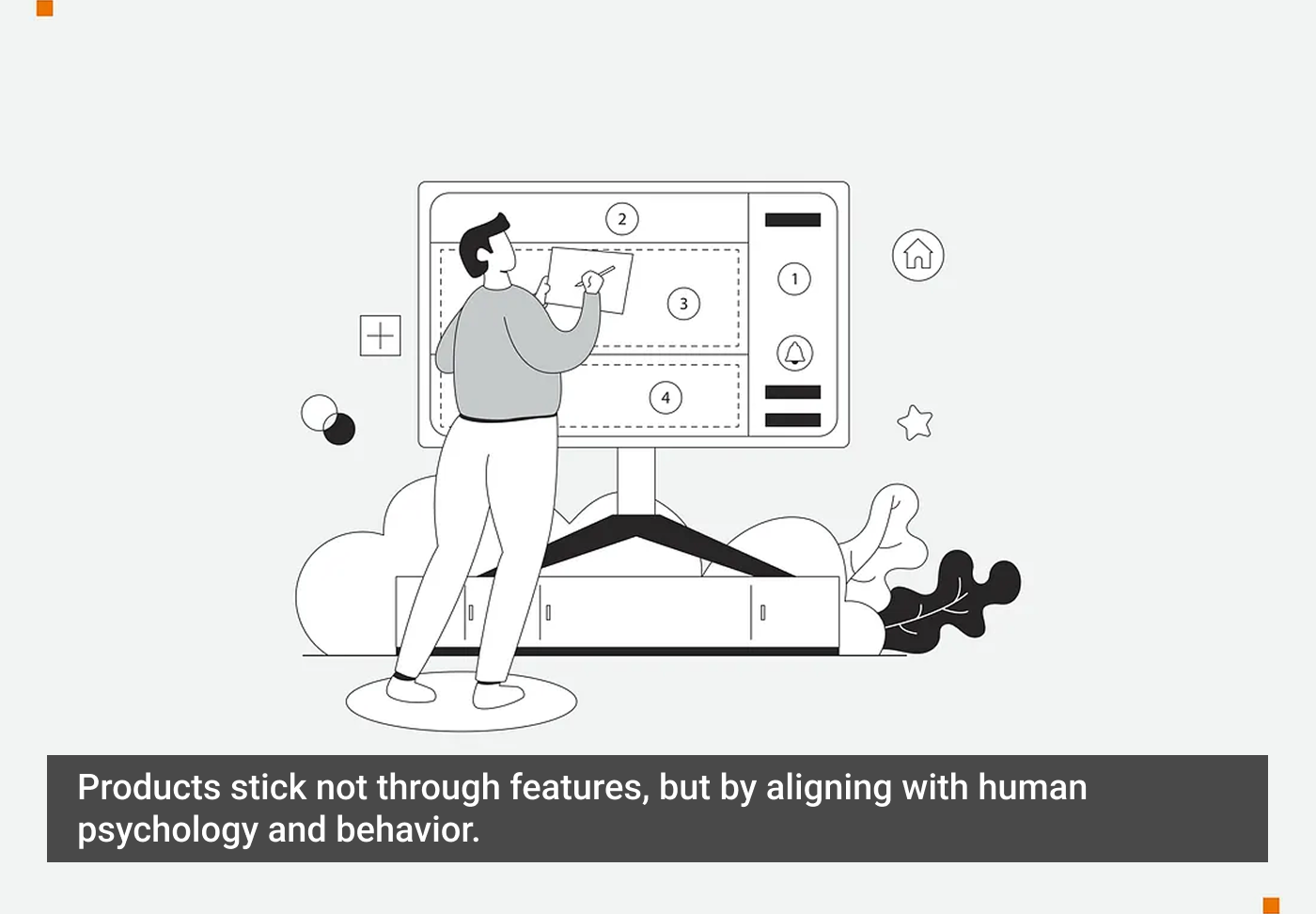
Product design has a lot to do with psychology. It’s less about how people should behave and more about how they actually do. In this piece, we’re sharing some principles that can be useful to keep in mind. The names might sound quite technical at first, but once you see the…

Six Circles : A Experience Design Framework Six Circles - an experience design framework is a book written by James Kelway. This e-book has explored some of the experience design aspects of digital …
See the ranked UX performance of the 319 leading ecommerce sites in the US and Europe. The chart summarizes 100,000+ UX performance ratings.

I’ve been building Kidz Fun Art (web, iPad & Windows) since 2021, so 4 years at time of writing. It’s a tablet optimized application intended to be used by children of all ages R…

The Wizard of Oz method is a proven UX research tool that simulates real interactions to uncover authentic user behavior. Victor Yocco unpacks the core principles of the WOZ method, explores advanced real-world applications, and highlights its unique value, including its…

Warm lights, tactile buttons, intuitive usage.
I recently met a woman named Dolores*, an older Hispanic woman, living in Queens, NY with her mother and teenage daughter. As the primary provider for her family, she had come to the organization…
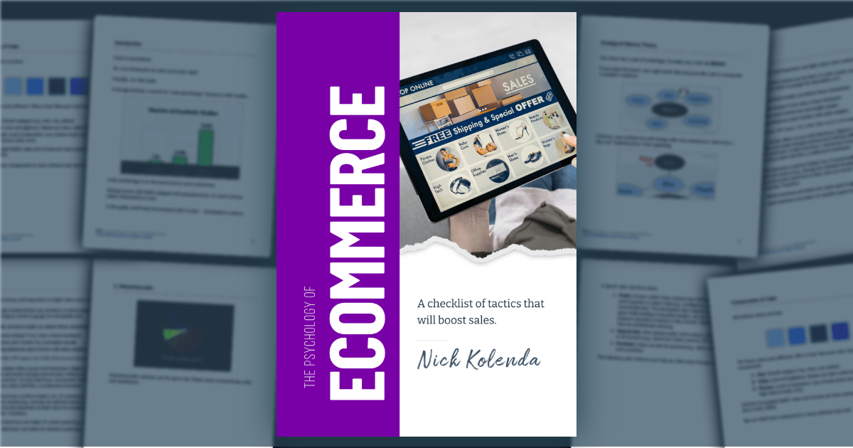
Dive into the customer's mind. Read guides. Watch cool videos. Pricing, sales, design, negotiation, and more.
Design teams rely on a combination of principles, patterns, heuristics, and charters to create consistent and usable experiences in a collaborative way.

A list of what tools and resources are most relevant for our designers right now.

OnlyFans leverages a meticulously crafted UX to create a powerful sense of intimacy and exclusivity, captivating users while sparking ethical debates about manipulation and exploitation.

A SWOT analysis helps teams understand how well a product, service, or organization is positioned in the market to serve its customers.

“I want to make it pop!”, but not at the expense of your customer experience. Here’s why.

Study guides and glossaries that were most popular in 2024

Use methods like 5-second testing, first-click testing, and preference testing to gain insights into how users perceive your visual design.

These 10 user-experience articles published in 2024 were those that our audience read the most.

Great thought and effort go into creating restaurant menus – and there are some very powerful psychological tricks employed to make you choose.

Use this glossary to quickly clarify key terms and concepts related to product management and UX.

One of the main laws that applies to almost everything in our lives, including building digital products, is Murphy’s Law: “Anything that can go wrong will go wrong.” Our goal is to prevent things from going wrong and, if they do, mitigate the consequences. In this article…
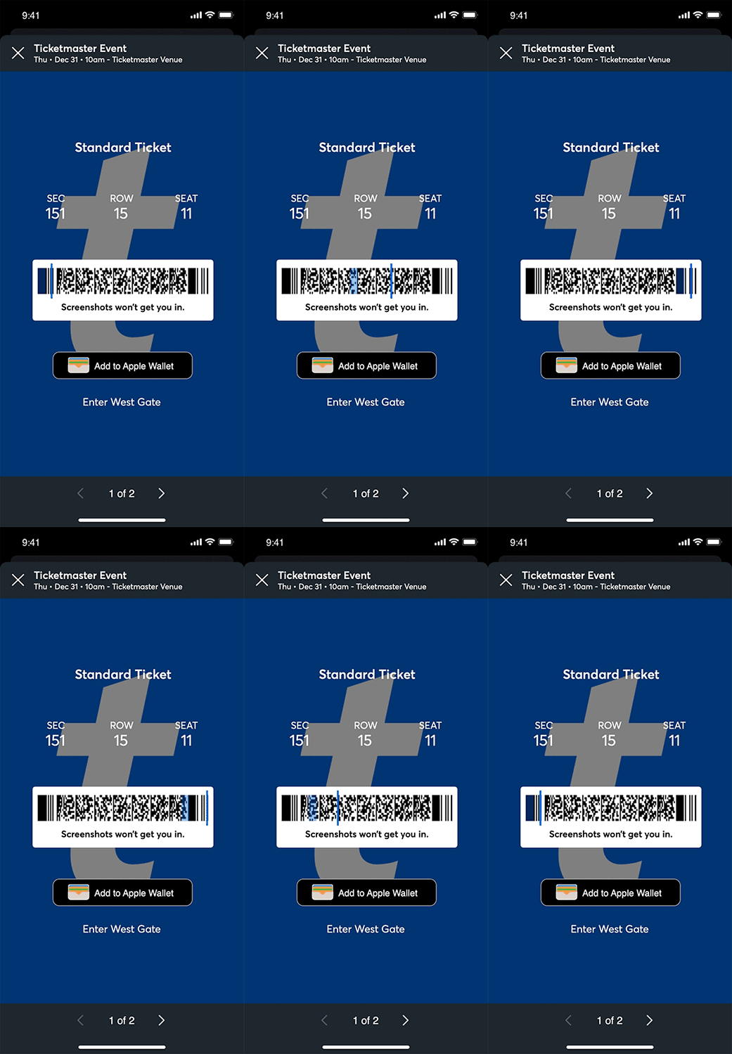
"Screenshots won't get you in", but Chrome DevTools will.
,co_rgb:ffffff,c_fit,w_1000,h_300/fl_layer_apply,g_south_west,x_100,y_160/l_text:Inter-Regular.ttf_40:Adam%20Silver,co_rgb:eff6ff,c_fit,w_1400/fl_layer_apply,g_south_west,x_100,y_90/card5.png)
Adam Silver – interaction designer - London, UK

Labels in a card sorting study must be neutral to prevent keyword matching and encourage careful, conceptual groupings from users.
Storyboards are visual representations of UX stories, which capture attention, provide clarity, and inspire us to take action.
Decent Patterns is a collective effort to further the adoption of decentralized technologies by providing open tooling and resources for the community.

Can designers defend pursuing beauty when communicating science or innovation?